Feedback from Rohan Hutchinson 19th January 2022
As I had previously reported I came across Rohan Hutchinson whilst listening to a weekend of photobook talks during the Ballarat International Foto Biennale (see Thoughts and Reflections 26/10/21 write up). Hutchinson has self-published over fifteen photobooks/zines and now has his own publishing business. I started following him on Facebook and noticed he was offering a number of workshops on book design and expressed a wish to join but due to COVID was unable to travel to Australia to attend and wanted to understand if they could be conducted on-line. Hutchinson responded by offering a one-2-one session. Following a number of email exchanges a date was finally set for the 19th January.
I recorded the session as I find it back to try and listen, take notes and discuss my project all at the same time. I also find it useful to review the discussion to ensure I have captured all the points, comments and suggestions. Summary of the main points:
- Reviews are very subjective so take or leave my comments;
- Your strongest work seems to be the artifacts and the landscapes as you seem to have taken more time with these.
- This is an important story and not just in NZ but around the world, so you need to bring that to the forefront, these women are the core. Some of the most powerful works are ones that make you question, that are shown but not in such a literal way as watching a person undertake a specific task;
- Think about lighting, this can make or break an image – may need to reprocess if you are not going back to reshoot;
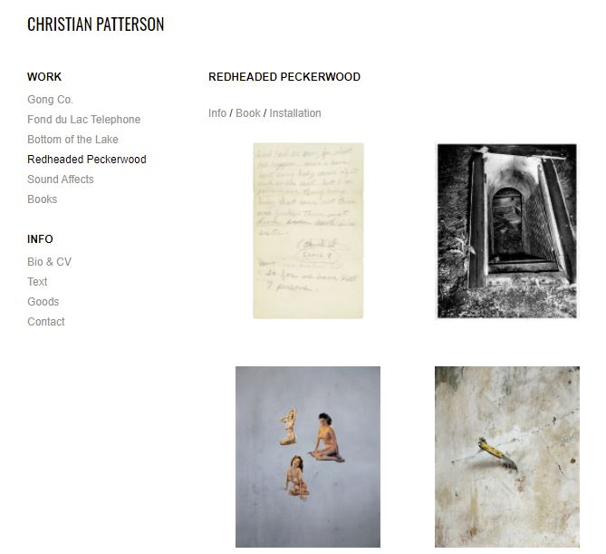
- Look at the work by Christian Patterson – his projects are often about a person but don’t include portraits of the person themselves. Your work reminds me of his especially the image of the note stuck to a wall detailing the instructions of a menu. This is a very strong image and one of your most powerful because it tells the viewer about the location, the economic situation;
- Another artist is Hiroshi Sugimoto who photographed machinery that had washed up on NZ beaches. A great example of how the narrative is shown in a very poetic way. The artist sets the scene with the statement at the start;
- In your portraiture – look at how you can show the person without really showing them. A good example is the work by Jessica Grilli. The viewer gets an impression of the person in a non-literal way, using a shallow depth of field. The presentation of the work can place it on an international; platform;
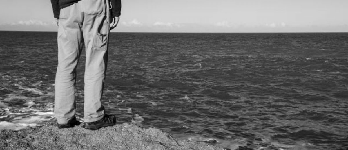
- Use of small boarders. There is so much information in your images that with the large boarder you don’t get to see, move to this more contemporary setting. Use large boarders for the landscape images with minimal detail such as your shoreline image;
- The lighting is letting the portrait work down, consider re-editing or processing;
- Mixing B&W and colour, there is work here that is suitable for both a book and exhibition, it just needs a re-edit/re-process
- Mix up and strip things back, avoid multiple images on one page;
- Use of text to set the scene – two paragraphs as a max, sets the story, work is strong enough not to require too much text;
- Look at different fonts – there are NZ font producers that have designed fonts for geography/location. You don’t want to distract the viewer, but it needs to read clearly try several and ask for reviews;
- Sound, solid images, some stronger than others just need to re-edit, crop and return to some of your ‘B’ images. Often your favourites don’t make the cut;
- The Zine competition is a great way to set yourself a goal. 36 pages is ideal for 15-20 images max, give the viewer room to breath and take in the information;
- Consider the smaller boarders and full bleed on a page;
- Group images and then look for link images;
- Good luck and happy to review the draft zine and provide feedback.
Reflection and Research on Feedback
Following session Hutchinson sent through several links to the artists discussed and a few extras for me to consider. Overall, I think the advice was really helpful. I have consistently been looking at the same images and re-editing using those when I should have been taking a step back, looking for images within those and re-cropping to get a stronger narrative.
My approach has been too literal, wanting to show the women but looking at the work by Grilli and Patterson I can see that although the project is about a person or event the way you present the images and edit means that neither have to be in the image to represent them. The narrative can still work without them being directly on show. Their presentence is there through the artifacts, lighting or composition.
Christian Patterson
Patterson an American photographer who lives in New York produces work that is based heavily around the narrative and based on documenting historical events. The images use archives, personal images from locations of the events, drawings, notes, newspapers, memories, objects, video and sound recordings from the locations. He has produced three books: ‘Redheaded Peckerwood’ (2011), ‘Recontres d’Arles’ and ‘Bottom of the Lake’ (2015).
Hutchinson directed me to the ‘Redheaded Peckerwood’ book and suggested that my work reminded him of the images used in this work, especially the use of notes along with images. The following image has been taken from Patterson’s website:
(http://www.christianpatterson.com/redheaded-peckerwood/#1 accessed 23/01/22)
A video of the book can be found here (accessed 23/01/22): http://www.christianpatterson.com/redheaded-peckerwood-book/
The images are based around the tragic events of a 19 and 14 year old that undertook a three day killing spree across Nebraska, until the were captured in Wyoming. None of the images show these individuals but include via a photojournalism style forensic, staged and landscape images to represent the narrative. He uses archive material but includes both factual and fiction to represent what happened but also people’s memories and theories of the events. To link the work to the killers he has used objects that belonged to them, this included maps, poems, confession letters, stuffed animals, and ornaments.
It was interesting to see the layout and mixture of image styles with small images with limited detail to those that filled both pages. I can now see how this could work with some of my work. The hardback book also contained a postcard and separate booklet at the back which contained additional text/essay by Luc Sante. A number inserts were also included which obscured the underlying image so the viewer had to stop and move them out of the way.
Jessica Grilli
Grilli is a freelance photographer and arts teacher. Limited information about her on line but she is interested and works around textures, the natural environment and the people who live in ‘creative places’ (https://shop.cream.town/artists/jessica-grilli/ and https://kuwaii.com.au/journal/jessica-grilli/ accessed 23/01/22). Looking at her Instagram account I can see what Hutchinson was trying to get across to me about the shallow depth of field to really focus the viewer on the point of interest. The soft light and the narrative of being about the people but not really show who the person is. I did produce images like this but these were rejected when I can to edit for my BoW submission. I will revisit with a view to reconsider their reintroduction for the Zine.
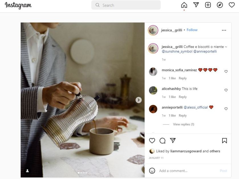
Jessica Grilli: https://www.instagram.com/p/CYkHYrrBwch/ accessed 23/01/22
Lisa Sorgini
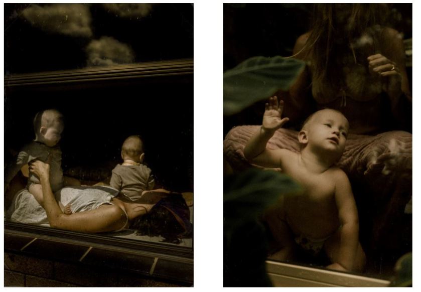
An Australian born photographer who started photographing only five years ago after loosing her own child. The project and book ‘Behind Glass’ explores motherhood during the period of the pandemic and lockdown. Images taken through windows looking more like Renaissance paintings than photographs, the images are looking in on family life, the confinement and domestic life during prolonged periods of isolation. The work is clearly centred around the role of the mother, her role and how isolation has affected them and their relationships and loss of community.
Sorgini is very much the observer of their lives, in the same way I was of the women of Ngawi. The lighting is soft and golden throughout, but large areas of darkness imply that all is not right in the world. Her work shows the reality of life, all in the garden is not rosy, it’s not like the adverts on tv/magazines or scenes in a film, there’s pain, anxiety, depression.
Images by Sorgini website: https://lisasorgini.com/Behind-Glass accessed 24/01/22
In the majority of the images you don’t see the women only part of her, an arm for comfort or guidance or comfort, a hand to offer food, but in each image she is there, implied or in the shadows which I’m sure a lot of women felt the same. In a similar way so do the women of Ngawi. People drive through see the tractors, cray boats but don’t think or realise that behind that are eight women making do and carrying on with life. There are hard realities of life that are often not seen and I need to try and bring this out in my images.
Bibliography
Accessed 23/01/22 and 24/01/22
https://www.libraryman.se/lisa-sorgini-behind-glass/
https://www.lensculture.com/articles/lisa-sorgini-behind-glass
https://lisasorgini.com/Behind-Glass
https://www.designboom.com/art/lisa-sorgini-behind-glass-quarantine-09-22-2020/
Hiroshi Sugimoto
On the review it was suggested that I look at the by this Japanese photographer and his project ‘On the Beach’. The book and images are based around artifacts that had been found on the beaches of New Zealand. The result of decades of erosion by the sea. These metal parts were all that remained of cars left on the beach in the sixties. This series of black and white show how quickly nature can take back what civilization had left.
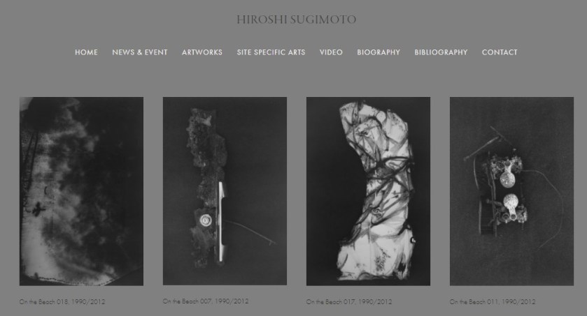
Sugimoto website: https://www.sugimotohiroshi.com/copy-of-on-the-beach accessed 24/01/22
However, what I was guided to was how Sugimoto had presented the book. The cover seems to be a simple black textured cover however on closer inspection I believe is maybe an image of the New Zealand sand, black from volcanic eruptions millions of years ago. I had already noted that for one of my re-edits I wanted to include textures for either the cover pages or as boarders throughout the book, so using the distinctive textures of New Zealand sand would provide some context and a scene of location to my project.
The photographers name and the title of the book run vertically along the opening, which means you either have to turn your head or the book to read, different but difficult for the viewer I think:

The internal layout is contemporary in style, with small boarders or frames around the images. Usually a single image on the right-hand side. There is an occasional double spread but at the end/front of the book there is a single image that has been placed centrally on the page which has large boarders top and bottom. The image is very simplistic, minimal in detail which seems to link the front cover of the sand where the objects were found to that of the sea which caused the erosion. I think this linking needs to happen with my zine/book and has been mentioned before but I hadn’t really understood how to do before now.


Bibliography
Accessed 23/01/22 and 24/01/22
https://www.sugimotohiroshi.com/biography
http://www.artnet.com/artists/hiroshi-sugimoto/
