Draft Book: Male_Female images with bi-folds Version 1
This version came about following all the various feedbacks I had received from fellow students and the Open Forum designed for Level 3 students to show work.
Student feedback on pdf version two here
Student feedback on videos version four here.
Initially there seemed to be two clear designs that people considered showed the work best and portrayed the correct narrative but I wasn’t one hundred percent sure so I contacted my tutor another opinion. The response threw in a bit of a curve ball:
“It is a difficult decision because they all have their merits. Conceptually, I like the male-female juxtapositions and the way they are conveyed in monochrome and colour. In terms of design, I like the bi-fold book because of the way the two-part image opens up to reveal two other images. It is worth considering making a book that has bi-fold landscape images that open up to reveal the dichotomy of the male and female world; in short, a combination of the two books and visual approaches. This would be a succinct representation of what you are working on. I hope this helps though I know I am suggesting more work.”
So back to the InDesign drawing board. Luckily I had set up all the Master pages and could easily transfer them to the new detail. All my images were in a series of folders so I could select and place the images I needed. Changing the bi-folds required the review of some of my old images and some additional processing.
For this version I have also reduced the font size again – finding it so hard to judge when on screen it looks fine but then when printed it looks too large.
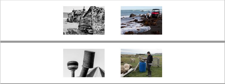
New Male_Female pairings within the bi-fold:
The pdf of the version is here:
Inside the Shell Book bi-fold Male v Female V1a
The video of the printed version is here.
As part of my feedback session for Assignment Three I requested time to discuss this version of my book design. The following review was provided:
I think the landscape images work well across the bifold pages. The male v female images on the inside to show a very gendered approach. That said it is not for me to tell you which approach to select, this is your work. If you continue with this selection then you need to document your reasons why, similarly if you decide it does not work for you.
On the draft proposed I would suggest that you review your selection of landscape two as this feels very gendered/male when you need the image to be about the place. The use of this image seems to lose the internal narrative of male/female, these two sides make the place happen.
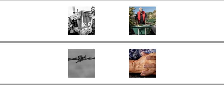
I think the pairing of the hands and the wire is inspired because of its form its not prescriptive or descriptive its quite poetic, you have the harsh knot against the soft hands. There are others that work but are not as strong, so take some time to review the images you have the pairings you have made, could you change any?
Overall I think I will continue with the book and depending on cost offer this to be purchased at the time of the exhibition. These will be digital images as opposed to the platinum and palladium prints and the bespoke book. I will also gift a copy to those that helped be complete this project and the course.
Compared to the other versions/designs I think this offers the viewer a more complete image of Ngawi. The landscape images show the place, the isolation and the conditions under which these women live. The images inside the bifolds show the contrast and gender divide.
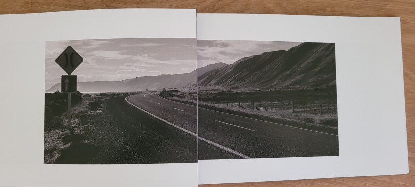
I agree that the second landscape image is too gender specific and so I have processed a different one to replace this.
Original:
To:
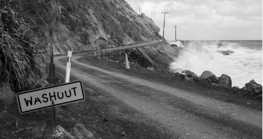
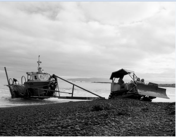
This later image shows the conditions under which the location has to live and work. In winter the road is often washed out by the Southerly tides.
I’ve spent the last few weeks looking at and reviewing the images and layout of the physical draft I produced. There are a number of advantages of seeing the physical version verses that on screen. To start I think there needs to be a gap between the foreword and the first set of bifold images, this could take the form of an image that introduces the location.
Considering the comments from my tutor on where to place the second collaboration piece I think this could be placed on a single page prior to the first bifold. The poem offers a contrast between the genders and I think will work well if I place it on one page prior to the images as a prologue. This will ensure that the images are the final thing the viewer will see and hopefully remember rather than placing the poem at the end.
New additional pages:
I think the poem works well on the single page and the additional pages offer a start to the book.
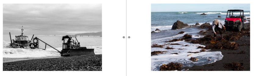
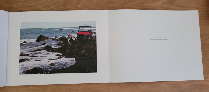
I have continued to review the pairs and made a few changes, the first was returning the tractor and boat image to be alongside Sue:
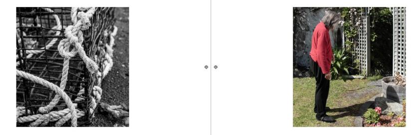
The second was to reconsider the pairing with Pam. I think considering her condition the cage and knot is a better combination:
As time is progressing, I need to understand if the book can in fact be produced so I placed a request on the local camera club Facebook page for anyone who had worked with a local designer and printer. A few suggested the usual Blurb (https://www.blurb.com/photo-books) and Momento (https://www.momento.co.nz/) but due to the bifolds and my concerns around the design I really wanted to be able to work closely with the printers and explain my idea rather than trying to fit it into yet another piece of software to reduce cost and have a lower quality result.
One of the members recommended a printers who was based in the next village from where I live so I arranged a meeting and went a long to discuss my ideas, taking with me the mock up I used for the video to obtain feedback from fellow students and my tutor.

The meeting with printers went well, we discussed the design, the types of binding, covers fonts and possible numbers. Following the meeting I sent a copy of the InDesign file for them to work out a possible cost.
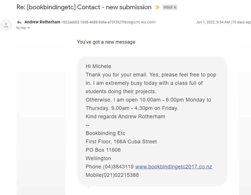
Rather than relying on a single quote I also investigated a number of options within Wellington. The first was a company called Bookbinding Etc on Cuba Street. I assumed that they would print as well as bind but after arranging a time It soon turned out that he would outsource the printing.
Andrew did however give me the contact details of the company he would have used: – Colourcraft [https://www.colourcraft.co.nz/]. I met with one of the directors Ben Johnston:
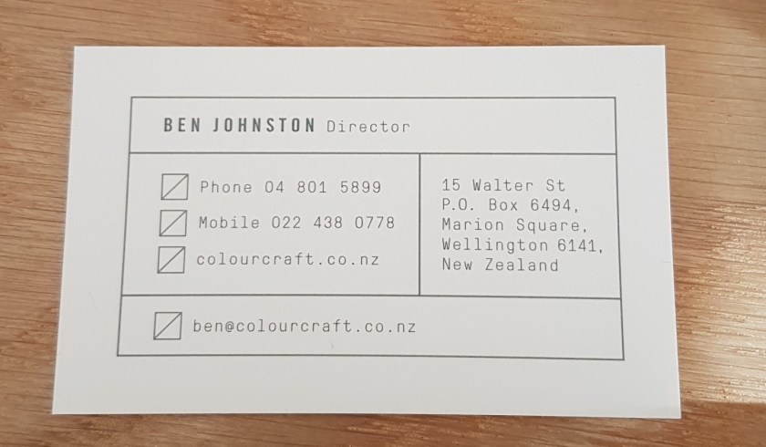
Ben looked at my work and we discussed possible bindings but after measuring the page size said that the machines, they currently had couldn’t cope with the print length. He could however discuss with the sales person a possible addition to the machine to add the additional length, alternatively I could try Pivotal Print who were a few blocks down the road. If I didn’t have any luck with them then I was to go back and they would see what they could arrange with the print manufacturers – the thing I love most about NZ, there’s always someone who known someone who can help.
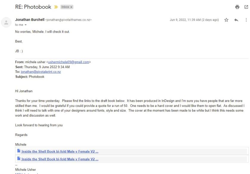
At Pivotal Print [https://pivotalprint.co.nz/] I met with Jonathan Burchell who confirmed that they could print the required page length. I stated that I want the book to open flat, explaining that I had been to see Andrew at Bookbinding and also Colourcraft. He offered to draw up a quote:
This is not going to be a cheap exercise but I want them to look and feel professional. I would also like to have them ready to sell at the exhibition in November.
16th June 2022
Received an email from Ben at Colourcraft the printers I spoke with in Wellington. As previously highlighted, they have issues with the sheet size and additional complications:
‘For your book you’ll need a sheet size 1200mm wide to cover the 4x landscape panels of the A4, plus a bit extra for print production.
However the largest stock we know thats available from paper merchants can be cut down from a sheet, but will end up a maximum of 1020mm wide.
All is not lost, there is a machine named a ‘web-fed inkjet press’ which uses a roll of paper rather than cut sheets, so you’re book would fit. However I’m near certain none are installed in Wellington so may need some googling on your part.
But I’d start with giving these guys a call https://www.ovato.co.nz/print/
Cheers Ben’
I decided to park the alternative supplier as I really wanted to work with someone locally and responded with the fact that I would be prepared to reduce the overall size of the book without loosing the narrative of the project.
Ben responded:
Hi Michele,
Just called to run through this but only got as far as voicemail.
I’ve spoken to Adam from Konica this morning and that approach isn’t going to work.
So have just called Andrew the book binder and we have a plan. We’ve figured out that we can do your book at its current size and with the fold out pages on both sides. Provided its perfect bound (like a paperback novel). Unlike a case bound document it will not open completely flat, but binding with the perfect bind style is the only possible option based on our press sheet size and available paper sizes.
As its quite tricky to produce and so unusual in construction. Andrew and I suggest we do you a full print proof once the documents is designed and ready to print, so you can make sure you’re happy with the results.
If this works for you please let me know how you’d like to proceed.
Cheers Ben
Rather than keep emailing I decided to set up a face-to-face meeting and discuss the options, this happened on Monday 20th June. Following this I felt a little deflated and decided to call in and talk to Andrew the book binder. We spoke about possible options and he had assumed that Ben understood his suggest which was over the phone (obviously not) and offered to call him to discuss, as there seems to be away forward with a stitched binding. It wont open fully flat but I also have concerns about the design and need to talk to a designer and so I have contacted a friend who has published a book for contact details and try and get someone to give me a review. Concern is they might want to change it completely!
I have also decided to return to Pivotal print to see if they can complete the print with Andrew doing the binding. If not then I will contact Ovato (details above) who are based in Auckland and Christchurch. I will probably need to ensure that the design is finalised before sending the file as trying to discuss things over the phone or via email is not really working well.
24th July 2022
Overall, I can report it has been a very frustrating four weeks. The discussions with Ben from Colourcraft came to nothing and so as previously reported I returned to Pivotal Print. I had several meetings and even showed them the book where I first saw the idea of the double bifold. I left my mock up and sent them the InDesign files. I was told that it would take a few days for them to work through my idea and come up with a quote.
After a week I contacted them and they apologised stating issues with staff being off with COVID and winter flu but that the quote would be through within a day or so. It eventually arrived three days later. The cost for 50 soft covered, fully bound versions was $3,000. I knew it wasn’t going to be cheap but I was hoping that I could recover some costs by selling them at the exhibition and through the website.
As I was still not sure about the cover, text and layout and wanted to work with their designer, which I still hadn’t spoken too, only the salesman, I asked if a proof could be produced so we could consider paper, text and layout, this was when things started to go wrong.
Late on Wednesday (20th July) I received an email from the printers say that they could easily print the book but that they did not think that the binding they could do would hold and would I consider a wire spiral binding? I replied with a very definitive no and that I was very disappointed that they had left it so long before telling me and even providing a quote with binding included.
This left me with several options:
- To no continue with the publication – not really an option as I wanted to give the women of Ngawi a gift of the project;
- Ask Pivotal to work with Andrew who would hand stitch the binding – the Pivotal quote would drop as this would only be for printing but the hand stitching would be an additional cost;
- Find an alternative printer!
As option one wasn’t on the radar, as I still have time I decided to progress options two and three. I asked Pivotal to contact Andrew and see if he would work with them to bind the book and come back with a revised quote for the work. By close of play Friday (22nd July) they had confirmed that Andrew would be prepared to bind the books but I still haven’t received a revised quote.
Whilst I was waiting for Pivotal to respond I decided to contact the Wellington branch of Momento (https://www.momento.co.nz/ ) as I had been given the name of a person there to speak to whilst on my photography trip to the Chatham Islands. The phone number had a voice mail service so I emailed asking for the person to call me back and she did! She explained that they only tended to do standard printing (all completed in Australia) but that Momento hired an office within the printing company of Wakefield Digital, in Wellington that wasn’t too far from where I work and that I should give them a call as they do bespoke work and have a binder inhouse. She gave me a number and said she would be really interested in my work and to call in if I decided to meet with them. I immediately call and spoke to representative who seemed really interested and helpful so I have made an appointment for Monday 25th went I will take the mock up I made and the book that gave me the original idea, so fingers crossed this will be a more positive outcome. I understand that I may have to make a few changes but as long as I can keep the same narrative, I’m happy to make the changes.
During the printing of the platinum and palladium images I investigated the possibility of producing a bespoke book using a different type of paper that was detailed in the book by Mike Ware (2021) ‘Platinotype Making Photographs in Platinum and Palladium with the Contemporary printing-out Process’. Routledge New York. This paper is made by Arches, a Platine paper made especially for this kind of printing, however it only comes in 22”x30” size and offers a beautiful edge to the sheet which I wanted to keep as part of the design:

Due to the cost and lack of availability here in New Zealand I have decided to use the spare prints I have made that didn’t make the selection to matt them and place in a box for the exhibition. The third piece of collaboration work – crayfish Lithophane will be placed in the lid of the box which will hold the prints.
31st July 2022
At the start of this course the idea of making a book had never even entered my head and based on my previous experiences with printers I would never even complete this one, however my meeting with the designer at Wakefield Digital was the complete opposite. They were so interested in the project and the design that we discussed my interest in producing a single hard copy and then multiple soft copies that would be available to sell. We selected print type, covers and textures and details around binding. The whole experience was so positive. Within two days there was a quote in my email inbox and a fraction of the cost of Pivotal.
The quote came with a number of instructions on how to resubmit the pdf files for printing. This was completed and return. Next step will be to produce an initial draft for approval before the full run. I raised my concern around the font and size, but we will discuss this once the draft has been produced.
15th August 2022
On the 8th I met with the printer to see the first mock print of my book without covers as this would be on the next version. There were a few issues around the folding of the pages i.e. they weren’t a double bifold but I was assured that could be easily correctly. I was also a little concerned around a few of the B&W images being very dark compared to when I see them on my screen. We discussed the possibility of the issue of converting to jpeg files and I said I would look at the set up and export settings from InDesign. I also stated that following feedback at the weekend I would need to change the wording of the foreword and I wanted to add additional wording to the copywrite section. We agreed that I would send a new file with the changes.
During the week I made changes to the foreword and sent the changes to Jim to ensure that he was happy with the final version (here). This now fits nicely on a single page. I also realised that when I exported the jpeg the image quality wasn’t at maximum. I corrected this and resent to the printers. Think we are nearly there.
20th August 2022
On Wednesday 17th I met with the printers again, this time the cover was on – well the soft version. As they have had to change printer machines the cover wasn’t a consistent tone:
It isn’t easy to see from the above image but we have decided to scan the linen cover of the hard back version and see if that works better. The B&W images are looking a lot better and so are the colour images, just a couple of the B&W bifolds need to be lightened and the Māori/English translation seems to have been changed so that needs to be corrected:
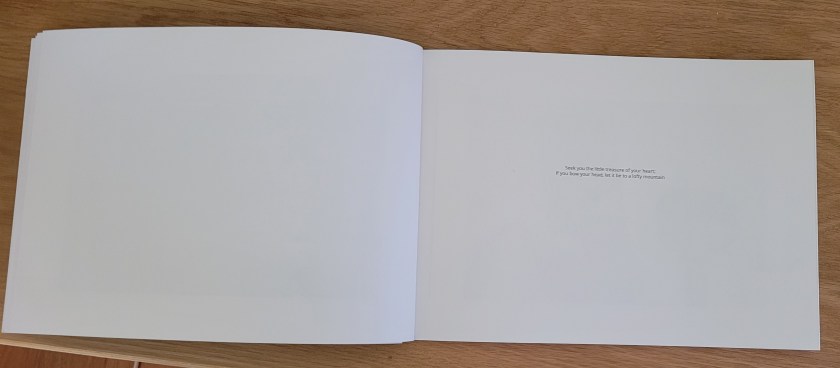
Image showing the placement of the wording incorrectly placed and here:
The bifold image is still a little dark so they will retry with the higher resolution image:
3rd September 2022
On the 29th August I returned to the printer to see the alternative cover. Although the scan was of a high quality, I found the cover too busy and felt that both the title and my name were lost, they needed to standout and so we started look for an alternative.
After some discussion we moved away from a printed cover and looked at ‘card stock’. This would already be of the correct colour and be able to travel through the printer to receive the ink for both title and my details. This would remove any of the previous difficulties of banding or tonal issues.
11th September 2022
On Monday the 5th I collected the final mock up to review and confirmed that the new card stock cover looked so much better. The black and white bifold images look a lot better and all text is correct. There is a slight increase in cost as we have changed from a fully printed cover to a coloured card but the increase was not insurmountable. I have confirmed that everything is fine and that the print run should commence and now await delivery.
21st September 2022
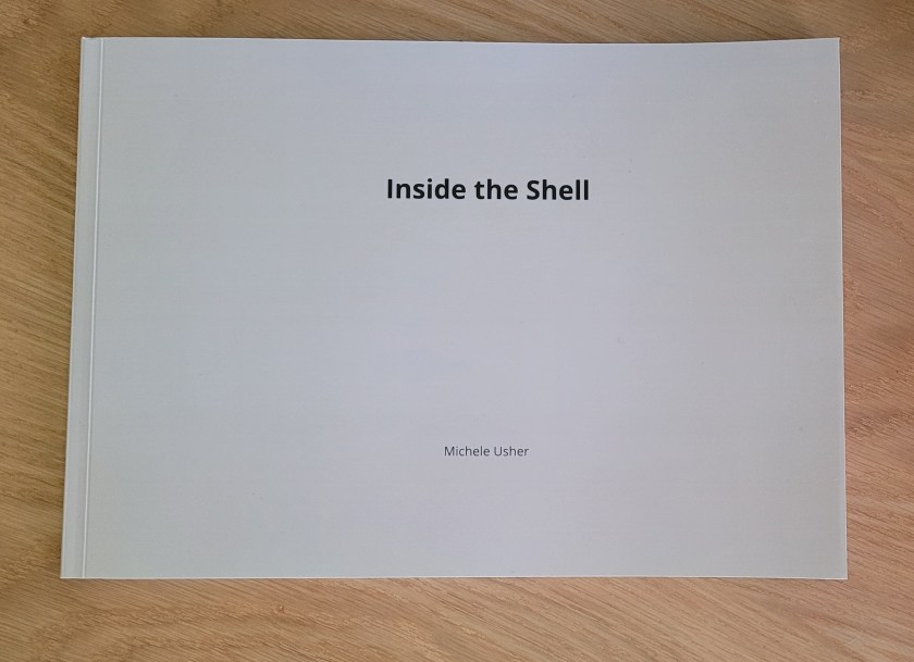
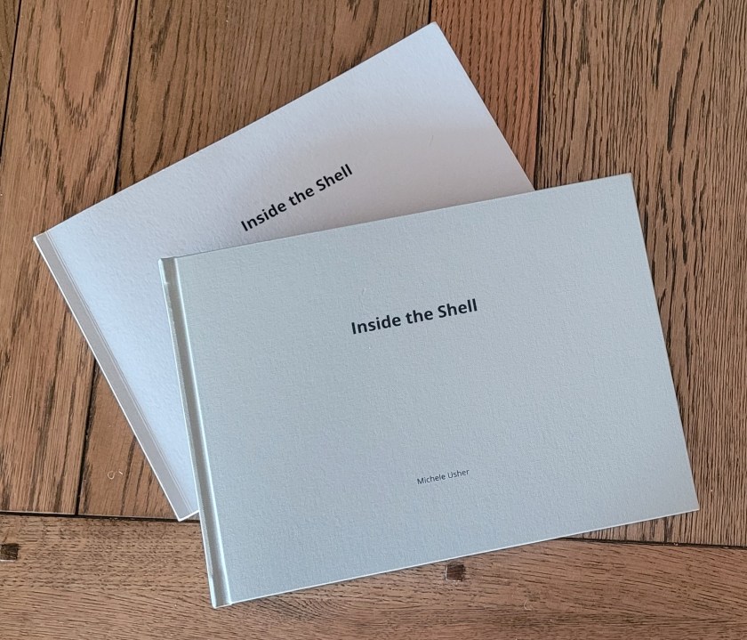
I finally took possession of the 50 soft copies and one hard copy of my book. I’m so please with the standard of the work from the printers. The quality is really good and they have gone above and beyond to achieve such a professional finish. The following image shows both the hard and soft copies:
I have started to advertise the sale of the soft copies on social media and OCA student sites:


I will create a video for my OCA blog and the website for the project (here).
Video of book can be seen here
30th October 2022
Since publication I have been actively advertising and selling the book and have currently managed to sell half the print run. The rest will be available for sale at the exhibition. Feedback has been amazing with just some of the comments received as follows:
Hi Michele
What a great book you have produced showing off your photography project and creative skills
The photos are fantastic and are a good representation of the Ngawi community and landscape. The presentation of the images, with ones behind the main image, adds to the story telling through the photos, the use of colour and subject matter. The remoteness of Ngawi is brought to life through the use of the black and white image. I enjoyed viewing the images in the book – it reminded me of the feeling that I feel when I do visit the region around Ngawi.
Congratulations on producing such a beautiful book which represents the story you are telling.
All the best
Debbie
And from Sue who was included in the book:
Oh Michele, I have just had time to really look at (and read) your beautiful INSIDE THE SHELL – it’s absolutely spell binding, what a truely lovey capture of NGAWI
Thank you so much for my copy
Can you remind me of your Exhibition details as I would love to come if I can.
Sue xx
Hi Michele,
When I first opened your book, Michele, I immediately saw the connection between the title, the layout of your book and the story of this very resilient group of women. The combination of the black and white imagery and the colour imagery makes a powerful statement to me as it is again reflecting that feeling of resilience. You have carefully curated the images to complement the written word, and the two languages reflect the long history of the area.
Congratulations on your book, Michele, it’s fantastic!
Love,
Fran
Gday Michele,
Your book I gather is for your course.
Loved it for its simplicity, yet creative thought to story line and continuity.
Lovely paper stock and design. Images are processed very well and importantly clear as to the story.
Well done!
Have sent this onto Pearce as he will love it. He has a big photo book collection.
He has just finished his Uni course which I think is the cousin course of yours.
He did it full time. He loved it!
Keep up the great work and I know this is helping you to enjoy your photo adventures…
Darran Leal
Photographer/Tour Operator/Author/TV Presenter
Hi Michele
Got the book today from Robert – it’s gorgeous, I really mean that. Totally blown away, beautifully printed and structured the images just pop out. The gatefolds work so well. You must put this in for book competitions, Chico Hot Springs etc. This deserves a wider audience. The wonderful thing is the tactile nature of holding the book, an attachment to it you would never get seeing this on screen etc.
It also the record of an important place and coastal community that can be studied in the future. Priceless work in fact.
So proud of you!
xxx
Jack Delmonte
I’ve been fortunate enough to follow the development of this body of work for a few of the phases. Over that time it has continued to evolve as Michele has applied her artistic process.
Her vision from the beginning was to take a different perspective on the life of the community. Many people go to/through Ngawi and on to the Lighthouse as a day trip, perhaps pausing to look at the tractors and the trailers on the edge of the inhospitable coastline. If the caravan is open, they might get fish and chips but otherwise it’s around to the Lighthouse and home again. Michele saw that there was something quite different going on in this community. She noticed the independent, other lives of the people who stayed on the land. These people weren’t just waiting for the boats to come home.
Michele saw all of that. She took the time to connect with people, build relationships, and ultimately catch them in those quite reflective moments as they went about the days work.
In its final form, inside, the shell represents all of that. It juxtaposes those quiet lives with the wild environment that shapes them still. Michele has shown genuine respect for the people she’s photographed, found the thread and ultimately told a different story of the community than most people see. There are quite a few of the photographs that I love on their own, but when you put them into the published form and they sit tucked away inside those big landscape views, they take on another meaning.
I really do love the book. I was lucky enough to see a lot of the photographs that didn’t make it into the book, and the thing I really like is that the ones that did make it in still represent the subjects very well.
John Saunders
