Draft Book: Male overlay Version 1
In this version the male images appear throughout the book but are printed on transparent paper so that the female image can be seem beneath. The Pdf version doesn’t really show this as well so I will have to produce a printed version.
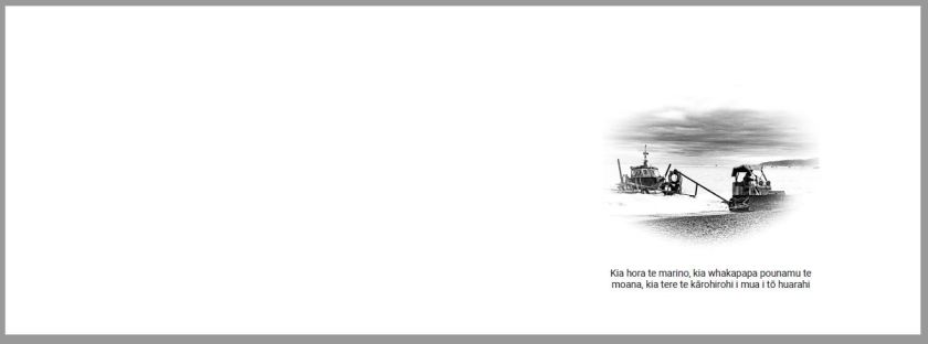
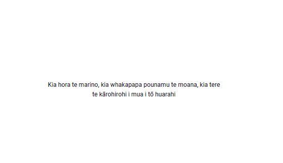
Each overlay contains a suitable Māori quote. The female aspect remains in the original format but I think that this could be paired back to just consist of a single image.
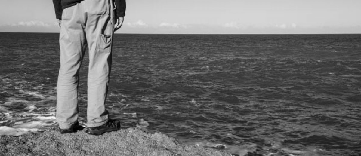
The male images have been processed differently, more of a pencil sketch.

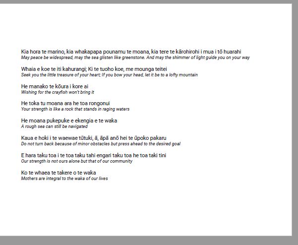
At the end of the book I have provided a translation of the meanings:
I like the idea of the overlay, giving the impression of the male cover with the female lying beneath, the strength, backbone, inside the shell. In order for this to be reviewed by others I think the book will need to be printed but the pdf of the book is here: Inside the Shell Book Male overlay
Draft Book: Male overlay Version 2
Prior to releasing for peer review I implemented a few changes. The first was to remove the multiple images on a page. This improves the visibility and allows the detail in the image to be seen – an area raised in the portfolio review by Rohan Hutchinson (here).
Version 1:
Version 2:

I also changed the images for Julie
Version 1:
Version 2:

This involved a re-process of the image to change the crop and format from landscape to portrait as I thought the layout worked.
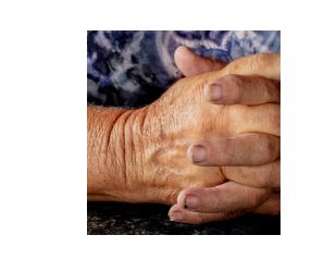
I also changed the crop of the hands for Trish to the way Rohan suggested as I think this is a better overall image:
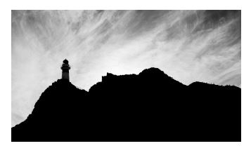
I also included the lighthouse image at the end of the book as I think this is a powerful image to end the narrative:
I will need to produce and add an additional image for Pam so that the layout is balanced and maybe consider flipping the current image as she is looking out of the page as this is distracting.
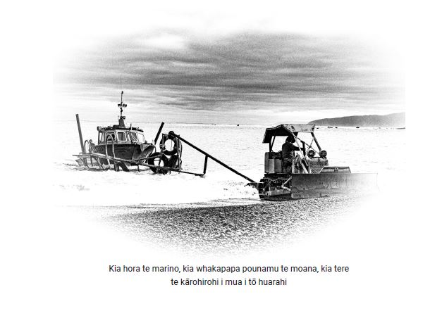
I have processed the male images as pencil sketches through a pre-set within Lightroom. I like the effect and want to print these on a vellum or transparent paper so that the viewer can see the female presence beneath. My concern is that the effect is not really seen in the pdf so it will be interesting to see the comments from the reviews. I think this will require me to print and video to show the full effect. I like the use of the image and text as that introduces the Māori element of the location. I didn’t want to use both the Māori and the English translation on the same page as this would make the page too complex.
I will also need to add the collaboration work by Jack and the illustration to the next version once they are complete.
Version 2 of the pdf:Inside the Shell Book Male overlay V2
Draft Book: Black and White Only Version 3
I released all five designs to several forums that I attend on a regular basis; the Level 3 Support Group, the Rest of the World Group and the L2/L3 Support Group. The full set of comments can be found here.
I have addressed the text justification to stop the text hyphenating across a line and I have reviewed different fonts, size and colour. The review and comments can be found here.
This version and the bi-fold version were the most difficult to visualise in the pdf version and so I will be printing and videoing to enable the final effect to be fully realised. In the feedback received in the Rest of World Group I was able to explain my idea in person but most agreed that to be able to physically see it would have helped.
Linda said that she had previously used vellum pages and raised concern that seeing the female image below may be a little too much, but by printing and seeing the effect I should be able to make a judgement. She only used text, so for mine I have produced three combinations:
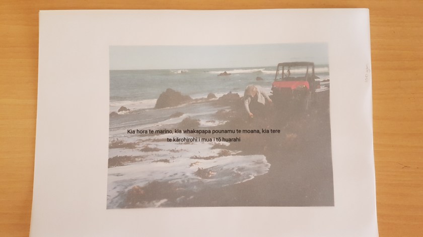
- Text and image
- Image only
- Text only
Text and Image example
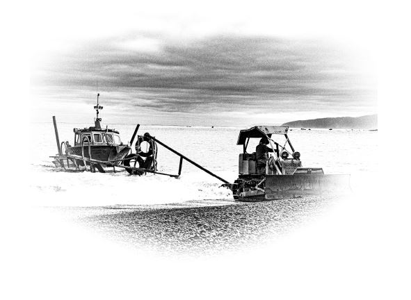
Image only example
Text only example
To demonstrate the effect and the density of the printing required on the transparent paper a selection of prints were completed. The following shows the different effect from applying more or less ink during printing:


As the image is already a pencil sketch, I think the 100% application works best, anything less than 80% would mean the female image beneath would be too dominate.
I needed to compare the female image with just text on the transparency v the image and text. From the two I think the image and text works best especially as I have dropped the text to fall below the image.
I think the text is lost across the page.

I think the two images work well together. The transparency allows enough of the female image through and the two images work well together.
The pdf of Version 3:
Male overlay: Image and Text Inside the Shell Book Male overlay V3 TandImage
Male overlay Image only Inside the Shell Book Male overlay V3 Image
Male overlay Text only Inside the Shell Book Male overlay V3 Text
