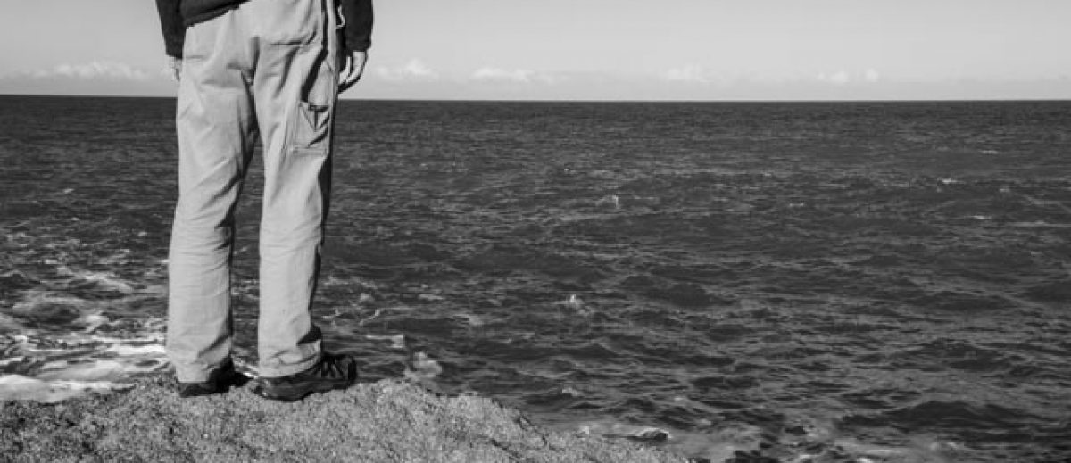
Draft Book: Male v Female Version 1
In this version the images representing the male aspects are spread throughout the book. They sit as a comparison to the female portraits. All images are in the 4×5 format and face each other.
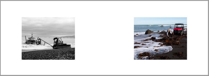
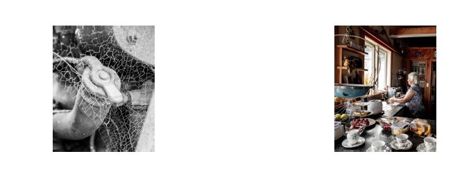
I have kept the simple clean approach with lots of space around each of the images. With each pairing I have tried to reflect the male elements in the female portrait. For example, in this set of images the top of the tractor looks very similar to the vehicle top that Sue uses to collect her seaweed each day:
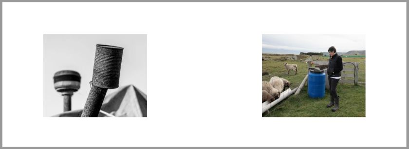
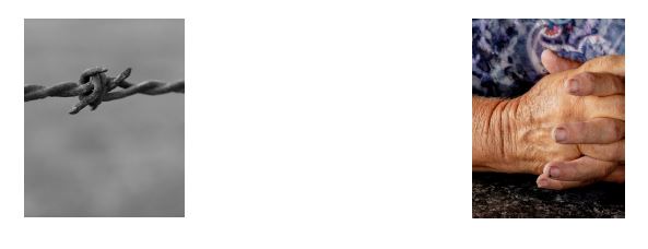
In this example the top of the tractor exhaust pipe looks similar to the blue barrel that Julie uses to hold food for her sheep:
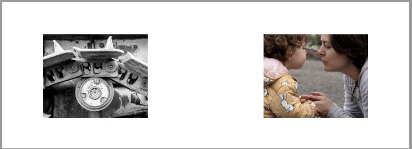
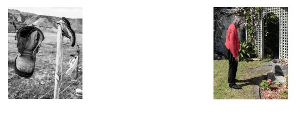
Here the arch of the tractor motor housing reflects the line from Melanie to her daughter as they hold hands:
I have added the foreword to the book that has been provided by Jim Graydon the author of ‘On the Edge’ one of the main forms of research for this project. When discussing my idea and my interest in him providing a written piece he told me that the book was about to undergo a fourth re-print. Once the final design has been selected, drafted and printed I would like to gift him one as a thank you.
I have really paired the format down with this design. Still using the original images from the book submitted for assessment but removing all the pages with multiple images on the same page. This approach introduces the male element throughout but without the male presence in the form of a direct portrait.
I’m wondering if the direct comparison is a little too obvious and if there is too much negative space as one or two comments from my BoW reviews stated that they would like to see larger images. I will issue a pdf for peer review and comment.
Pdf of the draft can be found here: Inside the Shell Book Male v Female
Draft Book: Male v Female Version 2
I didn’t make many changes to this layout prior to releasing for review as I thought that the images matched fairly well. I did change the images for Trich:
Version 1:
Version 2:
I think this combination and the change in the crop of the hands is a lot stronger. I also simplified the front to just the title and my name thus removing any reference to my course as I didn’t think was necessary if I went to publish and not just produce copies as gifts.
If this design version is suggested to be progressed then I think I need to consider flipping the image of Pam as she is currently looking out of the page and this takes your eye away from the image:
I will need to add an additional page for the collaboration piece from Jack once that is complete and the illustration. The selection of the font, size and colour also needs to be considered and changed following review.
The pdf of version 2: Inside the Shell Book Male v Female V2
Draft Book: Male v Female Version 3
I released all five designs to several forums that I attend on a regular basis; the Level 3 Support Group, the Rest of the World Group and the L2/L3 Support Group. The full set of comments can be found here.
I have addressed the text justification to stop the text hyphenating across a line and I have reviewed different fonts, size and colour. The review and comments can be found here.
There were no comments made on this particular version, maybe this was because it didn’t really stand out compared to the others. I will however print and video really for further peer review and provide feed back here if this version is progressing.
The pdf of Version 3: Inside the Shell Book Male v Female V3
