5th February 2021
I have left my images on the wall and keep looking at the series and reviewing the comments I have received to see if I can portray the story/theme of my project in a better way. I have been speaking to a close friend who has recently purchased a new printer. I think I want to standardise the format of the images from both a size and tonal aspect as I think that some of the images look a little too saturated, this may be due to the fact that the printer was not calibrated to my pc.
The images are currently all 5 x 4 but I’m thinking I would like to return to the square format, giving each image a strong white boarder that will force the viewer to look at the image as a standalone narrative. I also think that the panorama images would work better across the pages in a gatefold format when square. I have also been thinking that in the stage of my studies I would like to print these as a tryptic using the palladium printing technique.
14th February 2021
I finally managed to complete the first draft of my CS essay and so have allocated this weekend to pull the images down from the wall, address the feedback from my initial requests from fellow students and friends and reprocess the images into the square format.
I managed to complete all the main images and I think they work now as the introduction and conclusion are a consistent black and white and the main chapters of my subjects have a consistent tone. I was concerned that some of the portraits wouldn’t work in the square format but I think they do work, just need to see them in a book format.
I do have some major concerns around the panorama images. I need them to standalone but also work as a tryptic in the same way as the images of Tomas van Houtryre. I have pulled together the images I might use into a subfolder to re-work but they will have to wait till next weekend as I have runout of time.
21st February 2021
Have spent what seems to be hours reviewing and reworking the pano images to get eight sets of three to form the chapter divides between my ladies. Think I now have them selected and think the next step is to see them printed.
I have also been exploring other software packages to form the book and on a number of talks there seems to be a strong drive towards ‘InDesign’ which I have as part of my monthly Lightroom subscription. So I have been looking at on-line you-tube videos to get up to speed on how to use it. Once produced I then need to decide how to submit for assessment – either video the printed version with the pages being turned or use something like ISSUU to complete this. Will investigate further and see if I like the results, but I really think that the physical prints will give me a better feel as to the flow of the book and layout.
10th March 2021
Not sure where time has gone and then realised, I hadn’t put my fingers to the keyboard for a while but I had been working on both my Body of Work and Contextual Studies off line. So as a summary of my Body of Work I came to the conclusion that the Lightroom book module was just not going to allow me to introduce a gatefold page as the divider between my chapters so I needed to find something else. Other students suggested Affinity but as I already pay for the monthly subscription for Creative Cloud, I decided to look what was available there. InDesign seemed the most obvious selection and there were a number of free courses and so I started with this one:
https://www.youtube.com/watch?v=N9D_0UQrOhA
[accessed 25th February – 5th March 2021]
This explained how to set up and get going – great start.
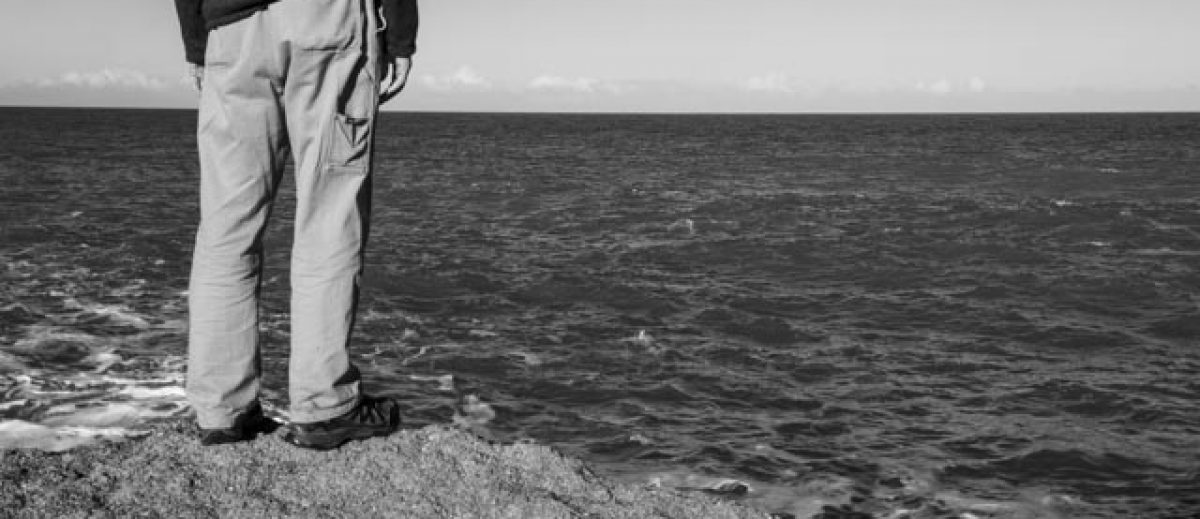
Following a presentation by Susan Meiselas (26th February) I started to think more about the front cover of the book. The main theme is how these women of Ngawi are the silent backbone of the community, how they hold things together, the glue. They keep going through thick and thin, coping with everything that life throws at them from health issues, relationships, isolation and environmental challenges. I needed something that linked all of these things into one image.
The previous weekend I had finally decided that the crayfish was not going to decay enough to be used and so I dismantled the set up but as this had shown such resilience to decay and rats I thought this might just be useable as a symbol for the women of Ngawi, linking their strength and determination with those of the fishermen that go out to sea every day during the season. I therefore decided to produce a series of close-up images of the ‘backbone’ (well the shell really) as a symbol for the front cover.
The following are those that I produced using a simple in door table top study and a black backdrop. I then posted them to the Level 3 Support group for comments:
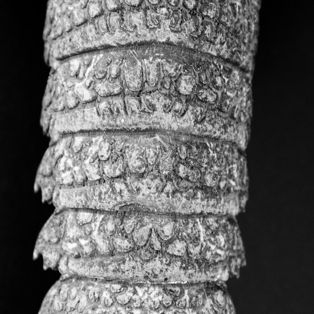
Image 4148
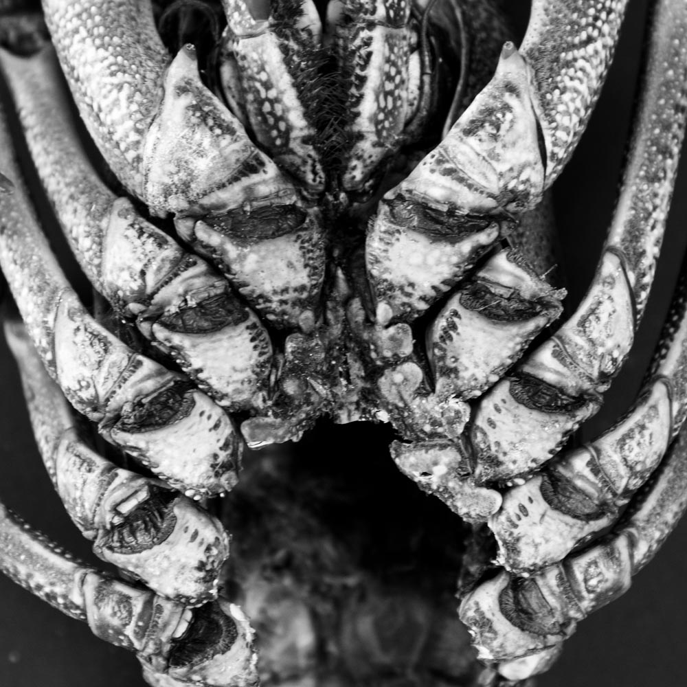
Image 4154
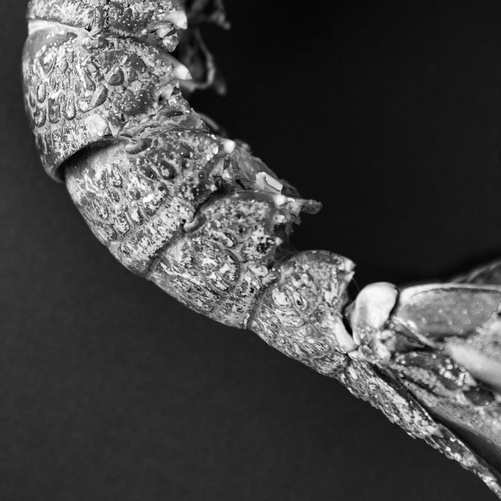
Image 4155
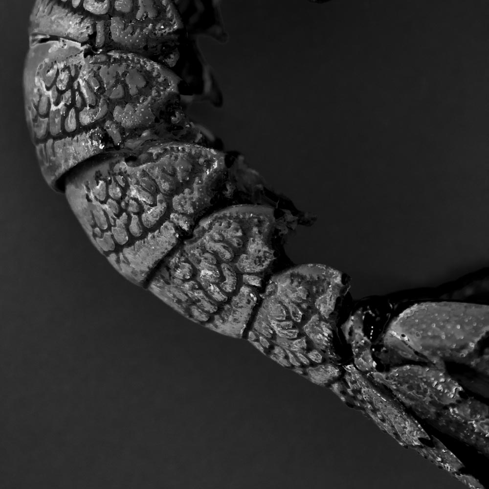
Image 4156
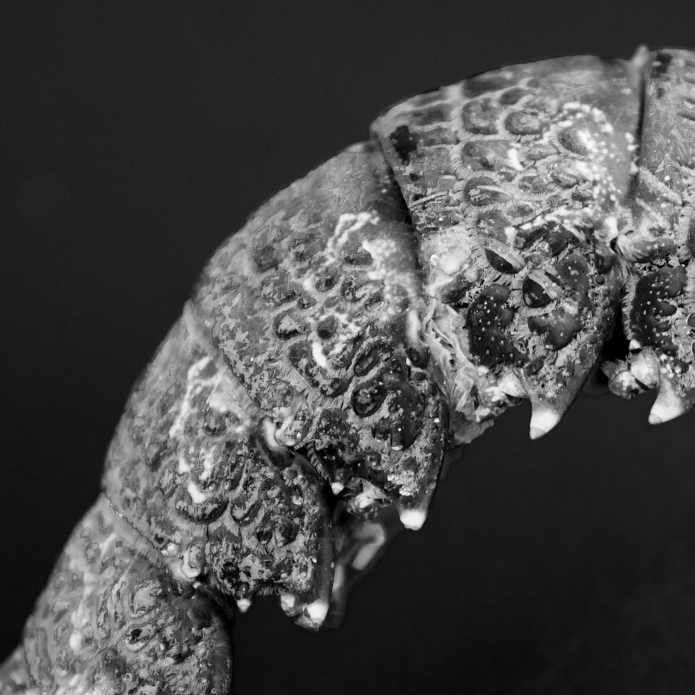
Image 4157
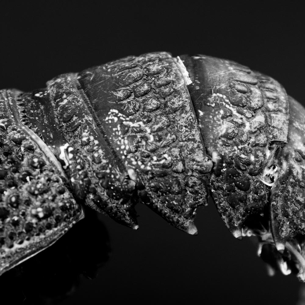
Image 4161
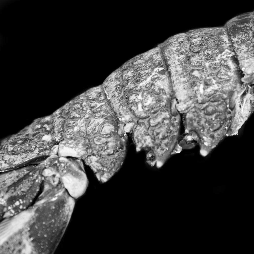
Image 4172
I think some are more successful than other but I will wait for feedback. I’m not really happy with the backdrop as its causing shadows and doesn’t seem to be a consistent back. The condition of the cray is poor as you can imagine – trying to bend the tail to form a curve resulted in damage as all the elasticity has been lost, so I had to stick the tail back together with Blue-Tac. I may have to purchase another to obtain an image for the front over.
