3rd January 2021
Over the last few days I have reviewed and changed a number of images and produced my Assignment Four which can be found here. This has been sent to my tutor for review and feedback.
Images for this first edit can be found here.
I have also posted the images and a request to my Level 3 Support Group for initial feedback – as it’s still Christmas and New Year and the UK are going into another lockdown; I don’t expect any comments back so will progress with my own changes and thoughts on each of the images.
4th January 2021
Received some feedback from two of my fellow students. The first from Lynda Kuit a student from Canada:
Hi Michele
Wow! You have been working hard on this. Right here is my two bob’s worth:
I don’t see any “b” images, but perhaps I’m a little late to the party after the New Year. 1a – 9a work well to introduce the landscape and the local industry. There is a good flow from introducing the town, hinting at the quirkiness (boots image) and then the local activities. Just wondering if 7a and 9a are too similar, but I do like the abstractness of 7a.
I like the way you have used a still life to introduce each of the ladies. They create a certain punctuation, change of rhythm in the viewing process. I think you may have “30.jpg” in the wrong spot (red anorak lady). She doesn’t seem to have a still life to introduce her though. I’d switch the order for the still life to introduce the sea weed lady and the one with the smart kitchen too. That way the still lifes introduce new “chapters”.
I think I understand the use of the B&W at the end – dying town/way of life etc. But to me it feels a little unbalanced. You’ve used 7 (excl the welcome sign) to introduce the town and industry. Perhaps a couple more B&W to sandwich it properly. Perhaps this one – it connotes a stranglehold on the local economy to a certain extent with the spider web taking over the machinery.

and the 67a version in B&W?
Hope this helps!
I thanked her for the feedback and asked about the possibility of using all black and white and her thoughts were:
Not sure about all being B&W – you do have a thread of red and blue running through the images: the dog in 23a links to the little girl’s parka in 22a and the red jug in 23a links to your old lady’s red sweater … the greenery in 27a links to the mint in 28a, the black pots in 28a link to the black sweater in 29a …. What was that talk we watched where they applied this to their editing – one of the HeadOn one’s I think. You might have to reshuffle a little within your “chapters” to finetune this process a little. You’d lose this if you converted to B&W.
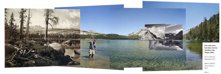
Did you manage to watch Mark Klett’s talk at the end of last year? He mixed B&W and colour – even in the same image. I think he was the bloke I was thinking about when I mentioned the way he does his panoramas – check here: http://www.markklettphotography.com/yosemite-in-time/2lsw1mj276vc8fhrhpj6f5hytscr3g then just click the right arrow.
I reviewed Lynda’s comments and made the few changes she suggested to see if the flow still worked. I also looked an alternative to the row of shoes and added a single boot in black and white as a possible:
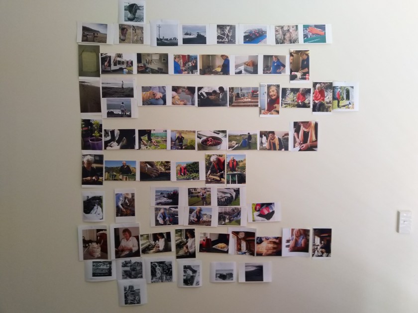
Will now consider this for a few days while I wait for others and my tutor to respond.
The work by Mark Klett was interesting by not a style I would consider for this project. He mixes black and white archive images on the top of his own modern day productions – a composite image. The following has been taken from his website: http://www.markklettphotography.com/yosemite-in-time/2lsw1mj276vc8fhrhpj6f5hytscr3g (accessed 03/01/21) and shows how he stitches the images together, a bland of old and new. An interesting concept and one I might have considered if I had managed to obtain a few male volunteers.
Sue Greenfield also kindly provide feedback:
Hi Michelle,
Have just spent a really enjoyable pause in my own BOW angst to look at your first edit images. I accidently viewed them back to front which actually was really helpful when I then looked at them in the right order! I really like the stories that emerge from your images – a great selection to work with.
I’m no expert but I think that you have some really strong images here and what struck me was the creative tension between the choice between people or process / facial expression or actions / people / still lifes in terms of what you want to say about these women and their lives.
For me the still life images have less impact on me though I can see that they fit well in the ‘process’ angle. I think I preferred those images that focused on facial expressions which hinted at character or their take on life and those that were action takes. It is difficult to express in words when really a conversation would tease out what I’m trying to say but here goes.
Re the choices of a or b, I’d go for 19a,50b, 53a
Certain images did not resonate with me, for example, the hands in 63a spoke less than 64a ( a really strong image – other strong images for me were 16a, 21a,22a ( lighten perhaps?), 26a, 35a,36a, 56a, 64a…not sure about 34a though – does this say anything? Having done a number of shoots with ordinary folk as opposed to models…I can appreciate these images as the whole process of getting folk to relax etc. can be so hard…
Another thought, I’d reduce some of the ‘process’ images in one or two of the mini ‘series’ e.g., the seaweed one choosing the strongest ones – 51b /50a instead of maybe 54a , and 55a – also take out any action shots with blur in…and also look at the facial expressions in terms of what they are saying (or not) .e.g., 57a compared to 56a. I’d crop 62a to get a better look at the lady’s expression…
Really liked the last three B/W images and think I can see where you’re coming from with these if using as closing shots?
Hope this ramble makes some sense ….happy to talk over in more detail…
Regards Sue
7th January 2020
Following a morning session with the Level 3 Support group I had a late-night call with my tutor to cover feedback on my latest Assignment for body of Work. Assignment Four covered the first edit of my images and the first really attempt to pull the work together and select just one theme to move towards final Assessment. I have to admit that this is the part of the course I wasn’t really looking forward to. I find selecting images that I have produced very difficult as I’m my own worst critic and probably lack the confidence where my own images are concerned.
The discussion on my Assignment and feedback was positive following a long conversation around the current lockdown situation in the UK and how the two countries; UK and New Zealand, had managed the situation. We discussed how I wanted to present for final Assessment. I explained that my original idea was prints with a view to undertake an exhibition in SYP. I also stated that I had planned to produce a ‘coffee table photo book’ as a present/gift to the ladies who had kindly allowed me to photograph them.
My tutor seemed to like the idea of a photobook, saying that I then had control over how people (i.e. the Assessors) would see the final project. I was a little confused by this as I’m not allowed to submit prints but I am allowed to send a book? My tutor suggested I see what has been put on the forums but I could still produce a draft book and then I produce a slide show of the results but not to predetermine the final product for SYP. It shouldn’t be the ‘final’ product but a good draft.
With the idea of a book for final Assessment my Tutor suggested I start looking at the various different layouts and styles starting with the ones by Tessa Buney who I reviewed earlier and at the twitter posts that he had completed during September for the OCA. I will also need to consider the use of text, either as a starting point or with the images.
9th January 2021
I had a little trouble finding the OCA twitter feed so asked my tutor and he kindly sent the link: https://twitter.com/BAPhotoOCA (accessed 09/01/21). The reviews started in September 2020 and just ran for the month. Every few days a different book was detailed. As I’m not a twitter user I didn’t really understand the reason behind it or obtain that much information about either the photographer or the books being highlighted, that said the posts did illustrate the various different layouts and formats that could be used. I’m drawn more to the single image on the right hand side with the blank left side or if not blank then minimal text such as that of Chauncey Hare ‘Interior America’ (https://twitter.com/BAPhotoOCA/status/1303383078434471936)
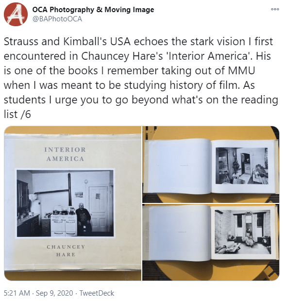
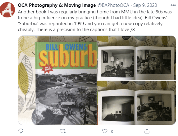
For me this is clean and professional, more in the documentary style. The viewer is drawn to the right-hand side page as they work their way through the book. I like the plain white boarder giving the impression of a matted print. Another in a similar style was the work by Bill Owen in ‘Suburb’, only in this book both sides of the page are used. This to me gives a cluttered feel, like the photographer has too many images and can’t part with any:
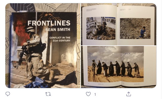
A number of books had images across the centre folder which works if the book opens fully and lies flat so that you are not having to fight with the book to see the complete image, as shown her in the book by Sean Smith ‘Frontlines: Conflict in the 21st Century’:
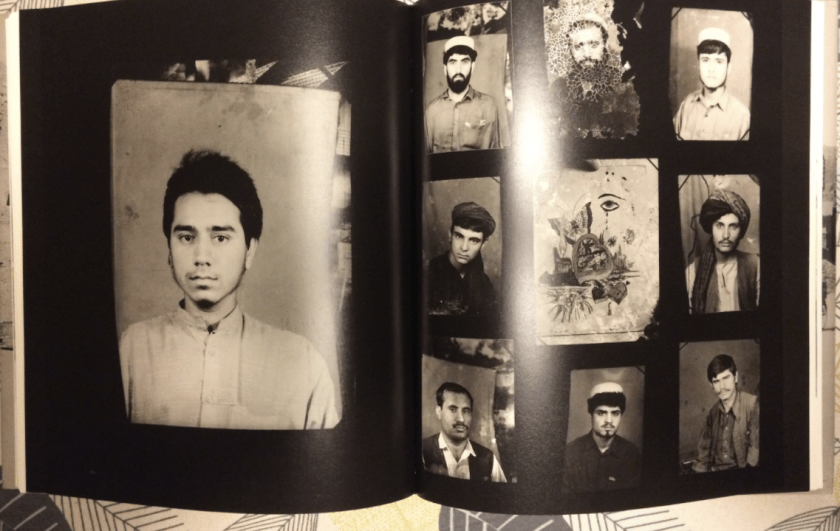
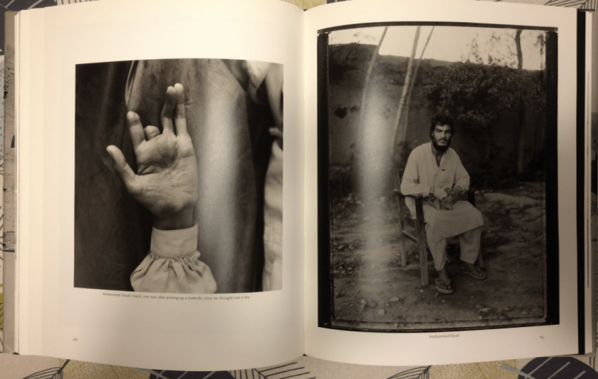
One of the formats that I really liked was that of the work and book by Fazel Sheikh ‘The Victor Weeps’. Sheikh used a mixed format with different background of black or white which I wouldn’t use, however he did provide a number of foldout pages and I was considering if I could use this as a means to separate my chapters instead of the portrait formats I would use part of the panorama images I had made (https://twitter.com/BAPhotoOCA/status/1306314538514612225):
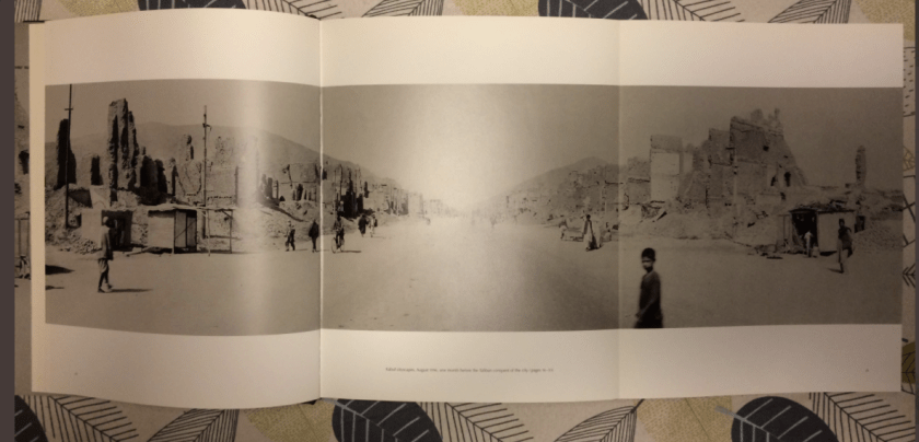
This narrow strip format for the street panoramas I have made would I think work well with a similar style for the main images. This design was used by Mahtab Hussain in ‘The Quiet Town of Tipton’:
(https://twitter.com/BAPhotoOCA/status/1305920132959662083)

Talking to my support group they also suggested I take a look at a website which solely covers photobooks ‘Photobook Book Group’ (https://www.jsybyllasmith.com/photobookgroup) so I will continue to research and edit my images and wait for any other feedback.
12th January 2021
Decided to take a look at the website Lynda had sent through – an on-line photobook review and discussion group: https://www.jsybyllasmith.com/photobookgroup. I selected the book conversation with Ben Brody ‘Attention Servicemember’: https://www.jsybyllasmith.com/currently-1/2020/11/20/attention-servicemember-photobook-book-group-12 which originally took place in November 2020.
This was a self-published book which is now on its second edition. This second edition has meant that his has just broken even financially on this book. He explained that it was probably one of the hardest things he has ever done. The book is about his life and the differences he noticed following his life in the forces as a combat photographer.
The book consists of over 160 images and text which is situated towards the rear of the book. The text was the last part of the book to be produced. What I found interesting was the use of black and white and colour images. He didn’t mix but used the black and white to open and close the book. These images are a traditional documentary style, framed with a white boarder and printed on gloss paper. One image to a page.
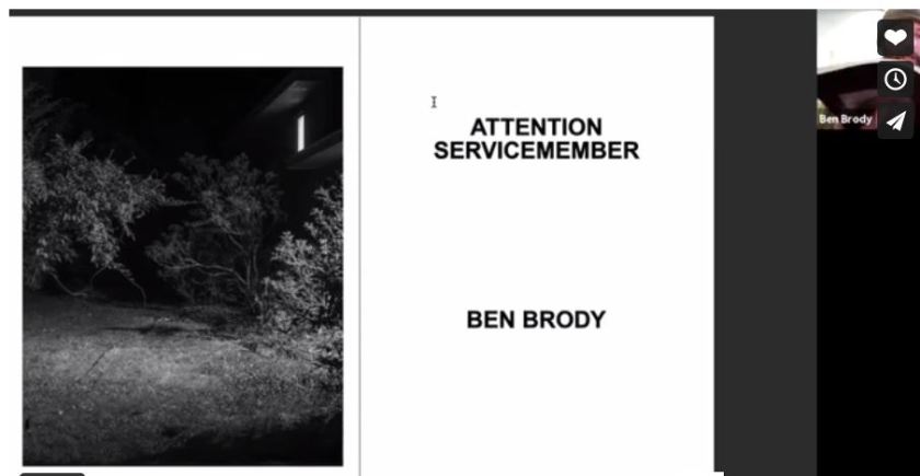
The colour images are a full page image, no boarder – known as a ‘full bleed image’. The matt is matt. He uses a total of five different paper types which must have been a printing nightmare and a costly process. The book is small and can be handled in one hand. The book fully opens so there is no loss of image at the binding.
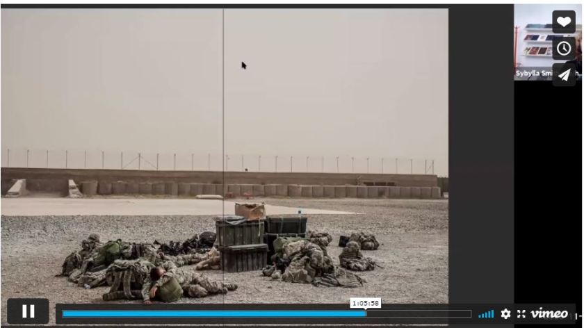
At the end of the text he provides his essay and a glossary of terms. He strongly recommended working with a designer and to produce a few draft versions of the book or other work yourself through on-line publishers so that you can understand the process and how you want the book to look and feel – ‘on-screen will never give you the feel of the end result’. The physical item can help you make a number of design decisions prior to making any expensive publishing mistakes – good advice, I think.
I like the idea of text at either the front or back and during my SYP I would like to work with a local author to have either an essay or poem form part of the final process. The idea of a glossary of terms interested me and I’m thinking that as my project is about mental health within the rural environment, I might consider using some factual information around the statistics of the situation within New Zealand.
Bibliography
Websites accessed 12/01/21
Book club: https://www.jsybyllasmith.com/photobookgroup
Video conversation: : https://www.jsybyllasmith.com/currently-1/2020/11/20/attention-servicemember-photobook-book-group-12
Article: https://www.huckmag.com/art-and-culture/a-searing-elegy-on-war-in-iraq-and-afghanistan/
Website: https://www.photobrody.com/
Tomas van Houtryre: ‘Lines and Lineage’
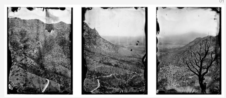
Spoke to a fellow student and she recommended the book ‘Lines and Lineage’ by Tomas van Houtryre. He used large format images to capture the landscape and people along the original Mexico Boarder – the one the American’s don’t want to talk or acknowledge even happened. The book starts with an amazing panorama of three framed images of the landscape. Each able to standalone as a powerful image but when placed side by side in a foldout page look like a panorama. I really like this idea and think that I could use something similar as a section break between each of my chapters.
https://www.leica-oskar-barnack-award.com/en/series-finalists/2019/tomas-van-houtryve.html
14th January 2021
Received some more feedback. The first from Sarah who has already completed her Body of Work and Contextual Studies:
1a- good introduction and sets the scene
2a- fascinating, really strong image and gets the viewer thinking about why these shoes are there, and how long they have been there considering the cobwebs
3a doesn’t feel for me that its as strong as the rest of the series and that the focus when looking at the series as a whole is more ocean/ sea orientated
4a- more of a better fit and link across the series than 3a
5a- love this, my kind of image and connects well
6a not sure about the tilt of the cages/boat but the colours are striking and really capture the eye- might be tempted to do a crop of the bottom buoys and the ones on the deck so it’s a bit more abstract
7a- gruesome and makes me feel uncomfortable but its very much a part of the fishing industry- wonder about this in black and white
9a- colours pop, think its fantastic
10a the age of this really tells a story
11a this could be anywhere, could you maybe try a different angle or a close up of the menu to compliment 10a
12a/13a/14a/15a captures the process and life in a takeaway van really well and form a good series (and 15a looks very attractive and I don’t eat fish and chips usually!)
16a- another strong image- makes me wonder her story and she seems to looking out to sea
17a- doesn’t add anything to the series- 16a would be a better one to end that mini series on
18a- would suggest a tighter crop so its just footprints as the skewed horizon is distracting
19a- think 19b is the stronger of the two and much more interesting as a viewer, 19a feels like a family photo
20a great colours and intimate crop
21a- is the emphasis meant to be on the community/beach or the relationship between the mum and child as its hard to tell what you want the viewer to get from this
22a- think this is an boat but could it be clearer or wider to show that its full circle- beach to sea
23a to 28a and 30- like the hints of red running through these, 29a feels like it fits better with the images from 30a onwards
60a and 61a- not sure what the theme is with these as they seem to stand out as different to the ones where the subject is making the bread and think there needs to be more of a link
64a- the subject looks like they are mid conversation and I think could be more flattering
General thoughts
Feels like there are mini themes forming around the different people so is there a thread that links them all?
Black and white- really striking, adds a timeless element and for me a sense of mystery and stripping the colour out makes you consider the content more and the textures.
The second comments have been provided by Helen, currently working hard to complete her Body of Work and contextual studies by June this year:
Hi Michele,
Sorry to be so tardy with this but here are some of my random notes/thoughts about your First Edit.
For me, these images provide insight into an area I have no knowledge of and which is very different from my world so I am really enjoying them.
I think I might have said before in one of our zooms, the ones that appeal to me are the ones that have tension in them eg 16a, 19b, 56a and 64a. Exhausted women looking out of a window is a strong visual metonym. The images where people are smiling and especially in the sunshine suggests (to someone like me on the outside, at least) ‘idyllic rural/remote lifestyle’ and I am not sure that is what you are trying to say? My (very subjective) view is that photo essays can quickly look like Sunday magazine editorials which, of course, is absolutely fine if that is what you are going for.
What are you going for? What are you trying to say? : )
I found it interesting that there is only one image of a person looking directly at the camera but in many other images the subject is clearly aware of you (smiling or casually posing) which adds something but could also potentially distract. Are we as viewers supposed to be dispassionate invisible observers/voyeurs or part of an exchange? How much are you in these photographs?
I love 2a and all the hand shots.
And I love the colour links between images with the wood eg 64, 65, 66. I wonder if the rope/cages/seaweed could provide a visual link as well – just thinking about the narrative journey if you were considering 12 images to go on a gallery wall.
I think you mentioned not having decided on b/w or colour or a mix…. personally I try to avoid mixing black and white with colour unless there is a really strong (almost overwhelming!) logic/compelling reason. Otherwise, I think it can look too sporadic and a bit amateur – at least that is how I see it when I look at my own work. I used to mix all the time but it was mainly because I just thought certain images looked better in b/w and some in colour and unfortunately that rarely provides enough coherence for the viewer so it can be jarring.
Hope some of this is useful. Great work – looking forward to seeing how this develops.
Speak soon, cheers Hx.
21st January 2021
I have spent the last week reviewing the comments from fellow students and notes I had made from the various book reviews and presentations on photobooks. From these I have rearranged, added and removed as well as adding a chapter break in the form of three images that will form a panorama in a gate fold page. The images are from the main street in Ngawi along which the ladies live. I didn’t expect to use these images but after looking at the work by Tomas van Houtryre and several other photographers I think it works.
I have also retained the idea of using black and white to start and finish the book to give the silent male presences to the location but the softer feel of the study shall be in colour. This isn’t to imply that the women of Ngawi are soft, they most definitely are not.
Images showing latest layout:
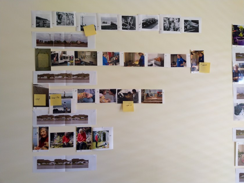

I have added Post It notes to those images I need to change or crop when I come to reprocess. This will be the next process prior to getting them into some form of book module, probably using Lightroom or Blurb.
I think the street images will need a lot of work to ensure they work as both standalone images but also when the page is unfolded, they work as a panorama. I have arranged to talk to Sarah a fellow Level 3 student who has attended a book making course through RPS and several personal projects to get some advice on the process. I have produced some draft pdf versions but as this will be for assessment and I may have to video or use a software pack to image the final result I need to get a reasonable result.
24th January 2021
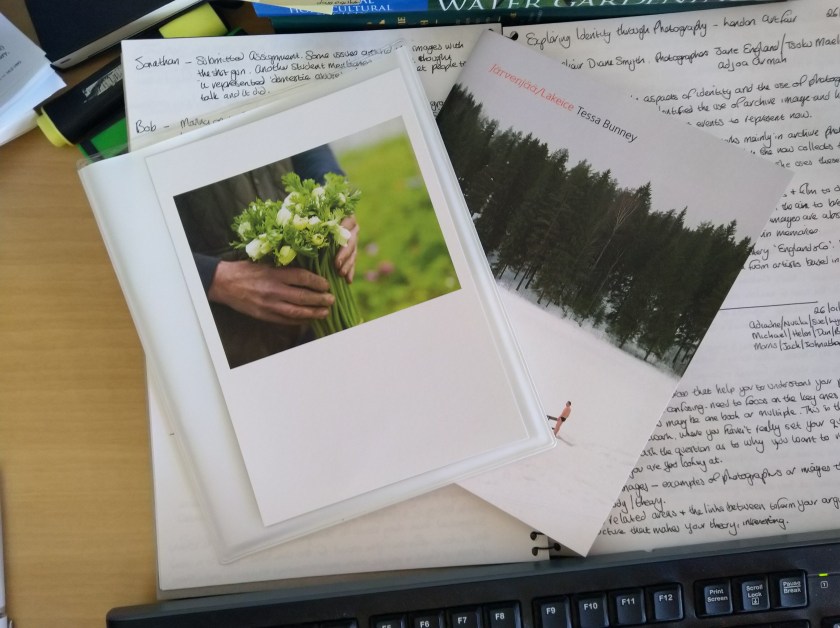
The books from Tessa Bunney have finally arrived so I have busy looking at the style and her approach to the images used. All are soft covered, less than A4 in size and coloured. The first ‘Moor and Dale’ has a dead bird in the form of a Pheasant on the front, something that the animal rights people would object to. There’s no face to the hand holding the bird, in fact there are no images of people looking at the camera, she is clearly an observer, an outsider, but I don’t feel that there is anything uncomfortable with that. There is a short introduction by Paul Burgess and a map of the location to give a feeling of location. The text throughout the book has been supplied from interviews with the people who live and work in Nidderdale AONB.
There are a mixture of 5×4, small images and square format. I find what seems to be a disordered approach to the layout uncomfortable and appears to be more thrown together, but after looking through a number of times I see that this change causes me to stop and take the image in, to really study the image and try and understand what I’m seeing and read the text. I also like the ‘index of works’ that she has included at the rear. I might see if that works with my draft book for Body of Work.
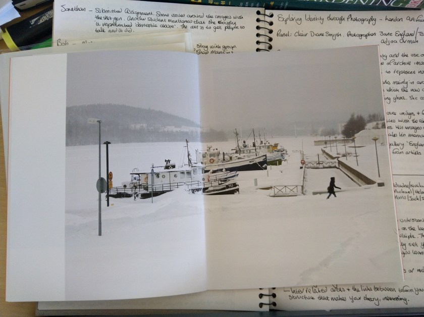
The second book ‘Lakeice’ by Bunney covers the relationship between people and their relationship with the environment. This is a lot simpler in design, small with a centrally stapled series of pages, which comes in a separate plastic wallet. The images have been taken in Finland, all colour and range in style and size with some crossing the centre of the page, luckily the pages open flat so you don’t miss any part of the image. This project has a similar feel and approach to the first, the observer to life but this time you see the faces and a number feel staged. There is more of an interaction between subject and photographer. There is no text with the images apart from an introduction by Bunney and a short essay translated from Finish, both situated at the front of the book.
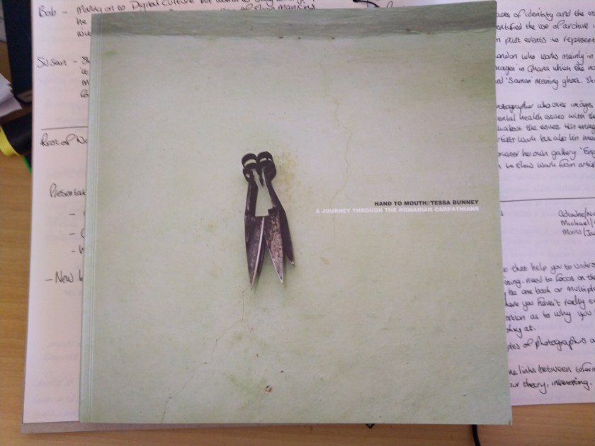
The final book ‘Hand to Mouth: A Journey through the Romanian Carpathians’ is in a similar style to that of the first but contains a lot more images. Soft cover, map and transcription of a conversation with one of the families she photographed. The project is divided into four sections which relate to the seasons of the year and the events which took place in each. Once again, a beautifully coloured example of the documentation of life, culture, environment and relationships. Each image is framed with a simple white boarder which holds your attention on the subject of the image. I really like the fact that you hardly ever see their faces, there are a few direct gazes but otherwise, you as the viewer are an observer. There is a mixture of landscapes, portraits and still life which show every aspect of family life as they use the land to grow food for the harder winter months. The images for me speak for themselves with some text at the rear of the book along with her signature small contact images and text.
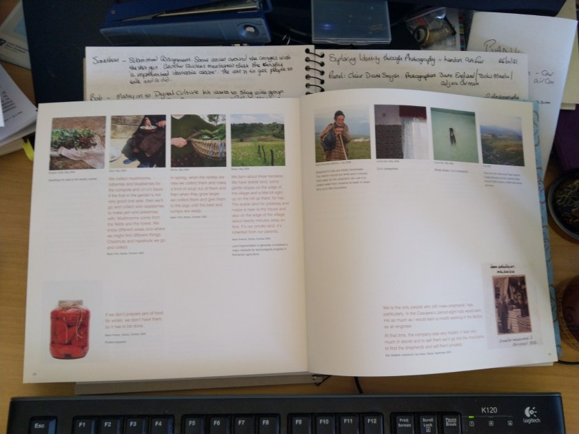
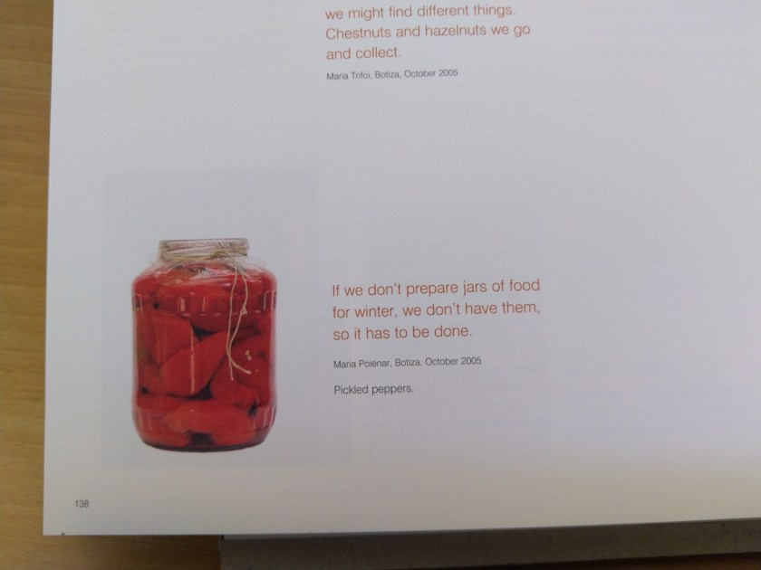
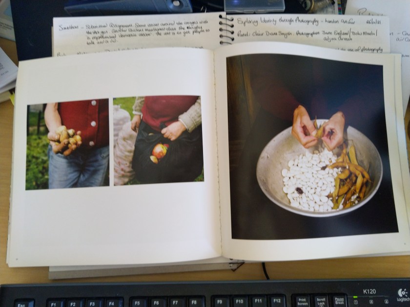
Each book had different aspects that I enjoyed and think about applying to my submission. The limited text I like, it means that the image needs to be strong enough to stand on its own to tell the story you want the viewer to see. I also like how she has used different formats to make you stop and understand that there is a need to pause and take the image in. There’s a nice balance of environmental images and portraits. I resonate with the lack of eye contact with the subject and the close crop of just the hands for example. I also like the use of the map as my assessment is taking place within the UK no one will know where Ngawi is so it might be a nice idea to include that at the start to help set the scene. Lots of things to re-consider as I continue to review and edit my project.
26th January 2021
I attended the tutor led discussion today and once again came away with that sinking feeling that neither my Body of Work or Contextual Studies essay is suitable for submission. I can’t seem to see the link and this seems to be one of the main things I need to show. I decided to get some help from some fellow students in the form of the Level 3 Support Group I join. Emailing my concerns to the group I got the following advice/guidance:
From Sue Greenfield:
‘Hi Michelle,
A couple of things occur to me..I’m not totally familiar with the subject matter of the CS essay nor your Bow (but really like your women images ) but if it is about representing mental health in rural communities through the folk that you have been photographing and in a sense giving them a voice i.e. saying this is how it is, could it be said that you might be demonstrating how this is changing or beginning to change by your representing their voice…and thereby is there is a link between CS and BOW here ?’
My essay covers the change in how the use of photography has changed over the decades, first with Riis and Hine using images to show the conditions of working life, so acting for the subject, but obviously this is also with the photographer’s bias. Then moving onto the use of photography by the subject in the form of photovoice and phototherapy, through to the reversal now in the use of Social media and everyone being the judge and juror of social conditions. I know that when I started to research mental Health in rural communities it was very much from the data I had gathered on line and this was very much someone else’s interpretation of that data. When I arrived at Ngawi, yes, I found an isolated location and a reserved population, not too willing to open up to strangers, but once I explained my project I was welcomed and they were more than happy to help. There is such a strong feeling of community, holding things together despite the lack of facilities. There is the typical Kiwi approach to things being already, the male front, but here I have found the women holding things together, they are the back bone of this community.
From Helen Rosemier:
‘So sorry to hear you are feeling lost with your BoW and CS. Could you maybe switch from documentary in your BoW to more conceptual to tie in with Voice? Your Instagram images are so so powerful!’
I don’t feel as if I have time to change to a more conceptual approach. The images I have on my Instagram are also documentary and address mental health. It would be nice to start again but I don’t think that would work as I probably wouldn’t.
From Lynda Kuit:
‘Re linking your CS and BOW, what about using captions regarding mental health from the conversations you had with the women and then just include mental health in NZ as another theme in your essay or sub-section under voice. I watched a very interesting talk last week – photographer had done a book on his group of friends (friendship & aging) – all in their 60s and the trigger for the BOW was when two of his friends died in the same year (they were a group of 14 all together since high school). But what was interesting is that he had a pocket inside the rear cover of the book with an essay written by a fictional author about the book. If you do a book you could perhaps do something similar and put your mental health research/conversations tucked away inside this pocket out of sight, referencing the unseen quality of mental health issues ….’
I had considered using text but I really like the approach Tessa Buney uses, by adding text at the front of her book. I have already spoken to a local writer about a collaboration piece and he seems interested but I want to wait until the last module SYP.
I also watched the talk that Lynda mentioned and had already made a mental note to myself to resume the research I restarted at the beginning of this course to produce a kind of fact sheet for the back of the book. Alec Soth produced something similar in this work ‘Broken Manual’.
29th January 2021
Had a catch up with Sarah Gallear over Zoom. A fellow student currently completing SYP and working to produce a book as her final submission. My plan is still to undertake an exhibition in SYP but to also complete a high-quality book with some hand printing for the ladies that took part in my Body of Work.
We talked about the different software packages available and Sarah stated that the software directly with Blurb was easy to use and the results were fine to get a good feel for the final result. She strongly recommended producing a mock up first to ensure that the flow through the book worked well. I have already followed her advice on doing small prints and pining them to the wall and living with them to help edit and that seems to iron out a few of my ideas and thoughts.
She highlighted the need to show my process and thinking – remember to document and not just let them assume. Once I’m happy get reasonable quality images printed and put into the book format. Understand the feel and flow – does it work, don’t just turn the page but hold together with a bulldog clip to see if any of the images fall into the centrefold – this will affect the book selection i.e., lie flat and how the centre is attached. Are there any images I want to reconsider? Add or remove? Now is the time to make the changes. For final assessment video turning the pages – on-line software might be an option such as ISSUU but she didn’t think it was that good.
Lots of great tips and ideas. Looking at the work of Bunney I think I need to ensure a consistent process across all my colour images. The panorama images need to be both standalone and a panorama / triptych.
