21st March 2021
Seems like work is getting in the way of making any progress. Trying to play catch up on all my write ups today as well as reviewing images and thinking about how to rework the images for the front cover. Spoke to Judith on the Level 3 and Documentary forum on Friday and she suggested velvet as a useful backdrop as it’s a very dense fabric – I’ve experience it before but then realised that it attracts dust which shows in digital images so you spend hours cleaning up your image. I think I need to ensure that the back drop is at least a meter away from my subject, use a tripod and a shallow depth of field to keep a consistent background and not see any dust or shadows. Need
more time than an hour to play with this.
Also found a useful tutorial on adding additional pages in InDesign to form my ‘gatefold’ page:
https://www.youtube.com/watch?v=pXWvphg6iNM
Seems easy enough – now just need to find some time to set it all up. Easter is just around the corner so this should get me enough time to import the images, get them printed for the mock up and create a new front cover as the feedback was a little disappointing.
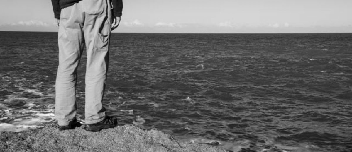
Lynda: Interesting! For me 4148 looks too much like a tree trunk, I like 4154 – ambiguous – almost looks like a bunch of eyes looking back at you. You could perhaps crop it in a little more; 4155 also good, like the diagonal line, 4156 too dark I think, 4157 – no looks too much like a centipede or silkworm LOL. 4161 – I like the tones here, but not the angle. 4172 – a bit like 4157. What about the head from the top – could you do that or is it totally disintegrated?
Anna: hey @Michele Usher sorry only just spotted these- I like 4148, it’s like dinosaur skin. 4154 reminded me of The Thing, something alien about it. 4172 looks quite soft, not sure where the focus is, maybe it’s because the image is small. 4155 and 4161 – i like the weathered look, the scratches, and the tones here; not sure about 4157; 4156 – looks solarised (and possibly some artefacts showing on the edges?), not sure if it needs solarisation, it’s distracting me from the image.
Intriguing images, would like to see more. Might be interesting to experiment with softness/ sharpness too. 🙂
The following seem to be the most liked but I will keep trying and see if I can obtain a more consistent image.

Image 4155

Image 4161
31st March 2021
Spent the last few days looking at a number of workshop videos and files on InDesign in preparation for producing my first draft. I initially thought I had InDesign as part of my current Lightroom package but had to up-grade in order to be able to use the package. Managed to transfer to the Student price. This will be valid for 12 months so will need to review my thoughts around a book.
I watch with interest the course by Lewis Bush on Book Designs. He expressed the importance of elements on the page and how this needs to express your concept. Areas to consider are:
- Layout
- Text and Fonts
- Graphic Elements
- The use of white space.
He covered the area of book format, the importance of the number of pages; height, width and the material/type as this had a major effect on the final cost when the final production had to be considered. Books are a key way to communicate your message, they are a direct link to the viewer as they are tactile, the size, weight and quality all relay your message.
There are a number of production implications that will need to be considered:
- The use of unconventional formats and page shapes will increase the final cost
- Trying to keep to standard sizes will retain costs but for a small print run of high quality, non-standard sizes maybe the aim/concept you are looking for
- Consider the amount of paper wastage when designing the layout;
- Remember this will need to be stored once printed – have you got enough space, not a problem if the run is only limited, or a Zine type publication
- Remember – postage and packaging for delivery.
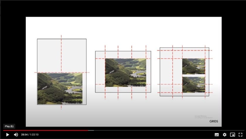
Hints and tips for InDesign started with the use of Grids. This is a trick that can help structure the layout, a way of seeing and obtaining a visual guide throughout the book, ensuring that placement of images and text are consistent and flow, giving a feeling of unity and logic.
Lewis Bush Book Course.
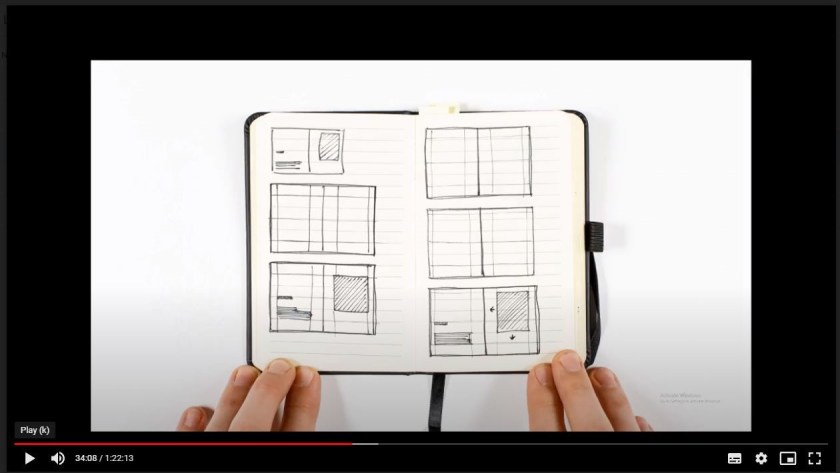
It was recommended to sketch out the possible design of the book first before opening InDesign, but then start to experiment, what looks good in a sketch may not when you start adding images and text.
The aim is to have a good layout that transmits my concept to the viewer in the most straight forward way possible, it should be effortless. The layout should not distract from the content but amplifies my concept and message.
There is no need to fill every space on the page just to get the most from your printer! Space around the image and text is important as it acts as a counter-balance, space gives the eye a place to rest and aids readability, however too much can be boring.
Another important area to consider are fonts and text. The font will relay a message as some texts such as comic sans is considered to be unprofessional and a bit of a joke where as Times New Roman is professional and very serious.
The selection of binding was considered in some depth with each viewed for its positive and negative aspects:
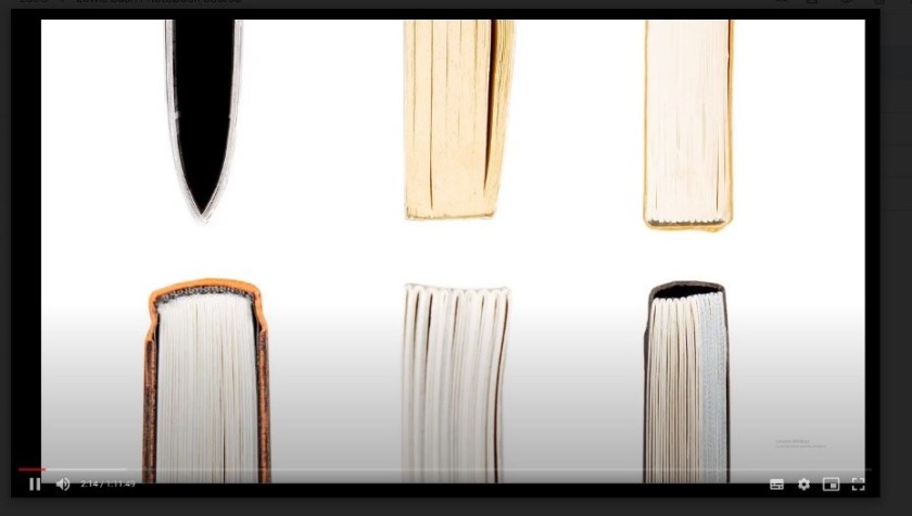
Types:
- Saddle Stitch Binding
- Perfect Binding
- Stitched in Sections with glue binding
- Stitch in Sections with Case binding
- Stitched in sections with opening/spine
- Stitched in sections with Swiss Binding.
As I’m thinking of a fairly large number of images the Saddle stitched will not be suitable. I might consider a small number of images for a Zine in SYP and for the Exhibition to sell to try and recoup costs for undertaking an exhibition. As I want people to see the images clearly and there will be a number of gatefold pages to separate the chapters I need an option that opens fully so the stitched in section versions will work best for me at this stage – final cost may dictate otherwise.
Now I need to down load the images and place in a single location for the use of InDesign and for printing as I would like to produce a mock-up first to ensure the flow and placement of the images.
