13th May 2021
Well, I have had to return to the drawing board a number of times and may have to give up totally on the hand production of a book. As previously documented the metal rods were not long enough or flexible enough to allow the book to open fully. This was a major problem when I wanted to try and open the gatefold pages.
I decided to then replace the metal rods with flexible pipe, ideal I thought but still not flexible enough to allow the book to open flat to photograph or video. The next idea was to use springs. This gave me the flexibility but this time every time I opened the book the page moved into the spiral of the spring and became caught so closing and damage to the page was now an issue. Covering the spring with heat shrink (electrical protective cover), made the spring too thick to go through the holes.
The latest suggest I have come up with is to glue the pages to a piece of webbing. This should give me the flexibility to open each page and for the book to be videoed. I have also transferred the images to PowerPoint and produced a video. One of the students from the Rest of the World forum who is on the Illustrator BA Course (Flavia R) kindly provided me with some drawings of a cray fish and I have added these to the book:


Illustrations by Flavir
I think they are amazing and make a great collaborative aspect to my project.
The PowerPoint presentation has been out to review by a number of fellow level 3 students and I think it now has the right times and flow:
Video of “Inside the Shell”
If I can’t get the webbing to work on the draft book, I think the video shows the flow and images to a reasonable standard for my tutor to review prior to final assessment. I would also like to complete some platinum and Pallidum printed images as well.
I have also been addressing the questions as part of the Assignment 5 submission and aim to submit by the end of next week. This will allow me a few months to correct any issues and address any concerns around my blog and pull together the Learning Outcomes, which are a worry as this will be the first time I’ve had to complete that.
23rd May 2021
Following all the feedback I finally issued my Assignment Five to my tutor on the 16th May. This consisted of the video as this was the easiest and most reliable method to see the flow and the written evaluation [Assignment Five]. Feedback on the pdf said the gatefolds just didn’t come across. My tutor didn’t take long to contact me requesting a time to discuss – not good I thought!
Overall, he seemed happy with the images but wasn’t happy with the edit. He recommended that I review the work by Allan Sekula ‘Fish Story’, ‘Let there be light: The Rwanda project 1994-1998’ by Alfredo Jaar and any of the books by John Berger and Jean Mohr. I have sent my notes from the session and I’m waiting for a formal written report.
I have ordered the book by Allan Sekula, and so I turned to my copies of ‘The Seventh Man’ and ‘A Fortunate Man’ by Berger and Mohr, I have spent several days reviewing the layout, format and narrative. Both contain extensive amounts of text which my book/presentation will not – well not at this stage, maybe something to think about in SYP. As I had already read the ‘Fortunate Man’ earlier in the course I now noted the layout more closely. The images are formed into blocks of narrative, the first very much the scene setting, locational images of where the doctor lived and worked. The next addresses his work and interaction with his patients on a professional level. This is followed by portraits of the doctor himself and then more portraits but of the social interactions he has outside of work. To close there is a landscape of the doctor climbing the steps to his home.
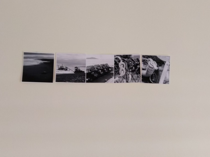
With this in mind I removed all the images from the draft book – luckily, I hadn’t glued them in place and put them back on the wall:

Mixing them up allowed me to try and remove the current edit. I also returned to the feedback I had received and how one person had said that they felt I had given her too much, she wanted to work for the narrative. A number had commented that larger image formats would also work.
I knew that I wanted to still keep the black and white images as a representation of the male and location and so as hard as it was, I dropped a number of the images I was really pleased with but formed a new start:
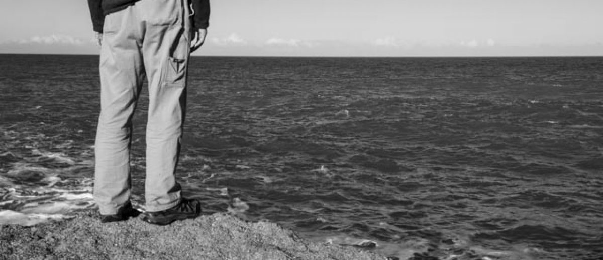
The location/place is all about the sea. It’s a hard life and now this is where the new edit started (but didn’t finish). I then looked at the colour images and formed themes around location, hands, working, products and portraits:


It was then a case of clearly a space and selecting, placing, rejecting and even returning to some of my original images to find the right one to fit. I did reject all of the triptychs and reprocess a number of images. The map has also been dropped and I have added a traditional Māori quote and translation. The PowerPoint presentation is:
Inside the Shell Draft 5 post feedback
Video: https://vimeo.com/manage/videos/567963640
I have re-issued out to my peers for feedback and will add these as they are provided – or not.
28th May 2021
Showed the presentation at the Documentary and Level 3 Student forum and received some written feedback as well which I have included below. There was still the suggestion around some form of audio although several agreed with me that audio was not needed. One student suggested a virtual exhibition but as I would like to do this for SYP I need something for after this submission. Judith who is on SYP stated that she provided a number of different methods of demonstrating her work for submission; video, mock book and a separate website. All sound doable and within my timeframe.
Written feedback:
Bob Harris: ‘I love what you have done, I think the message is very clear. It is good to see the pages build up and I am a fan of the square format. The crops of the ladies are great, great use of different angles and compositions. Not sure I would want to change anything, the video works well’
Jonathan Lamb: ‘Sorry I have missed the group sessions recently, they have clashed with other events as we seem to have got quite busy coming out of lockdown. I can’t make this session but hopefully can at least give a few thoughts here:
I too like the video format as it makes the eye move around and brings a dynamic to the set. I think the selection of images is also more varied from when I saw the set last time, the new shots work well for me. If I have understood it correctly the parallel of the women being the rock inside the apparent outer shell of the community is a very good one and you could perhaps draw that out by having the image that most directly references that more prominent or at the front?
The only other suggestion I have is that, at the moment, it sits somewhere between a book and a video – a presentation if you like. You could consider other ways to use the space or move around it, such as the “Ken Burns” effect of moving around a still picture, perhaps starting on a detail and expanding to take in the environment in which it plays out. I know this is used a lot but I also think that is because it is very effective’.
Judith Bach: ‘I think this is a great improvement on the original version. What works particularly well for me is how the images in the layouts with more than one photograph are individually revealed’.
Neil Gallacher: ‘Loved the video Michelle. I felt there was a real flow to the work and felt myself being drawn into the world these women work in. I think this works very well and enjoyed the way the photographs appeared. Great work’.
Nicola South: ‘I love it Michelle. I particularly like the way we get glimpses into the women’s lives and Think there’s more context for each of them which builds a greater picture than before of the women’s lives’.
Lynda Kuit: ‘I like it. You’ve tightened it up without loosing any of the narrative. I like the triptych format for the ladies too. The only thing I would change is to switch your lighthouse image and the welcome to Ngawi around. For me it feels a little off kilter to have the welcome image at the end. Nice touch adding the Maori language – definitely sets the scene that what is coming is not from the UK. Pity you had to drop some of your landscape triptychs though. Still think you need to add sound bytes though, especially with the Maori statement. Be great if someone could read it out for you’.
Susan Greenfield: ‘This is a really good edit Michelle…like triptych format and varied presentation of the ladies is much stronger narrative to my mind agree with Lynda that the welcome to Ngawi needs to be switched …and would like a little more time to read / digest the translation of the Maori. I think it is better for removing some of the previous landscapes…agree again with Lynda’s suggestion of adding some sound bytes / reading on the Maori quote.
Great work!!
Sarah Gallear: ‘that looks good Michele, I don’t mind the welcome sign at the back as it feels as if you’re slowly introducing the people first and then revealing where it is, love the maori quote too and the translation, its a very beautiful saying. Its a really good presentation’.
I have decided to take a few days away from it and attend the Auckland Photo Festival. Think this will give me more time to digest the comments and get a clear headspace to review again
