Lynda Kuit 6th April
Kudos for doing it in InDesign!! Firstly what size is the book? The title page/cover looks like it’s in portrait format while the others are in landscape format. I would suggest adding a blank page before Jim Mortram’s quote – that way you get his quote on the right hand side of the page and the Welcome to Ngwai on the following left hand page, unless you want the Welcome image opposite his quote? Then ignore my comment :-). I viewed it in PDF format 2 page up view and sometimes the gatefolds appear on the left, sometimes on the right, so you might want to check that for consistency. Personally I would like to see the single images larger. Your images are really great – you don’t want to drown them in white space. Same for the images in the gatefolds – can you make those a little bigger too? Or even spread them out over the left page and then 2 on the right hand side fold out. I think that might help the “male domination” to come through. It also feels like there should be a gatefold after Trish before the “male” images again. Donna – you have 2 images there which are very similar, perhaps sub one of those with another. I seem to remember some good ones where she is looking towards you. Have you considered including a map perhaps (for the benefit of the non-NZ readers). Other than that, I think you have done a great job!! I really like it. Are you going to put the cray on the cover?
Sarah Gallear 8th April
Hi Michele
I’ve been having a look and a ponder tonight, I like the mix of black and white and colour, not sure I get male influences but from the tone and content of the black and white, I get a sense of the harshness of the life and landscape there
Some other thoughts I had
Cover page seems to be portrait but book seems to be landscape
I like the quote from Jim Mortram, that’s a good fit, just wonder if its worth having this just on its own on the right hand side leaving the left blank, the go into the images on the page afterwards. I also do like the quote and the image being close though so maybe its good to challenge what I expect from a book layout
Could do with a better idea of how the gatefolds work- are there extra folds in them so they fold out
Where you’ve got the pages telling the women’s stories, Alison’s name is on the left side spread but then the next name Melanie is on the right- is there a reason behind this and the switching, part of me likes the idea of it all being on the left or right but the same so there is consistency.
If you’re not in too much of a rush maybe we could go through in a couple of weeks when we meet?
speak soon
Sarah
Susan Greenfield 8th April
Hi Michelle,
Great to see how all of your images have come together in your draft book design! I like the format and have a much better understanding now as to how your work fits together.
Anyway, just a few ‘snapshot’ comments re my initial view..
I really like the use of black and white to differentiate between male and female side of the community. You have some really strong images here. I also like the idea of using gatefolds to divide up the work into chapters though I find myself puzzling over the content. I can see the landscapes, unpeopled and carrying male influences are a good foil / contrast to the following personal stories of the ladies but not sure I would have picked this up without your tip off in your email. Is there a pattern in the sequence i.e. is the central image the key image each time? In some gatefolds the images seem rather similar though only slightly differing ( could probably explain better on Zoom !!) Another thought occurs to me … are the gatefolds referencing the lady above them or the following lady or neither?
And re the ladies I did wonder if the sequencing in ‘Julie’ might end better with the penultimate image; likewise with Bea and maybe Pam …i.e these seem to be the stronger images to end with…Re Melanie, just wondering how key is the dog image ( i.e in terms of ending the sequence) as it doesn’t seem as strong as the other ones you have for Melanie… I like too the Mottram quote but maybe this might possibly be better at the end as it is referencing the photography rather than the ladies and their key role in their community? What about a quote from one of the ladies here instead ? Just a thought….
Have just read the above back to myself (??!!?)..hope it makes some sense.
Anyway, well done for getting this first draft out…
Regards
Sue
PS How did you find InDesign ? I’ve not tried it but mean to explore it at a later date.
Helen Rosemier 9th April
Thanks for sharing this with us all Michele. It is great to see how the book really format does bring everything together.
Here are my unedited thoughts/reactions (and I know this was just a rough first draft so forgive me if I say anything that you already have in progress)…
- The first page looks to me a bit like an academic paper rather than a photobook. Definitely needs an image IMO. I, would love to see a map of where we are going on this visual journey. Or a satellite image or drawing of the area.
- I don’t think you need the Mortram quote – the images themselves show that you have made the work with humility and humanity. It would be great if the first encounter with text was about the women and how they contribute and act as the backbone of the community – not sure if that is quantifiable?
- The mix of black and white and colour works really well together. Could you accent this contrast by having the b&w images bigger (or smaller)?
- Could the seascapes be across a spread? and the close-ups of the fish etc be full page to really show the challenging environment and the harsh work involved?
- The sequencing is really good – nice and varied. Fab shots and I like the rhythm of the three gatefold images to set the scene for each of the characters
- I definitely feel like there should be some text to contextualise what they are doing – even just the name of their occupation/work function maybe?
- I don’t really read the B&w as male – definitely more harsh than the warm colour images but to me it reads as being that is just the environment the women live in
- I love the mood of the final image – abso beautiful – but it doesn’t seem to fit at the end of that sequence for me. What are you saying with that image? as in, why have you included it there?
- I wonder if the skies and sea could maybe ‘fill’ a lot of the empty space you have included. What was your rationale for the images being that size and taking up that % of the page? From a practical printing PoV – this is a lot of pages and ‘wasted’ white space.
- How did you decide on the sequence of the women?
- Would it be dramatic if the close-up of Trish’s hands were the last colour image?
It would be great to hear more about your choices and decisions – looking forward to hearing more when we next meet I hope?
Love how it is coming out and great In-Design work btw
Mark Racle 7th April
Oh – no pressure eh!!
I’ve scribbled some notes on the draft I’ve linked… https://www.dropbox.com/s/5n4fzgdn86kqwbu/Ngawi%20Book%20draft%20Spreadversion%20v0.2%20MR.pdf?dl=0
Generally – I get it (I think).
I wonder if …
In the introduction there may be a place for more … you and I know Ngawi, me a bit, you a lot, but the audience is mostly half a world away… and even pronouncing the name would be a challenge :). I don’t know what the brief is (is there one?) but you might have to start with the idea that Ngawi is actually in a very quiet part of quiet New Zealand… or something. Are there any essays or other words that you could hook into and include (hey, who’s on part four of I&P – Image and Text?), a map?
The guys are there, but often not to be seen. It’s a hard place to live, and isolated. Possibly more so for the women who aren’t out fishing, and whose lives are largely centred on their own place, and their own company – be it at home, in the business, on the beach, with the youngster, etc etc.
The black and white ‘bookends’ – work, and the absence (almost) of actual men, seems to as well – the themes are all there.
The gatefolds too work for me, by providing more context around Ngawi. The only caveat is whilst I like the theming of each triptych, some may have images may be ’too’ duplicated.. I’ve marked up an example.
The individual subjects work – there’s certainly no ‘one size fits all’ and so the layer of diversity through their individual portrayals adds …and becomes a mini-essay on each of them. I wonder though if the women never get together .. they are all portrayed as being in isolation, not just because of the location, the absence of the men, but from each other too? Is there a deliberate reason why images of women together (still without the guys) is absent?
I’ve also marked crops of a couple of images as a way of keeping the reveal to later in each series, and at the same time, reducing some potential duplication. I’m guessing that some series have a lesser pool of images to work from …
Happy to discuss further.. I expect I’ve missed elements and having you talk through it might be helpful.. to me at least 🙂
Go well!
Mark
Jonathan Lamb 6th April
Hi Michele
Wow lots of work here! I enjoyed the sense of place from the images. I am a sucker for contrasty b&w so loved those particularly the boots, the fish C-U, the wood panel and the beach at the end.
I was a little confused re the structure – do the gatefold images fold out in the physical version of this book? To be honest I was not sure if you needed them – you could spread the b&w ones out so that they sandwich the sections about each women, for example, maybe even make them full bleed? This might give more of a sense of them being embedded within the male culture you describe? Also the sense I most got from the b&w stuff was a fishing culture, not necessarily rural (apart from the boots perhaps) or male?
The image of the list was also very strong but appeared on a different format from the rest of the book? Similarly the title page was a different format? These switches took away from me the idea that this was a book as such, since it is hard to imagine in physical form.
I had a sense of a setting image for each person when I started, related to their role, but then this disappeared (e.g. not with Pam)? I really liked how the story developed for each person, perhaps you do not need all of the images where some repeat. Withholding information so that you build a sense of the person worked well so with Melanie the footprints, the looking away, the shell detail all lead up to the portrait with the child, maybe the next image in the tractor is not needed? Similarly with Julie the plant details worked to lead up to the image with the scarf, maybe you don’t need two images like this, or the one of her leaning over the rhubarb? Again with Donna you might not need both images at the sink? Maybe if you are able some more varied images of some of the women or the work they do might help?
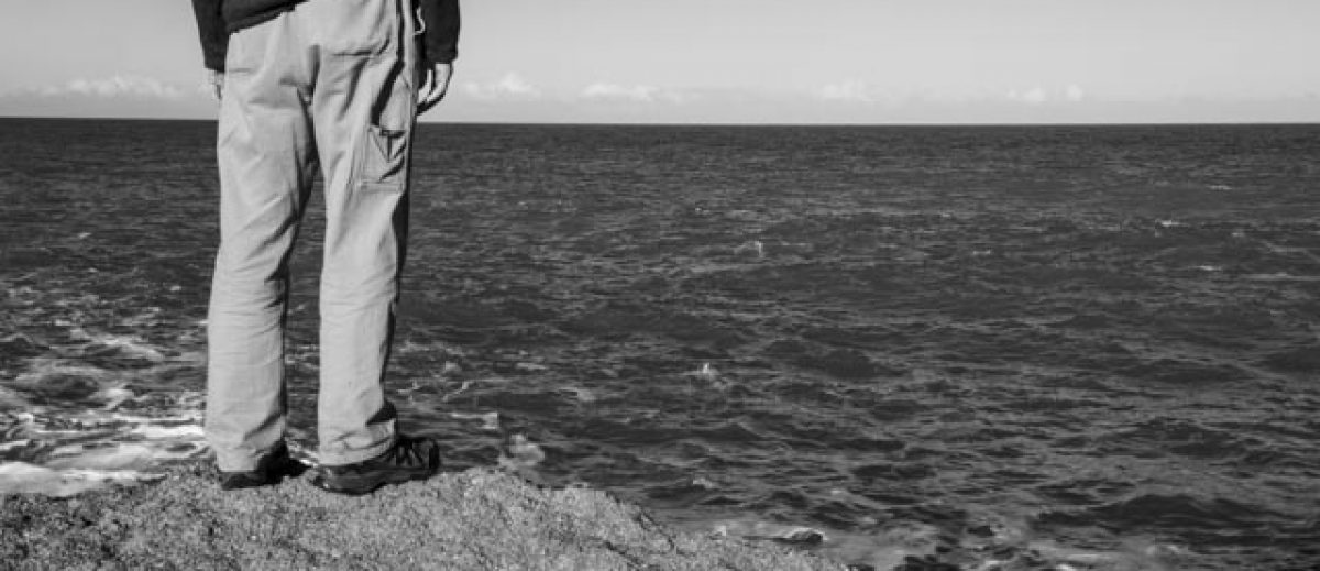
I thought the last image of Alison with hand on hip looking out at ? was really strong, for me it summed up the sense I got from the work.
Hope that helps!
Jonathan
Jack 7th April
Hi Michele,
I am with Jonathan on the book structure. I find it hard to visualise – is it worth creating a book dummy to see how it looks in physical form?
Love the images – thought Trish (that hand shot!) and Pam the strongest sets, get a real feel for their personalities. I would think of taking out the welcome sign and putting the ‘boots on wire’ in as the first image you see (or cover?) So evocative. I love the B&W compositions – so hard to get that right with a square format, well done!
I am not sure about the colour vs B&W gender differentiation thing as ‘I think’ how they are positioned in the book now. If you had not told me I don’t think I would have guessed this context (maybe says more about me than you.) I can see what you are trying to highlight, but what are you trying to say? Is it only men allowed to do this work? Is it a misogynistic society you are documenting? If it was all in B&W (or colour) would that change the viewers perception of Ngawi? What would it say if all the houses/location images between the woman’s photo essays was in B&W as well?
As Jonathan says you can edit our some of the more ‘duplicate’ images but unsure of what your intentions are for the final outcome – SYP? – for example, are they going to be exhibited? As that could change the edit again.
Basically, I think you have all the content, but just needs a bit of shuffling to really show your images in their best light.
Nice one Michele!
Regards
Jack
Nicola South 7th April
Hi Michelle
Really interesting work and portrait of the women of Ngawi.
I like the contrast of the black and white, what I would call contextual images, at the beginning and the end, to the colour images of the women’s lives. However they give me a sense of context for the women rather than the male side of Ngawi, as I think you are after. They do give me a sense of the outside work/world contrasting to the women’s more domestic roles around/nearer home, but are not an obvious signage to a male world to me.
I like your idea of gatefolds as location and context for each woman but as the others say I’m not sure how you’ll physically present this or not – I’m sure you have a plan!
I agree with the others that the portraits of each women might be further strengthened in some cases by losing one or two images.
Hope this helps a little.
Niki
Neil Gallacher 7th April
Michelle
The black and white images certainly set the tone for the book of a hard community life with the colour images bringing intimacy to the work. The impression of a local fishing community was my first thoughts as they are very reminiscent of the communities in the East Neuk of Fife not far from my home so unsure of the rural in the title.
Images are all the same size in the book and I wondered if you had experimented with sizing. My current tutor goes on about different sized images and placement on the page and full bleeds being used to direct the viewer and perhaps influence the narrative.
The gatefold before Pam confused me, as we tend to read left to right and the images don’t seem to match up for me and appear back to front. However I don’t know how this physically folds out so this may just be a quirk of the digital presentation.
I don’t get the sense of particular maleness with the images as many women work in the fish industry especially the processing side of things. This of course could be a Scottish thing. Your portraits of the different women have a very domesticated and homely feel with the women’s hands being a feature. These are not pampered hands!
I love the images of Pam especially the one where she seems deep in thought and your close up detailed images say an awful lot about the community. My favourite image is the last photograph in the book, the rock on the beach, set apart from the other rocks that are grouped perhaps saying something about the community and it’s residents even highlighting individuality.
Since this is a draft you will no doubt go through several iterations and it would be good to see how this develops. Great work!
Bob Harris 8th April
Hi Michele
Wow, just love what you have done, overall I feel I have an essence of the place. You have covered a variety of subjects in a complementary way, that clearly tells part of there life. The sea becomes very important to all of the subjects taken
I had to have a look on google to find out about the place, I wanted to find out more about the place before I responded.
The main points I picked up was a location that had more tractors than people and fishing was there main crop.
“Backbone of a rural”. My personal view, I have never gone in some much depth before and enjoyed the experience of trying to convey my thoughts on a subject seen for the first time. I have the misfortune of not knowing any of the background and I may have interpreted some or all of the book incorrectly.
Hope my comments are not to heavy and may help you finish the final project. Thank you for the opportunity to look at a great piece of contemporary work. I hope I can reach you standard when I start working at level three.
Initial look
From the web page the idea of a strong square image against a white background enhanced the images. The use of negative space worked for me. I could see the book using very glossy heavy duty pages. Not sure the image of the fish heads are of the same tone, I personally like to see the image rotated 90 degrees clockwise. Like the fish head coming in from the bottom
The idea of using three square images to denote chapter worked for me, they create the scene for the theatre of the next set. In fact I went back to their page to confirm what I thought the chapter was telling me.
Alison 7 images
Being a chef I can relate to theses images, I can remember just standing and looking while I stood in a kitchen. For me all the images worked and told a story
Melanie 6 images
Families meeting the sea, I think again the story comes through. I felt the story was about the child being introduced to the sea and demonstrates the importance of the sea for the family. I might have used a different image at the end, as I needed a greater connection to the sea. There is a hint with the clothing, petrol can and basket. So may it is just me,
Pam 4 images
Like the repetition of the theme of the chapter markers, creates a feeling as I want to see more, I keep getting a little taster of what is around the corner.
You have portrayed a good relationship with the subject, they tell a story of isolation, I find the images quite sad. This set for me is more about emotion than telling a story.
Julie 7 images
A story about self-sufficienty Clothes, food and live stock. Like the story and get a good impression on surviving on the peninsula
The rhubarb image shows the finished prep article, all the other images are showing the working towards. Would a basket with the rhubarb in work better showing the crop instead of the finished item, or just leaving it out. Like the conversation image, very documentary.
Bea 6 images
You have captured the essence of the allotment, like the backgrounds in the environmental images. Again you can see a relationship between the photographer and subject.
Sue. 6 images
Images very similar, a set of images showing doing, there seems a different approach, Sue is demonstrating what they do and you lose the contact with the photographer. The early photographs include a glimpse of looking at the photographer, this set hasn’t worked in the same way. The images seem very linear, you might want to change the linear approach and make the viewer work out what is going on. Wondered if the beach shot should be first, the first image looks different to the other images due to the excessive expanse of cloth, do you need this image?
Donna 4 images
Nice and simple, love the concept “bread of life”. Not sure why but the images feel like you are getting on with the subject, maybe it is just the facial expression on the image 2nd image. Images work well for me.
Trish 4 images
Great environmental images, I can imagine having the formal afternoon tea there, great picture of the hands and good to see the “looking out of the window” following thought the set.
Last section 6 images
I feel from seeing your other work that the first and last section is more you. The imagery is about tone and textures, love the detail and the crop you have selected.
This brings up an interesting question, I know when I did my last assignment I had a mixture of styles as I wanted to include my artist work and documentary. Still not sure if I showed both to cover all bases or to just not confident that artist set would stand on its own. Have you asked yourself the same question. I like both sets, but they are two sets that need to be integrated into the final book.
Hope I have understood where you are going to and been helpful.
Judith Bach 9th April
Hi Michelle,
Sorry for the delay in responding.
I love what you’ve done, really beautiful images & well done on mastering InDesign, although it’s difficult to visualise the gatefolds viewing the PDF.
The mix of colour & mono works well, although without understanding the context the black & white images don’t particularly convey the male side of Ngawi to me.
I like the square format of the images & the layout but would love to see perhaps one larger scale image from each set of the woman in the book in addition to the small square detailed ones. Or even perhaps just two or three larger images, Pam & Bea have so much character in their faces,Trish’s hands are spectacular, I think they would look fantastic full scale.
Best wishes Judy.
