Written feedback from Documentary Forum Group:
Bob Harris: ‘I love what you have done, I think the message is very clear. It is good to see the pages build up and I am a fan of the square format. The crops of the ladies are great, great use of different angles and compositions. Not sure I would want to change anything, the video works well’
Jonathan Lamb: ‘Sorry I have missed the group sessions recently, they have clashed with other events as we seem to have got quite busy coming out of lockdown. I can’t make this session but hopefully can at least give a few thoughts here:
I too like the video format as it makes the eye move around and brings a dynamic to the set. I think the selection of images is also more varied from when I saw the set last time, the new shots work well for me. If I have understood it correctly the parallel of the women being the rock inside the apparent outer shell of the community is a very good one and you could perhaps draw that out by having the image that most directly references that more prominent or at the front?
The only other suggestion I have is that, at the moment, it sits somewhere between a book and a video – a presentation if you like. You could consider other ways to use the space or move around it, such as the “Ken Burns” effect of moving around a still picture, perhaps starting on a detail and expanding to take in the environment in which it plays out. I know this is used a lot but I also think that is because it is very effective’.
Judith Bach: ‘I think this is a great improvement on the original version. What works particularly well for me is how the images in the layouts with more than one photograph are individually revealed’.
Neil Gallacher: ‘Loved the video Michelle. I felt there was a real flow to the work and felt myself being drawn into the world these women work in. I think this works very well and enjoyed the way the photographs appeared. Great work’.
Nicola South: ‘I love it Michelle. I particularly like the way we get glimpses into the women’s lives and Think there’s more context for each of them which builds a greater picture than before of the women’s lives’.
Lynda Kuit: ‘I like it. You’ve tightened it up without loosing any of the narrative. I like the triptych format for the ladies too. The only thing I would change is to switch your lighthouse image and the welcome to Ngawi around. For me it feels a little off kilter to have the welcome image at the end. Nice touch adding the Maori language – definitely sets the scene that what is coming is not from the UK. Pity you had to drop some of your landscape triptychs though. Still think you need to add sound bytes though, especially with the Maori statement. Be great if someone could read it out for you’.
Susan Greenfield: ‘This is a really good edit Michelle…like triptych format and varied presentation of the ladies is much stronger narrative to my mind agree with Lynda that the welcome to Ngawi needs to be switched …and would like a little more time to read / digest the translation of the Maori. I think it is better for removing some of the previous landscapes…agree again with Lynda’s suggestion of adding some sound bytes / reading on the Maori quote.
Great work!!
Sarah Gallear: ‘that looks good Michele, I don’t mind the welcome sign at the back as it feels as if you’re slowly introducing the people first and then revealing where it is, love the maori quote too and the translation, its a very beautiful saying. Its a really good presentation’
Feedback for OCA Student Platform:
Nuala513668
24 June
I am not sure exactly what you wish to submit – all the individual images and the video or just the video?This is very powerful work.
Both are really interesting. Although I love most of the images in each section of the individual sets. I would reduce the number. I know this is really difficult but keep a spectacular set of say 9 or 12 is even more impressive. Your rejects will go into a file of learning outcomes as “What I had to reject”. For example in the portraits you have a lady in a red jumber- within that set you have 3 really great portraits 3,5,7. It is the same with the other sets – 3 really great images are more spectacular than 7 with one or two less powerful. The fact that you can lead the assessor to what you rejected and why is as important as what you show.
I am not even sure you would need the video although it is lovely.
Hope this does nto send you up the walls!!
Gary513749
24 June
Personally, I like the video, I Iike the way that it develops.It is difficult to get that in an exhibition as people don’t necessarily view the images in the order that you intended.
Morris513748
24 June
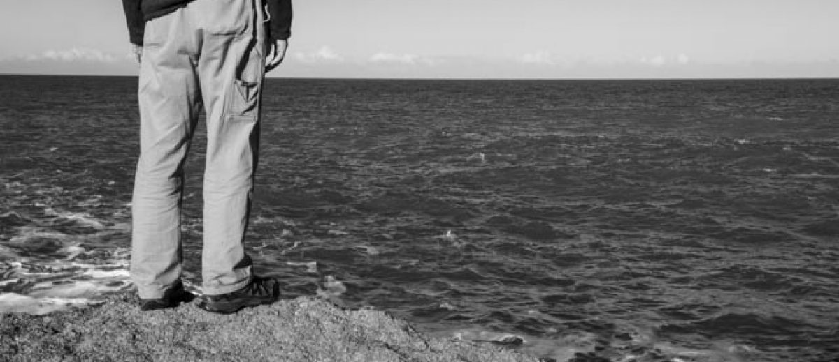
I too like the video, starting with the sea and coming back to the land and sea with intimate glimpses of people’s lives and their connection to the land and sea. I did wonder about audio – sounds of the sea or wind to pick up the notes about the hostility of living there, but audio can dominate the experience.
As Nuala suggests I would reduce the numbers in your image series ‘Portraits’ to the best ones that relate together as they will have more impact. I have found the advice of Jorg Colberg in ‘Photobooks’ very helpful in making decisions about what to keep and what not to use. He, and my tutor, talk about standing back and try to disassociate yourself from what is in the pictures and your background knowledge and feelings about them when selecting images. That advice has helped me a lot in ordering lots of images.
