Overall, I think the feedback was positive, but I think when I send it out in future, I need to be a little more direct in what I’m looking for and not just as for general comments, even though these are helpful I need to start to think about which one will be taken forward to final print.
Main points I need to check:
- The foreword for length and formatting, making sure that words fit on the line and are not cut. The size of the font seems to have raised a number of comments so maybe look into how this looks on the printed page as the screen often gives a very different view – I saw this with the Zine production. Not having my own printer is a real problem. Need to print out several different sizes and types to see which looks and reads best. I have an author who has published so will ask advice.
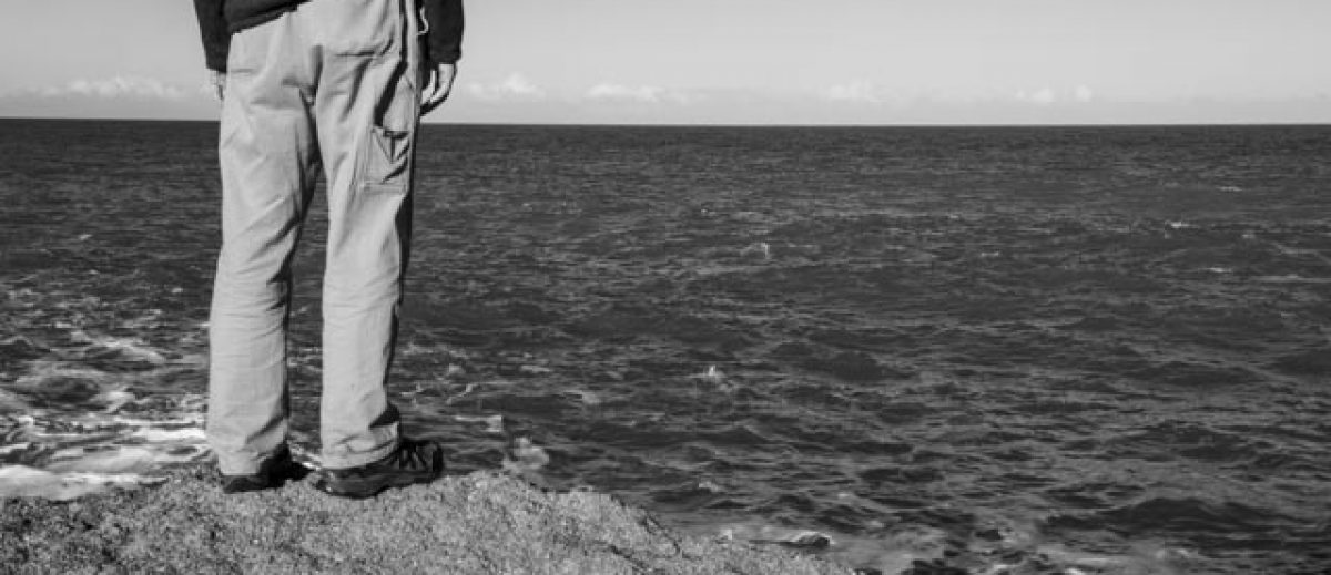
- I need to review by processing of some of the B&W images as the B&W only version detail was lost. This doesn’t seem to be the strongest option to progress but will review and address and check computer settings.
- Consider two volumes – I think separating the male/female elements will result in a different narrative, almost as if they are opposing each other instead of working together.
- Check the best way to show the pdf versions on my blog from InDesign. Exporting as pages I think works for sending to print but not to show people, think this needs to be as a ‘spread’. Will review and up-load the new pdfs to my blog.
- Correct who’s to whose – silly error!
- Once changes made arrange for printing and video for next round of reviews. I would like to take them back to the wider OCA student forum that is held each month.
