Image Selection
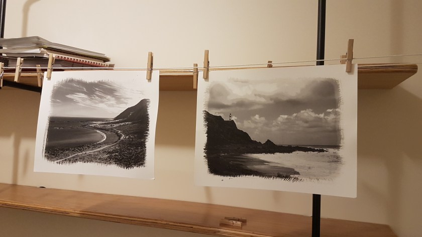
At the start of the process, I selected a range of images that I thought would work as platinum and palladium prints. My initial selection of 30 images resulted in 25 final prints, not all were suitable using this technique. The whole process of printing can be seen here.
When selecting the images for the exhibition I followed the same process as that for the book, but for this selection I had in the back of my mind that they needed to sell, so images suitable for the book may not be suitable for a wall as they would need to stand on their own, without supporting images to show the narrative.
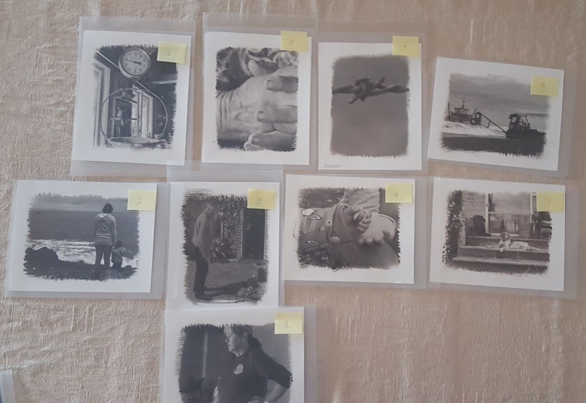
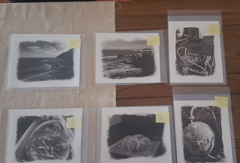
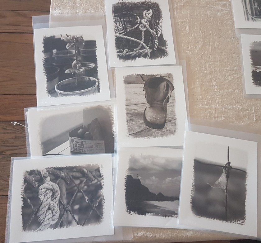
Although the narrative would be different there still needed to be an order and for each image to link to the next, so I started by placing all 25 images on the dining room table to see which were the strongest images, removing the ones that just did not work as platinum and palladium prints. These three were placed to the side.

I knew from the visits to the initial location and now the new gallery that approximately fifteen A4 framed prints would fit. I also thought that as you entered the location the wall opposite could hold a single large image as a focal point to the exhibition and this should be about the place.
From this central image I then started to select images that would flow/link to the next until I had the final fifteen.
Spare Images
Making of the Maquette
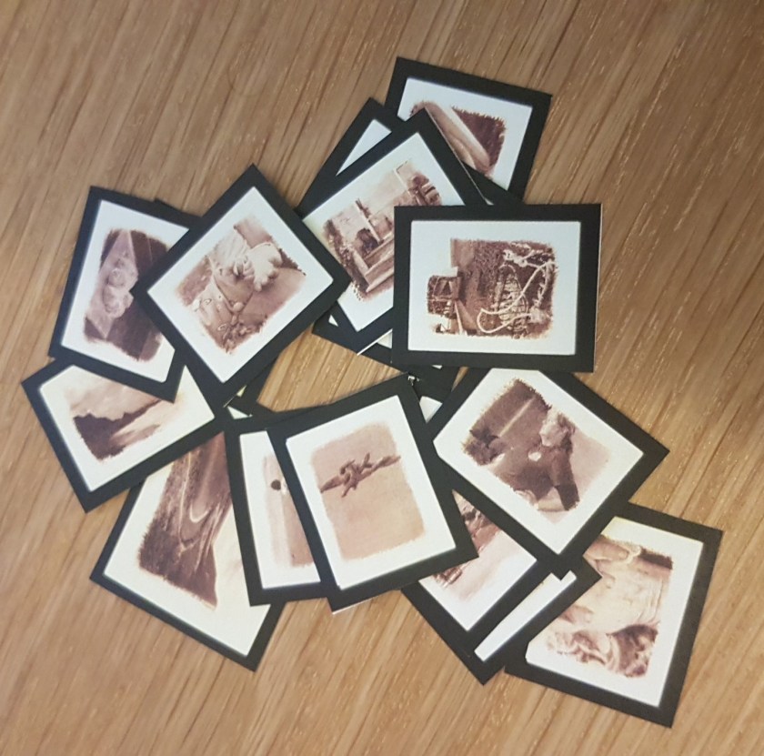
Since starting the final modules I have attended a number of artists talks that discuss their process of selecting and hanging images for an exhibition. All spoke about the importance of having the physical image, even just cheap prints, to manipulate and order. This process really works best for me as well. The next step is to see how these images would work in the exhibition space prior to the hanging which is not until November.
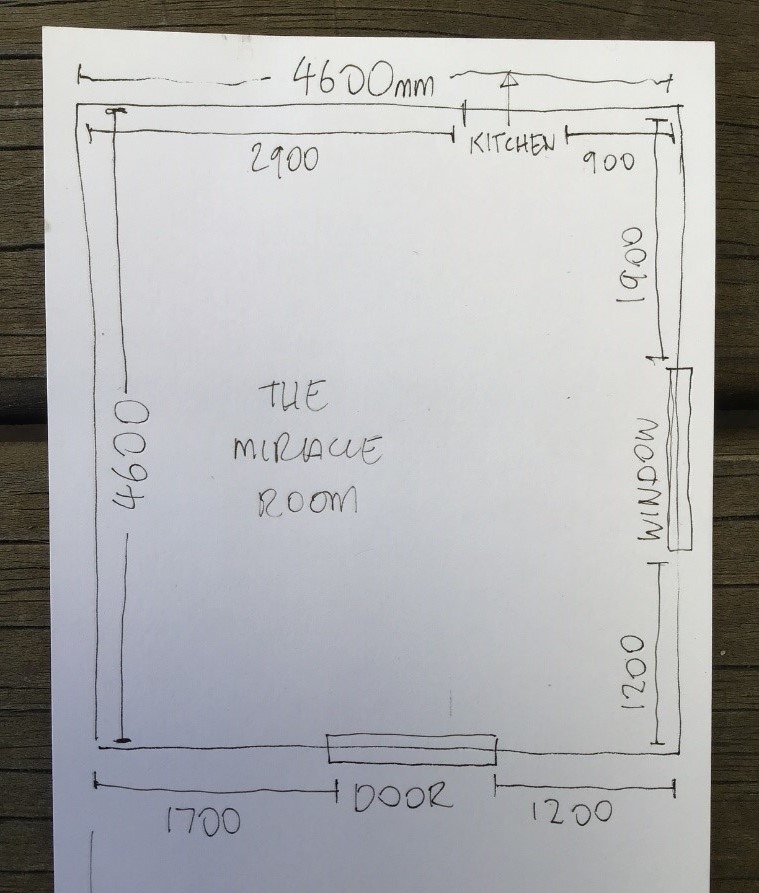
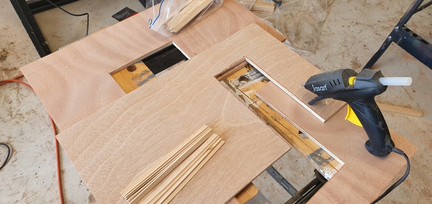
I investigated several virtual exhibition spaces but both fellow students and other professional photographers and artist use a maquette. As the gallery space is only a simple white box, I decided to make a scaled version.
I contacted the owner to obtain the dimensions and he kindly sent through a sketch of the location:
After sourcing some materials, I started by cutting out the walls, windows and doors:


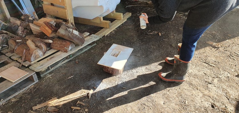
Then the floor:

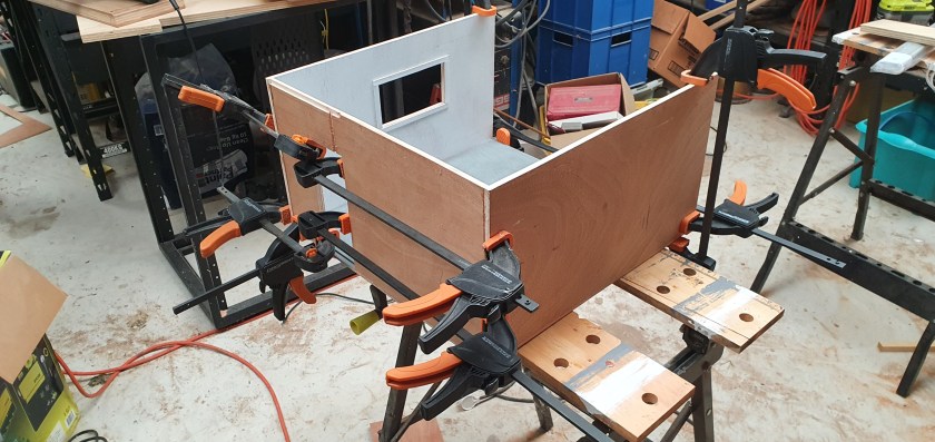
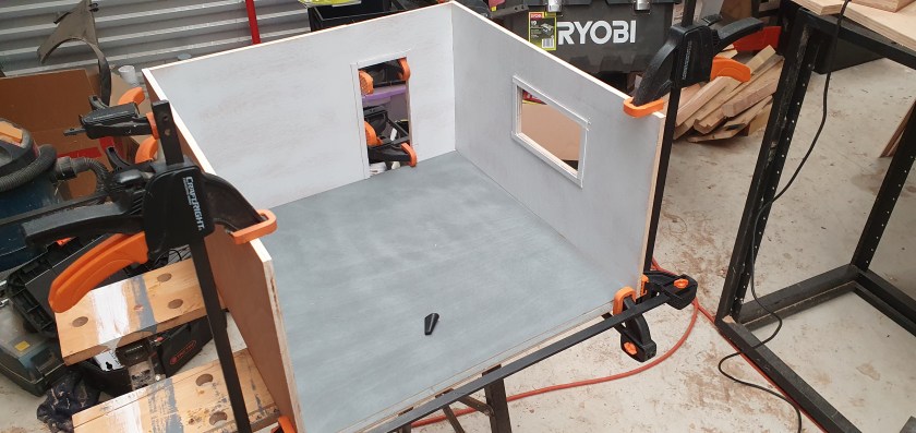
Painting the walls and floor:
And finally fixing the walls:
In order to show the images within the space I scanned each print and then placed a simple black frame around them:
Each image was cut out and then applied to the walls using Blu-Tack which allowed me to move the images about until I was happy with the order:
Hanging Ideas
I decided to experiment with different hanging styles to see which portrayed the narrative best. In this first example I placed all the images on just one wall. This would be the largest single wall that offered no interruptions to the images i.e. no doors, windows. This would offer the whole project in one view leaving the rest of the gallery as a negative space:
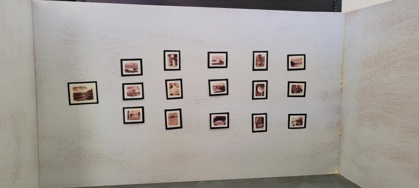
Although this contained the images to a single wall, I didn’t think it offered the best viewing conditions as a viewer would first be faced with a blank wall (one facing the door) and then have to turn to the left to see the images. I really wanted space around the display so that each image could be considered before moving on to the next.
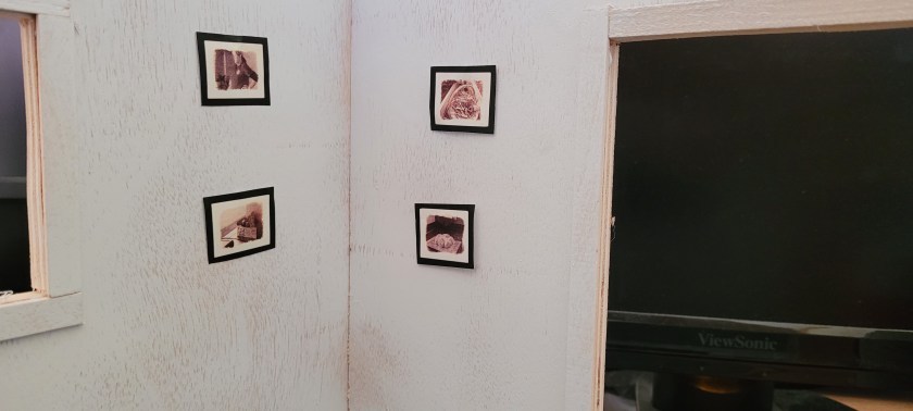
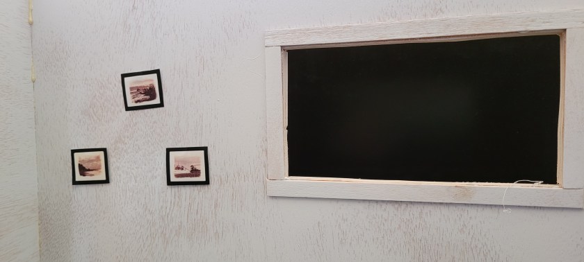
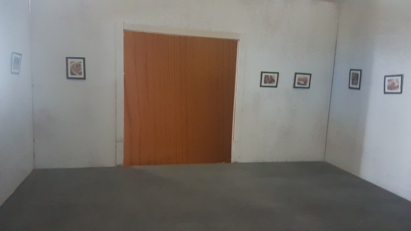
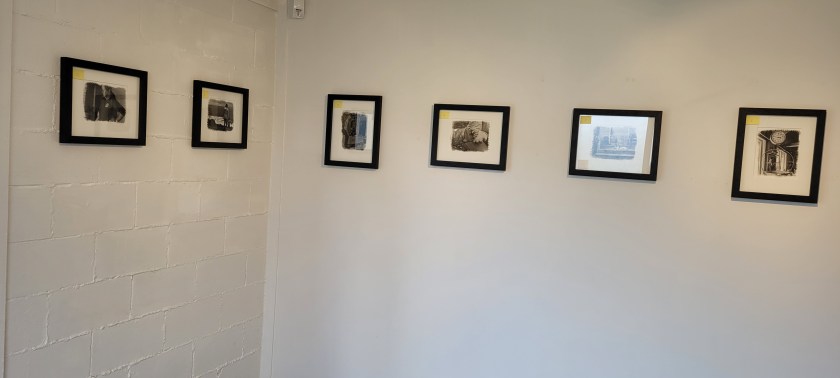
The second idea was to space the images out over two walls – the one facing the main entrance and the left-hand side. These offered the most interrupted wall space and the viewer could see the images as soon as they entered the gallery:
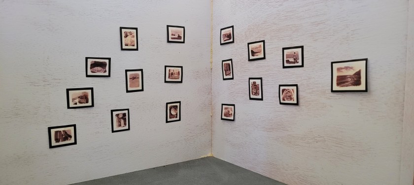
I liked this as it offered immediate connection with the viewer as they entered the gallery. There was also more room to view the images but I wasn’t happy with the way the narrative came across. I had to place the images according to orientation rather than the narrative of the project to achieve the fit with the space.
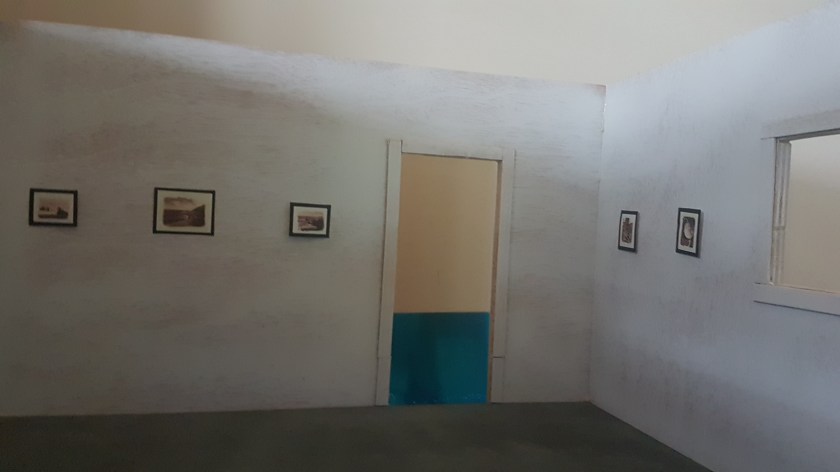
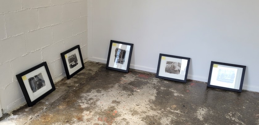
In this next layout I considered extending into the space more and concentrated on the narrative and the groups; the combination of space/location and the male/female:
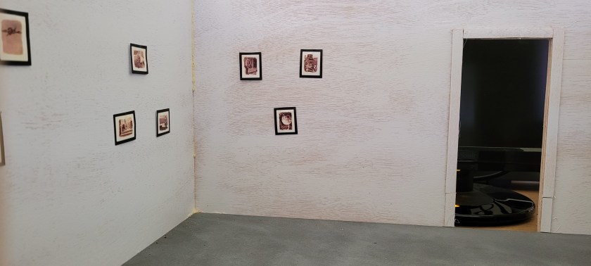
This layout utilises more of the gallery space, using three of the four walls. This allows for more room between the images and time for the viewer to stop and take in the detail. There is a visual impact as soon as someone enters the space and they can view the display in any direction as the images have been grouped around each of the women rather than my original narrative of space/place and the male/female elements.
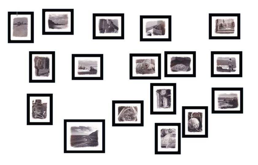
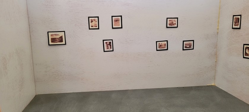
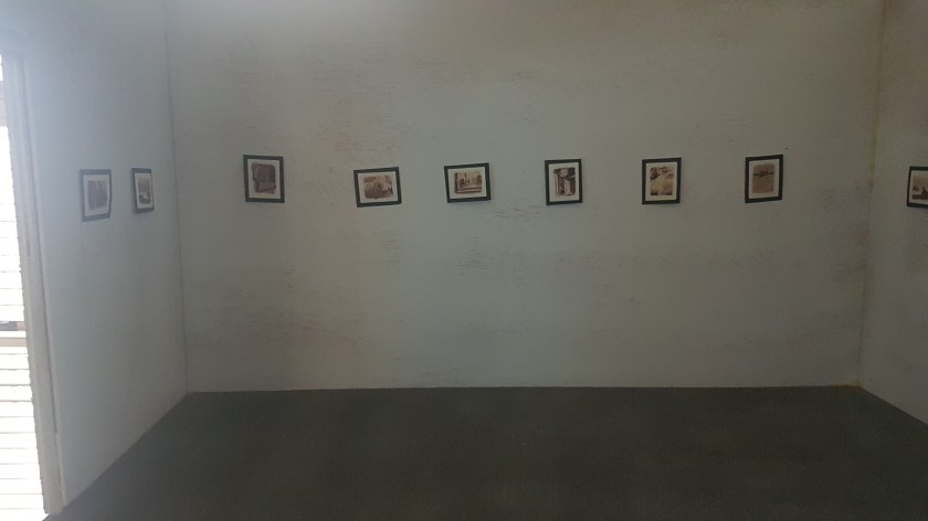
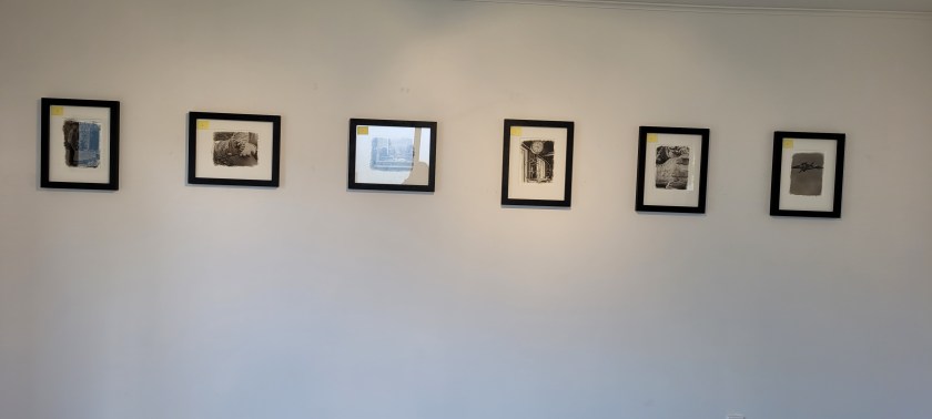
In the last layout example, I have returned to a more traditional display. The single row, hanging across all four walls. I have introduced a single larger image as a focal point on the wall opposite the entrance to the gallery. This for me sets the scene as it details the place. I’m assuming that most people entering the gallery will be drawn to this image and then work either left of right around each wall to view each of the images on display. I have selected images that flow from this central point but regardless of where the viewer starts the narrative would work, as each image links the one on either side and is based around my original narrative of place and the male/female elements.
This layout offers a number of advantages over the others; it gives space for the viewer to look and take in the detail; the narrative is maintained regardless of the direction the images are seen; the whole of the gallery space is utilised; and there is a clear focal point to the project.
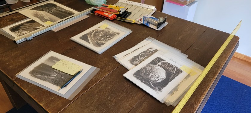
Print matting and framing
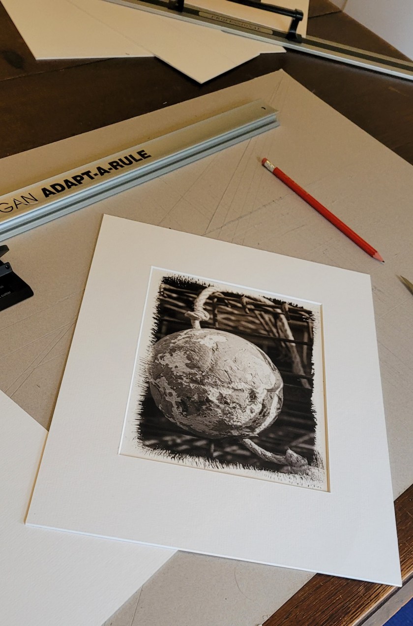
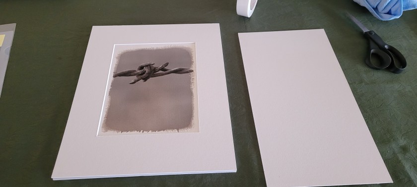
Starting to matt each of the images meant returning to my original notes on how to calculate the sizes which I learnt many years ago. I wanted to ensure that each image kept as much of the brush work as possible but also ensure the matt covered any mistakes I had made.
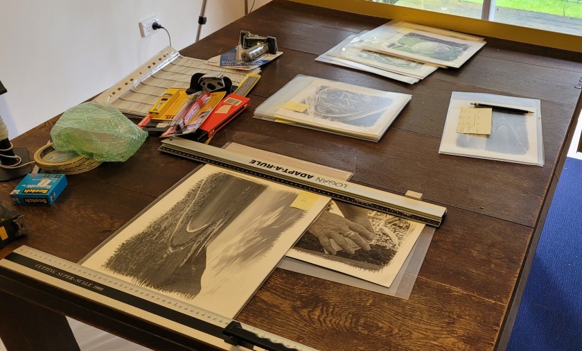
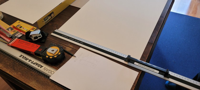
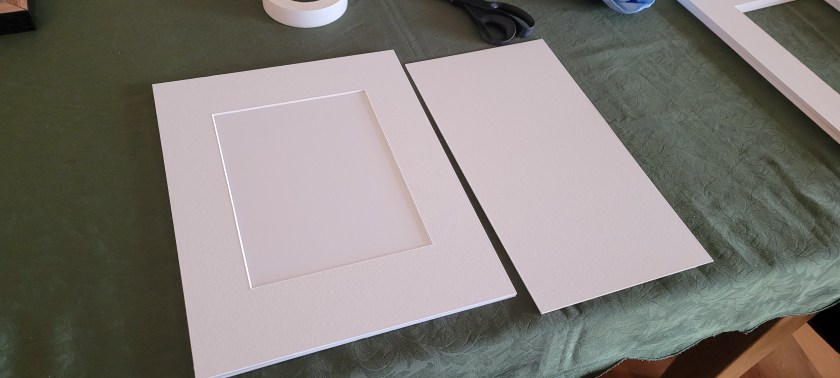
Once I had figured out the size for both portrait and landscape sizes I could cut down the large pieces of matt board to fit the frames:
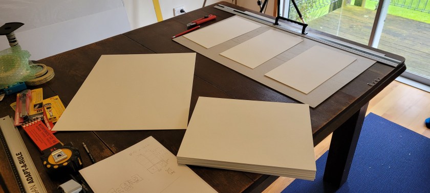
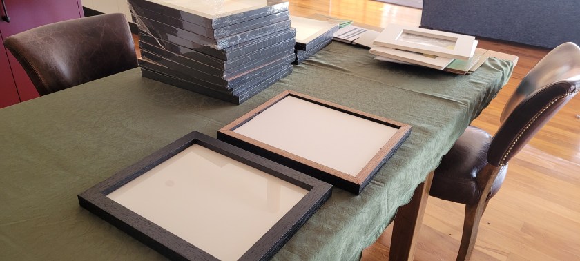
Fourteen smaller images and one large image which will be the centre piece.
And now for the matt cutting:
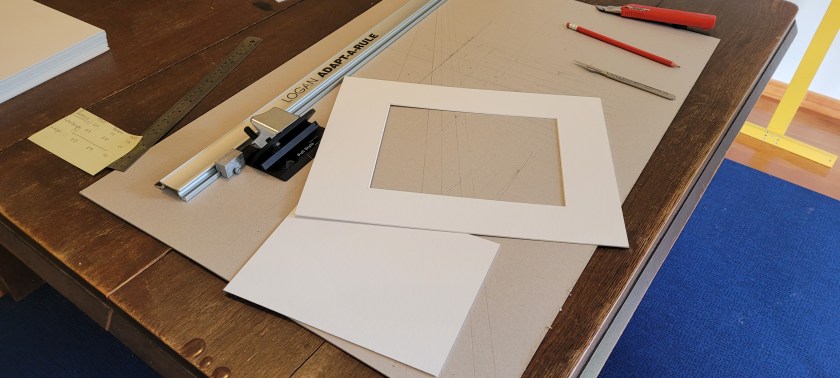
And checking the matt with a print:
Framing:
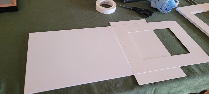
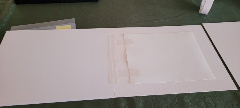
Attaching the matt with the backing board using fully archival tape:
Positioning the image prior to final fixing:
Fixing image into place:
And finally, image into frame:
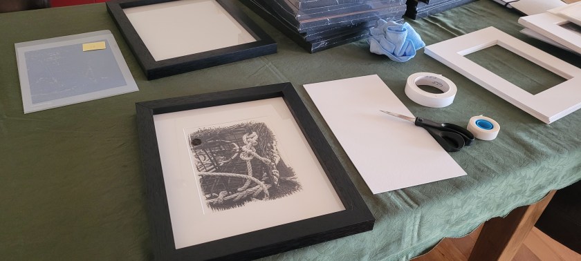
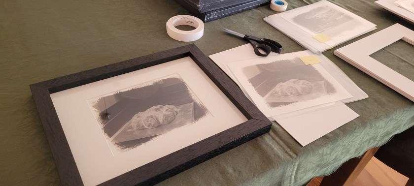
All done and ready for hanging in the gallery

Hanging the exhibition
Thursday the 3rd November was the day of hanging for the exhibition. The use of the maquette showed its value as I was able to arrive at the gallery with each of the images fully numbered and in order ready for hanging. However, I still placed them around the room and double checked and confirmed the order.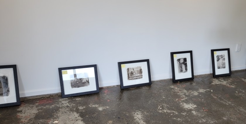
I was still happy with the order and so moved on to hanging each image.
The following shows a short video of the installation:
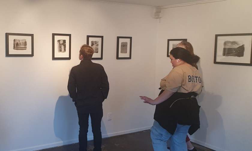
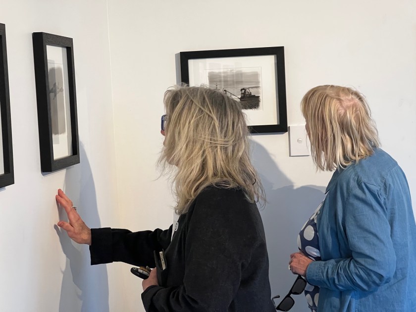
And finally, the evening of the exhibition. An amazing turn out for the size of the location with over fifty attendees and even some sales: