After seeking some advice around which images to print in my feedback session with my tutor I was given the following:
‘One of the most important things you can learn from this course is the trial-and-error process you need to undertake as a photographer. I am not here to tell you which images to select, this is your exhibition and your decision. What I can do is offer advice once you have selected and started printing which you need to do. It is ok to make mistakes (this is how we learn) and once you finish with OCA there will be no tutors to help. Remember to document your decision-making process and your printing – mistakes and all’.
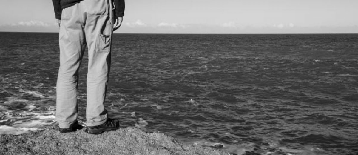
And so, the journey begins. I have made an initial selection and posted these to my blog site here. When I completed the initial workshop in platinum and palladium printing during the BoW course (here) I really liked the brush effect finish on some of the examples I made. I think this will work well with the images from Ngawi.
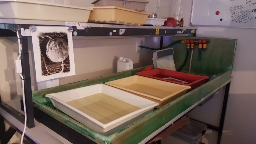
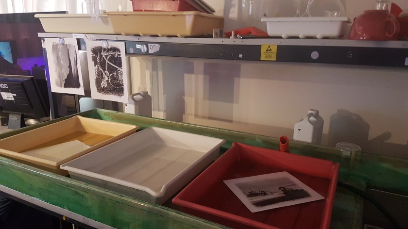
Because the cost of the chemicals is so high, I decided to first perfect the coating technique of the paper using cyanotype first. Using Bergger COT320 100% cotton paper 8×10 inch (20.3 x 25.4 cm) I set up a mask:
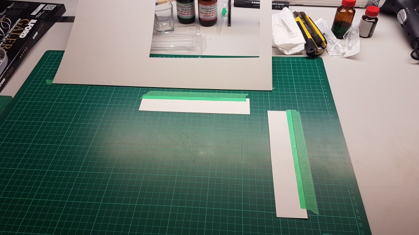
Printing the digital negative larger than this would ensure that there were no hard lines and the image would seem to bleed into the paper. The size of the mask also allowed for final matted and framing of the print. When coating the paper, I needed to keep within the mask but still give a feathered like appearance.
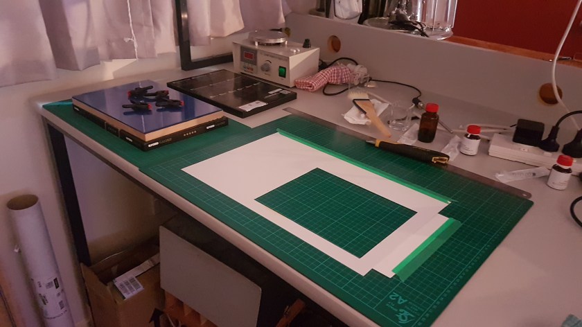
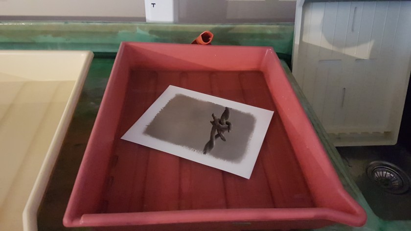
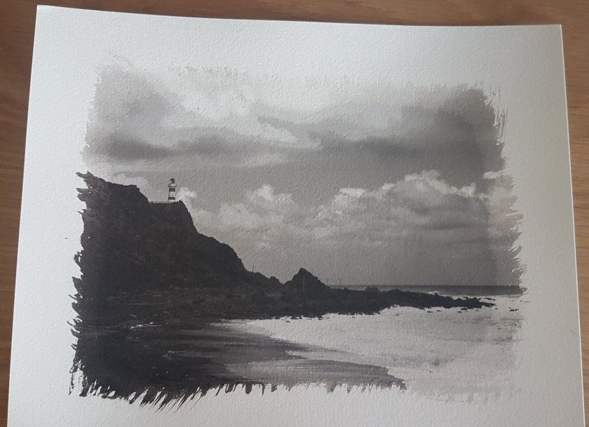
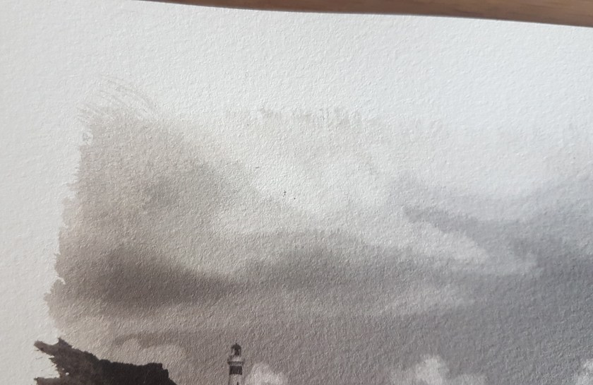
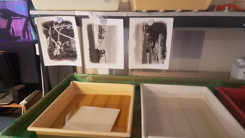
The first attempt highlighted some errors with the negative size and the need for the mask to ensure the line from the negative was not seen:

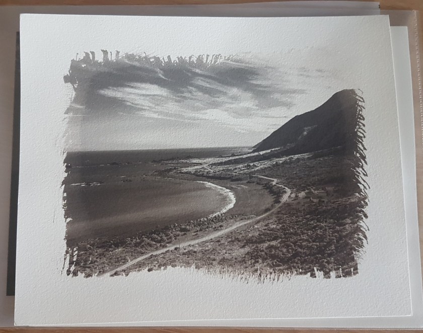
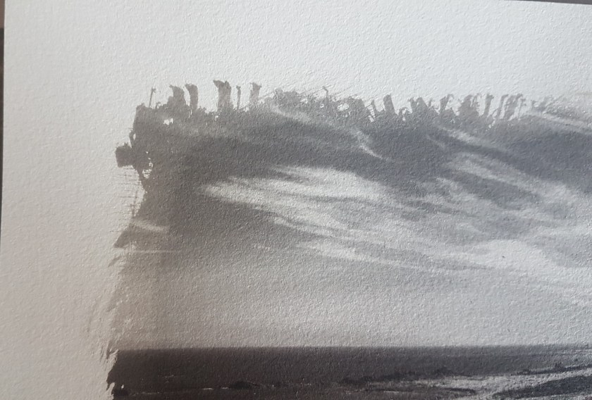
The following print I think works a lot better, showing the brush feathered effect and no hard negative line. I did however loose some detail in the highlights but as this was more about the effect/coating technique I wasn’t too worried:

I think the overall size of the image works and I should be able to procure a standard sized frame and matt. As I had coated an additional sheet of paper, I tried another image to ensure the sizing was correct:

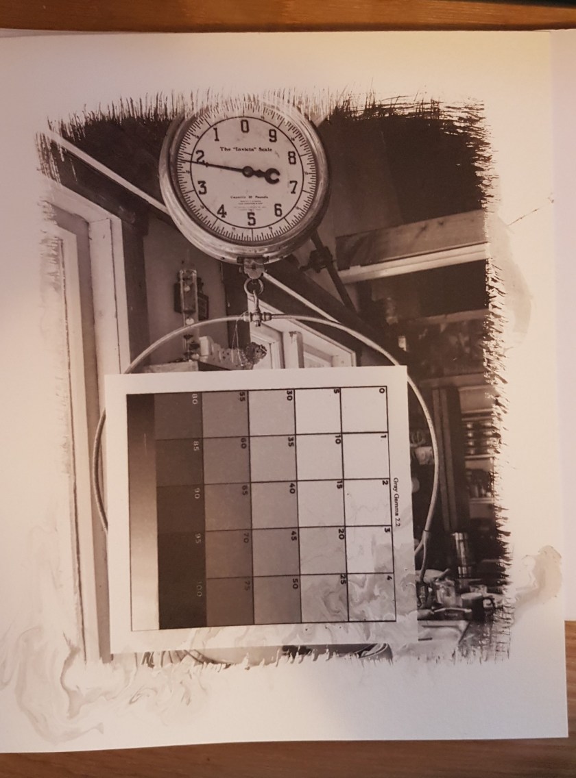
Now to start with palladium only (well 0.5mls of Fe and 0.5mls of Pd) as this would be the cheaper option. I coated two initial sheets of paper so that I develop a test grid. This would be the starting point to try and ensure the digital negative had the correct tonal range. The test grid has ready been developed and supplied by Mike Ware*. This is printed onto the transparency and then placed onto the coated paper before placing under the UV light source.
*Ware, M (2021). ‘Platinotype Making Photographs in Platinum and Palladium with the Contemporary printing-out Process’. Routledge New York

The negative and coated paper is then exposed for 10 mins or until 376437 UV units has been reached.

Following the development process each of the squares of the grid are measured and the data added to the curve in Photoshop. This then produces a new grid with the first curve attached. A new digital negative is then printed and the whole process is repeated:

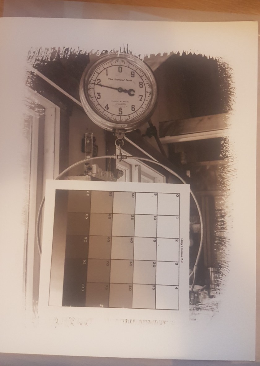
This was once again measured and a new curve produced. However I’m not sure what went wrong but the data didn’t seem to be correct and the resulting results did not produce a clean image:
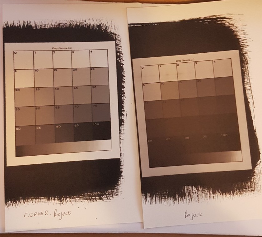
I decided to return to the original data and retry:

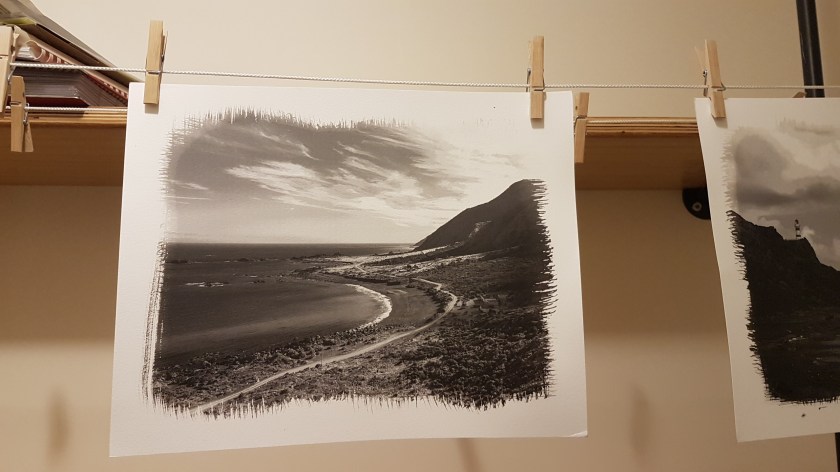
This produced a far cleaner grid and data was applied to the curve and a new image negative was produced. This time the grid was added to one of the images to be printed to see if the tones across the image would work.
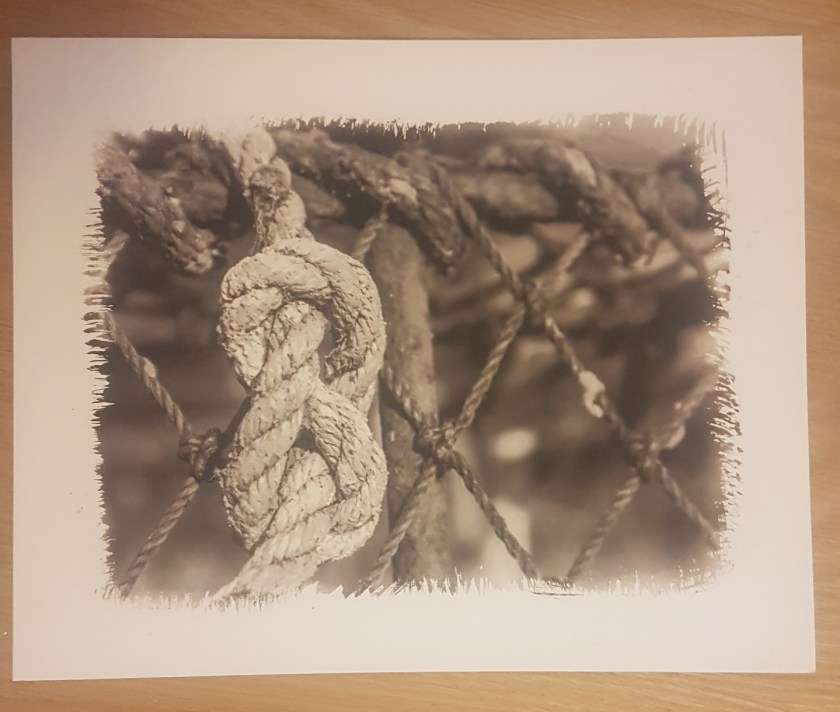
This worked well apart from the markings along the lower edge which I discovered were from holding the exposed paper too close to the stream prior to placing in the developer, this cause the paper to become wet prior to the development.
Looking at the image overall I seem to have a good tonal range with details in both the blacks and the whites. The highlights don’t seem to be blown out and I really like the effect. I think this will work well with the overall narrative of the project.
During the week following this initial session I completed some additional research into the different combinations of chemicals and the effects they produce. After workshop I had invested in the book by Mike Ware (2021) ‘Platinotype Making Photographs in Platinum and Palladium with the Contemporary printing-out Process’. Routledge New York. This shows some amazing examples of current practitioners of the process, but I was drawn to the work by Stavros Pippos who uses a Fe:Pt:Pd ratio of 4:1:3. As this was impossible to measure I decided to double the ratio to coat two sheets of paper at once, making sure I kept the second sheet covered before I dried and then hydrated ready for use.

@Stavros Pippos ‘Old Store, Bungaree Ranch, Clare, South Australia, 2013.
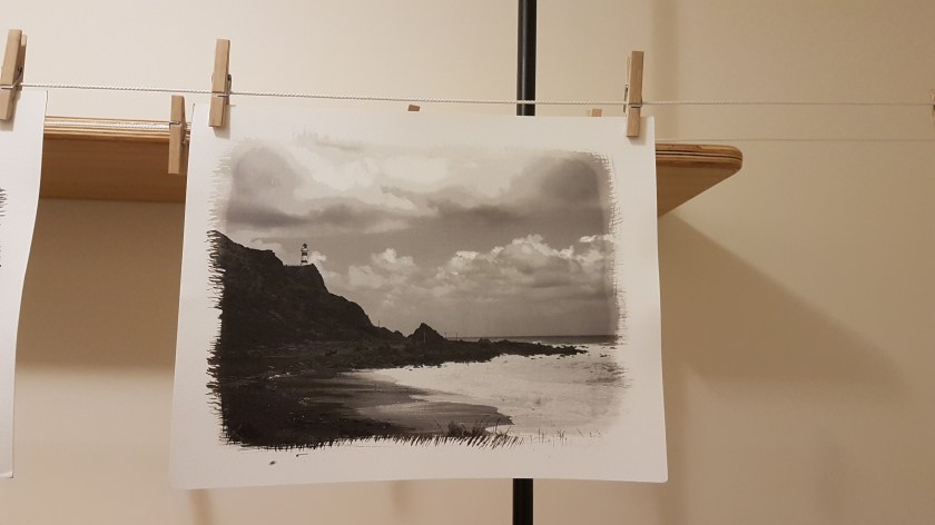
I decided not to change the curve from the previous week and see if the move from the 50:50 ratio to the new 4:1:3 made much of an impact. Using the negative with the curve on the scales I processed an image.
The result of the new ratio combination I think worked well. There are details within the shadows, the highlights are not blown out and the tone gives a warm feeling, which is what I wanted:
I did measure the grid again and found that there was no real need to alter the negative so made a new full print and ensured that I completed the full ten minute for each development bath and a full ten minute wash of the print at the end.


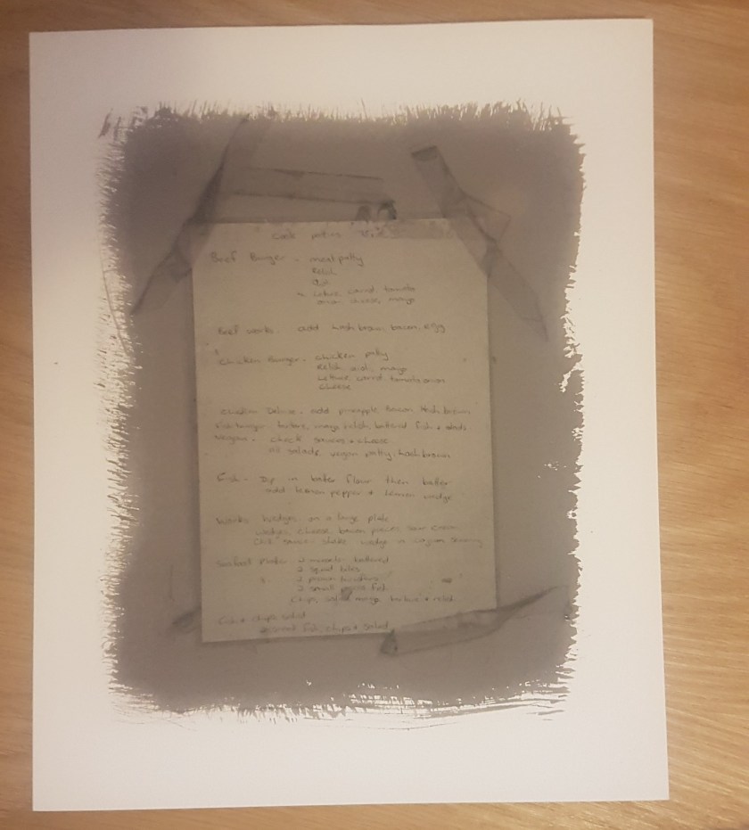
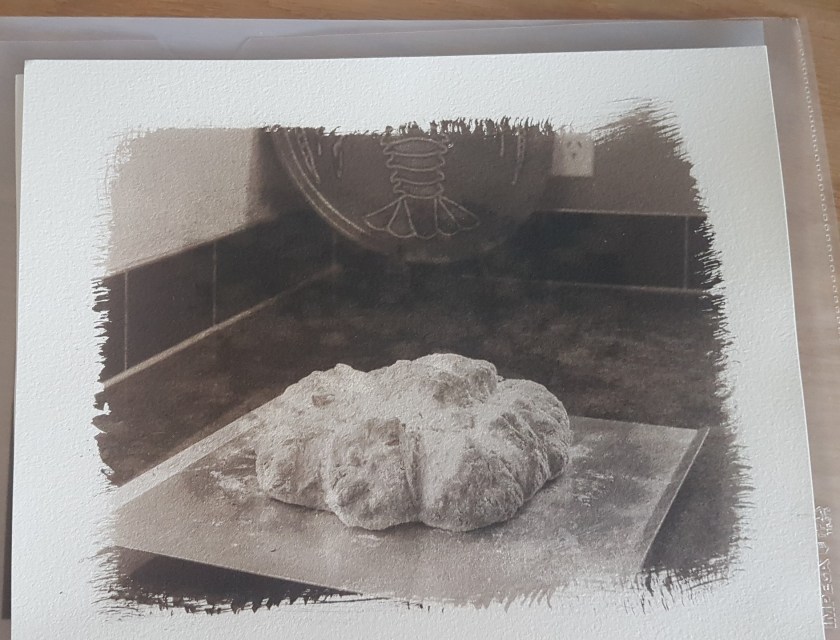
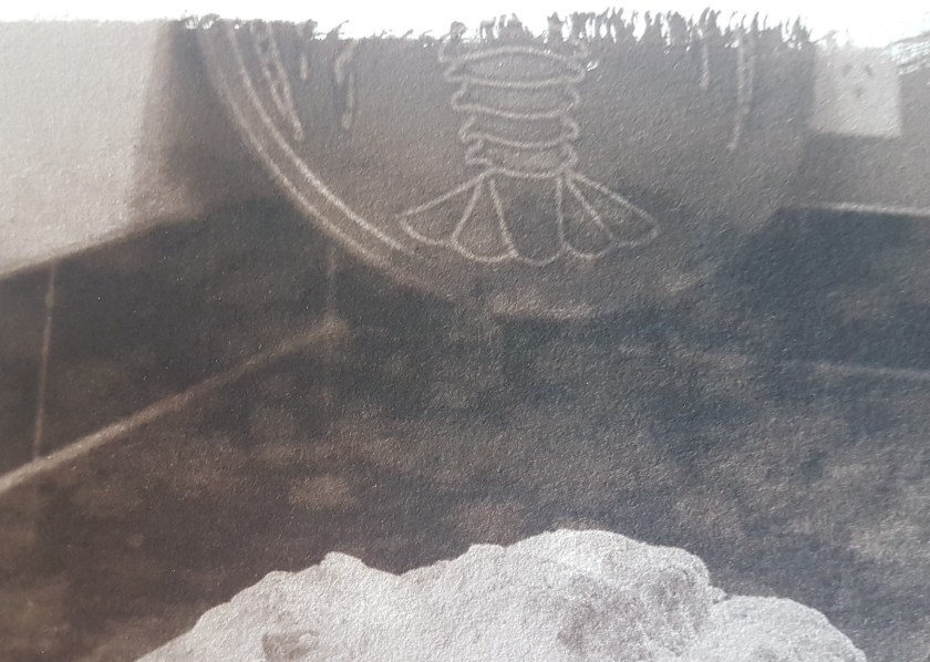
I continued to develop two more:

Both of these I think work however the menu image I don’t think is as successful, probably due to the lack of contrast in the original image, so I will see how it fits with the final set:
Sunday 19th saw a bit of a production line with a further eight images being produced. As the gallery has moved location I need to revisit and assess the size as I was planning on just fifteen A4 sized prints. If the location is larger, I might try and produce a larger landscape image as a centre piece. Visit pencilled in for Friday this week as we have a public holiday then.


26th June saw another great session of prints being produced. I managed to call in to the new exhibition location yesterday. It’s just round the corner from the old site. A little disappointing as it’s not on the main high street, but easier for parking. The overall space is slightly larger and so I think I might be able to include a single large image that will act as a centre piece to the display. There is also a small space in the corner that would hold the digital books (fingers crossed I can get them printed!) and the boxed set of prints.
Prints from the day:


I had a few issues with inconsistent coating of the paper. This of course doesn’t show until after the image has been exposed and subsequently developed:
A second problem was getting too close to the stream following exposing of the negative to try and bring out detail in the highlights. This resulted in a kind of mackled effect:
Concerned about the limited time I had available I decided to take a day’s leave from work and finish the selected prints and complete a number of re-prints due to the issues around coating and steam. As I had the studio to myself I made an early start:


Prints from the day:


Repeats:


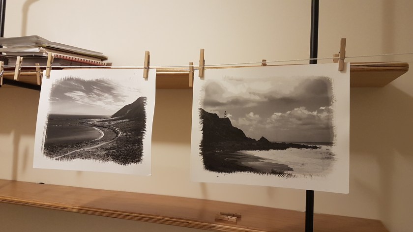
These last two images are the ones I think might work as a larger centre piece. A larger negative will be printed so I can try and get a good coating on the paper. I will also try and clean up the mark on the lower edge as this will not be masked by the matt. If it can’t be removed with bleaching then I will have to re-print. I still need to select approximately five images to go in the box set.
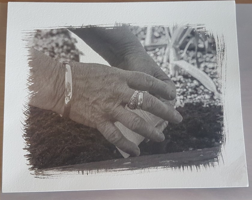
The following print is going in the reject pile. I don’t like how my eye is drawn to the large negative space between her hands. This isn’t something that is noticeable on the digital print.:
Following a second visit to the gallery I have decided to produce a single larger image to act as a focus point of the exhibition. Considering the need to sell the images I need to select an image that someone would find acceptable on their wall, which is not necessarily my favourite image.
On Sunday 17th July set about producing two possible larger prints on 11×14 paper. As I was setting up all the chemicals I decided to complete two prints just in case one wasn’t successful. I selected the two landscape images of the local area and I think they came out rather well:
The exhibition layout and the framing can be found here.
