4th April 2021
After listening to the course, I decided to spend a large portion of the long Easter drafting my ideas for the book and then getting my head around InDesign. I took the advice of Lewis Bush and drew a draft layout before opening up the software. I had been thinking about the layout for some time once I realised that with some disappointment, I couldn’t send prints.
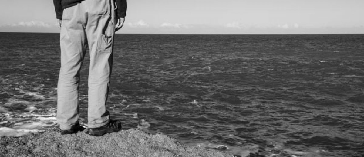
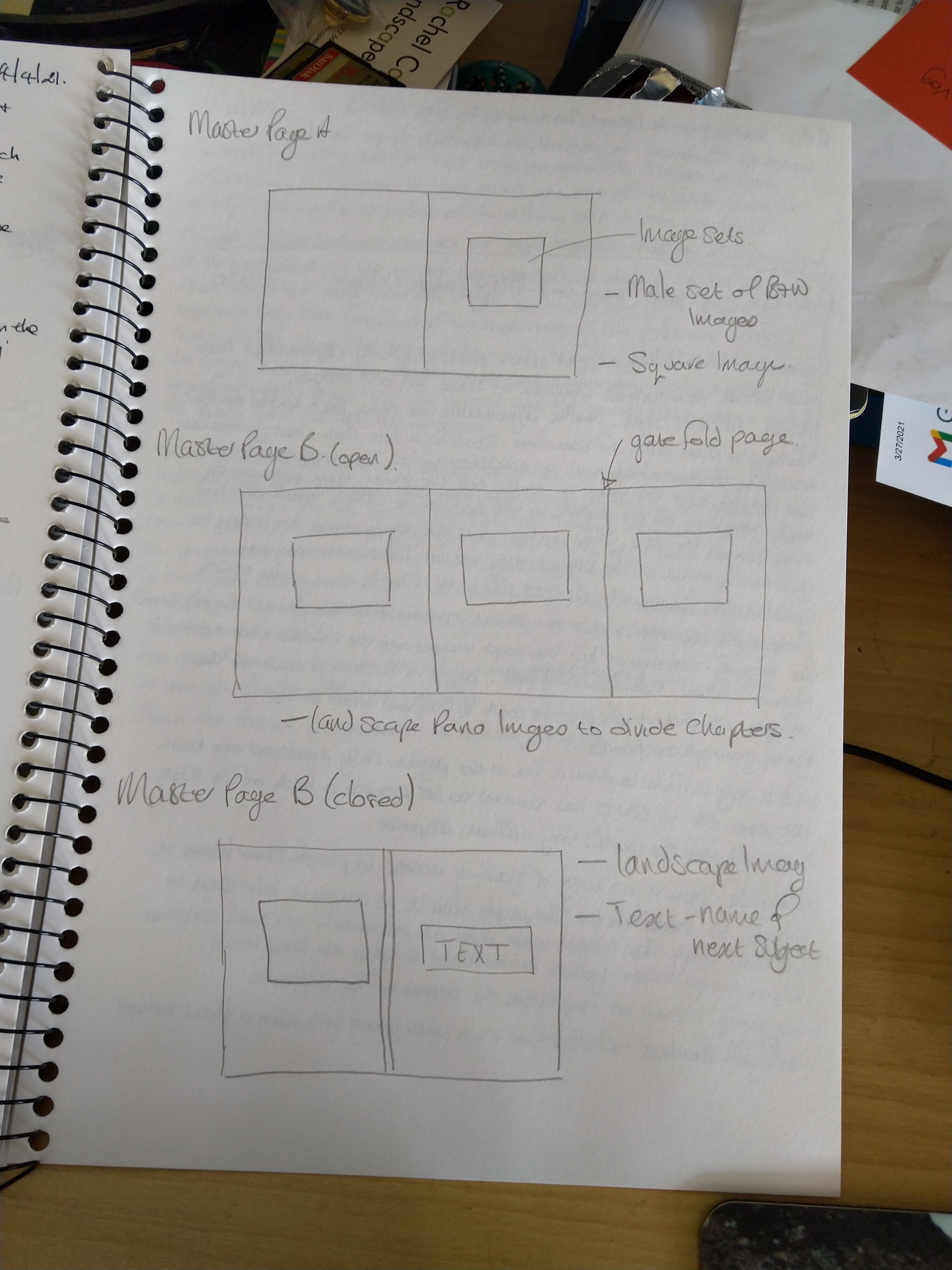
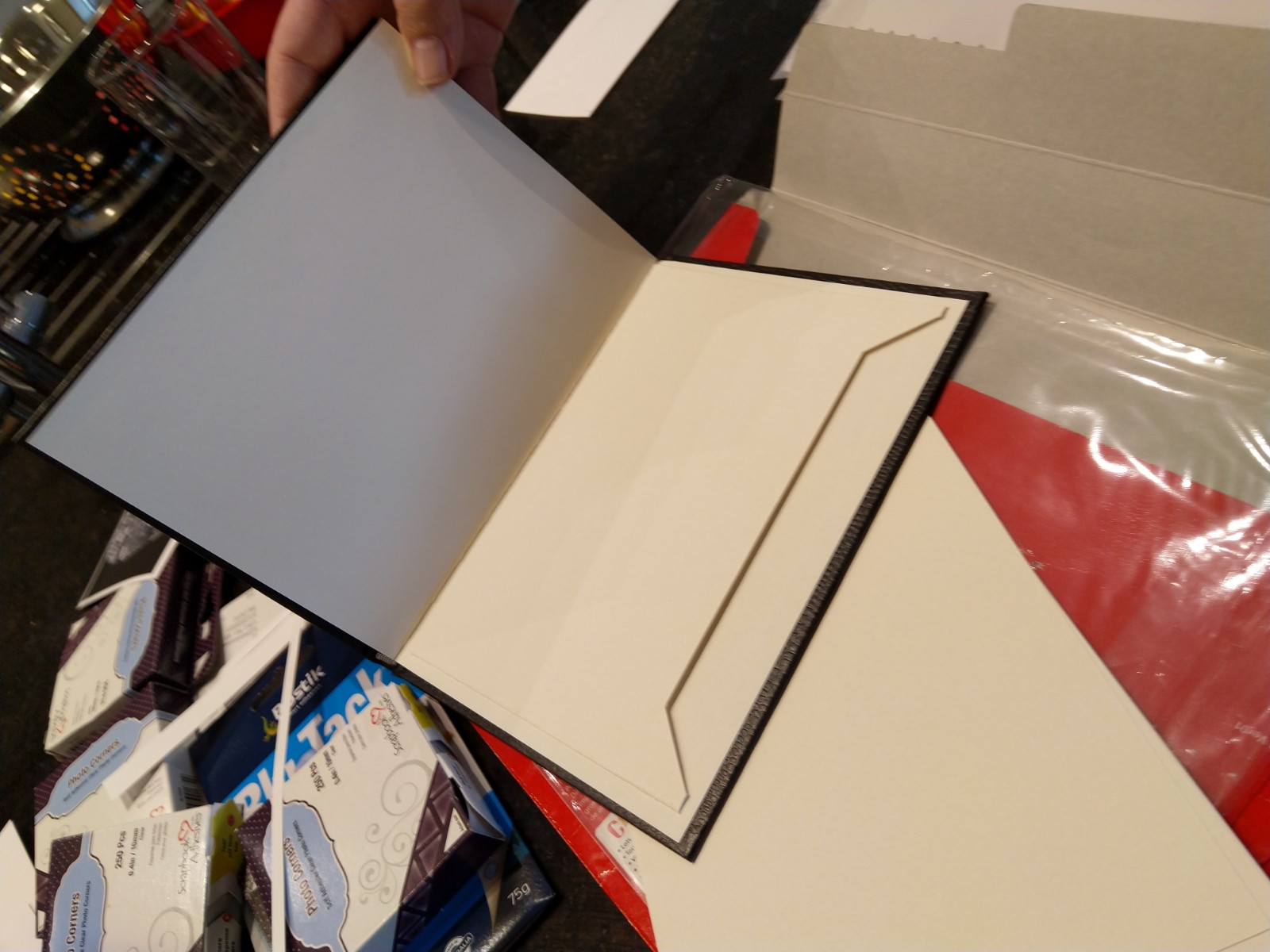
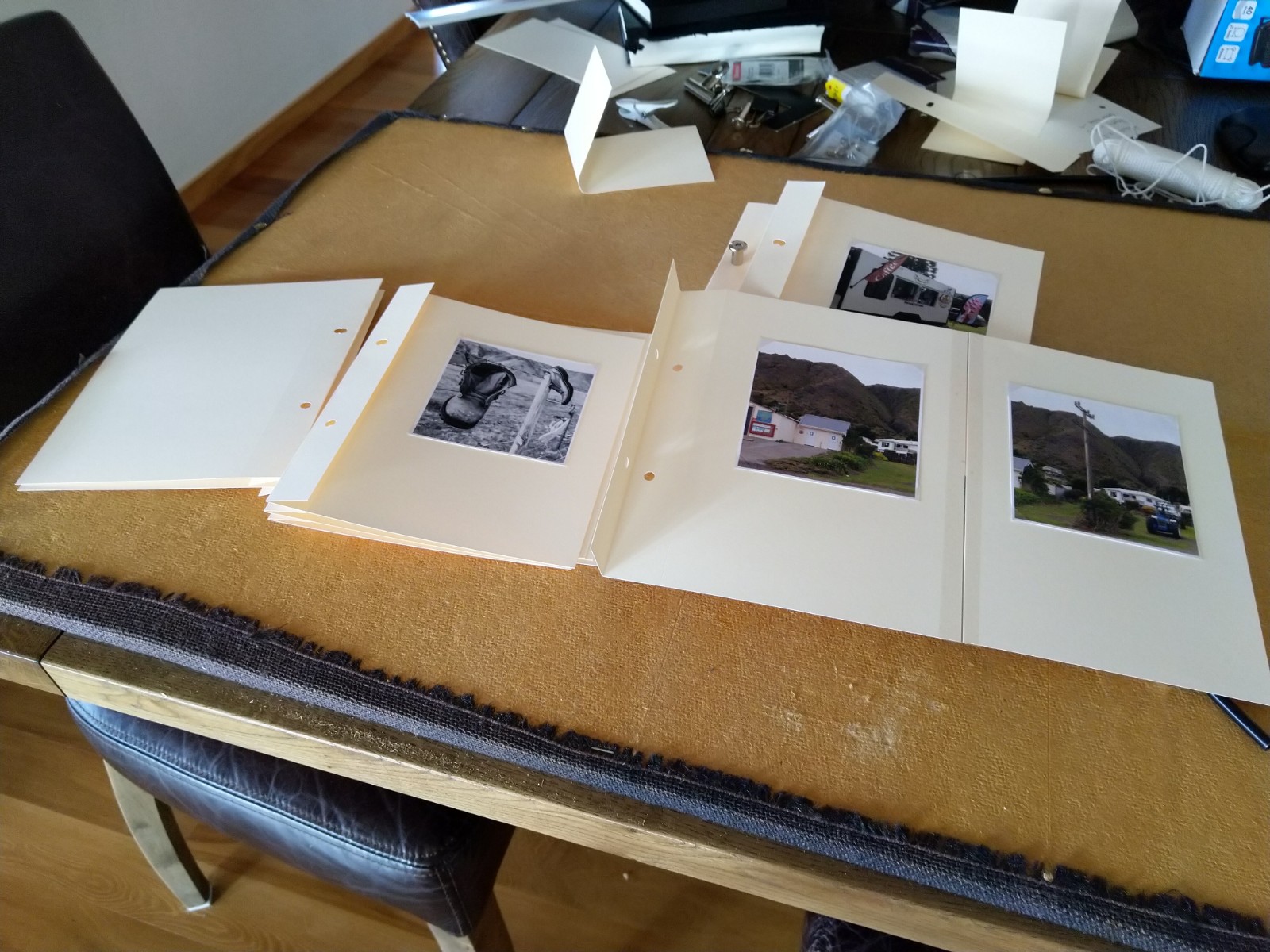
I knew that I wanted to try and produce a chapter per person but how to separate them was a challenging point. Initially I considered using a B&W image, but on feedback and consideration during the editing part of the process this was put to one side. During the edit the images were 5×4 in format and consisted of both landscape and portrait, so I considered using a portrait image to separate the subjects. When the prints were on the wall and I was editing and moving them around to try and get a more structured flow the use of a single portrait images wasn’t strong enough to be noticed or make the viewer (long suffering partner) stop and realise that they were moving to a new subject. This was when I realised, I could re-use the panorama images I had taken and produce a ‘gatefold’ set of pages – easy I thought!
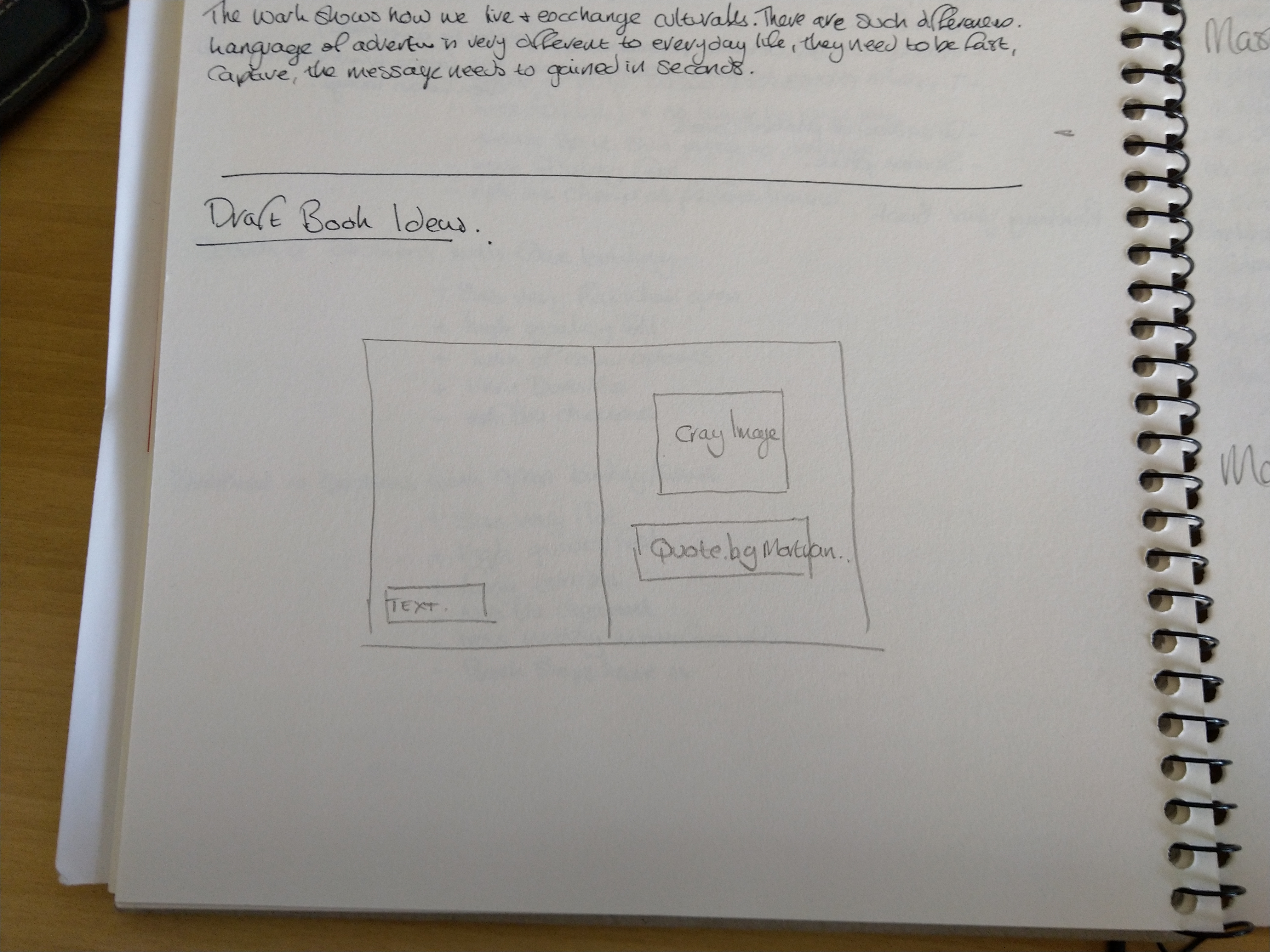
The following shows my draft ideas from my learning log:
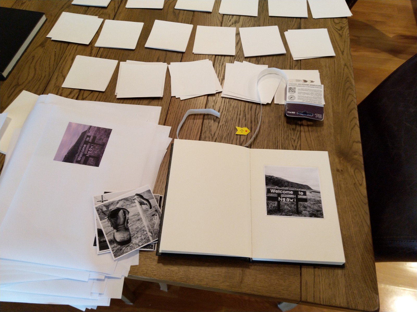
As I had already edited the images into an order, I did change the format to square as I had also decided that the draft book would be just A5. I created a new folder for the book and downloaded all the images into TIFFs and high-resolution jpgs so that InDesign could easily cope with the file sizes.
The on-line courses and additional YouTube videos were an absolute blessing as InDesign is not as easy to pick up as first envisaged, but once I had my two different master pages set up it seemed to flow fairly easily. The layout is not one of the most complex. I wanted to keep the flow simple, for the images to speak for themselves. The use of negative space in the form of white pages there to force the viewer to concentrate on the image.
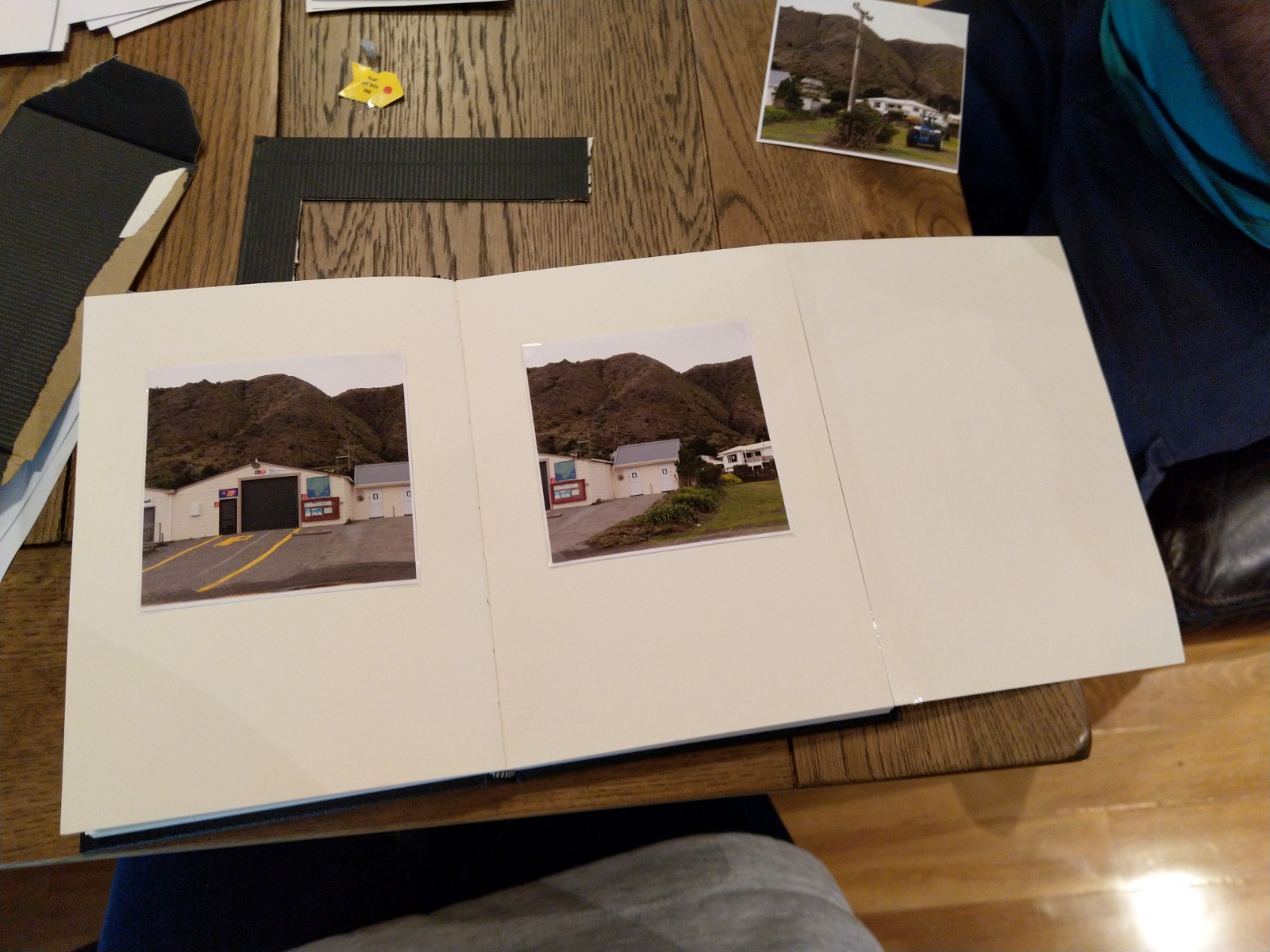
The layout in this initial draft consists of a black front cover – this will have the title embossed on it. Inside there is a quote by Jim Mortram which I think resonates with my whole approach to the project. This is followed by a series of black and white images which I hoped to give a feeling of the location, the hard conditions, the maleness of the place and isolation. The first set of panorama images appears next this I hoped linked the male/isolation part of the location with the images of women. The selection of images that I think represent each of my subjects follows. I have ended with a series of black and white, bringing the story back to the location, isolation and the whole male feel about the place.
InDesign allows you to produce a pdf version and so that’s what I did. I up-loaded this to the various shared drives for each of the groups I interact with and asked for feedback. Have to admit I wasn’t looking forward to that part.
Link to first initial draft here:
Ngawi Book draft Spreadversion v0.2
10th April 2021
I received lots of constructive and honest feedback from my fellow students. I have added them here as some were very thoughtful and very in depth, so I have tried to summarise the common themes from the comments and reviews:
- On the whole the mix of B&W and colour images worked. The B&W not necessarily giving a male feel but more of an absence and isolation
- The pdf as a way to view the book was not that successful and advised that a mock up would be useful, especially for the gatefold pages
- The square format was good but some should be larger or even full spread;
- Need to add information about the location for non-New Zealand viewers such as a map or written context
- There seemed to be a few repeats so I should think about swoping or cropping
- Strong feel of a fishing community than a rural one so may need to reconsider the title
- The quote should be moved to the back or removed and consider an essay or more text about the location
- There was a strong sense of story, location and place.
So back to the draft to do some changes before producing the dummy book and a second version as a pdf. Not sure if I need to go all the way to publish for Assessment as I know this is not going to be the finished product for SYP maybe something to discuss with my tutor following Assignment 5.
New version:
Ngawi Book draft v0.2 Post feedback
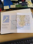
One of the items mentioned in the feedback was the need to give non-New Zealanders an idea of where Ngawi was as a place. I have seen and reviewed a number of photobooks that include maps at the start of their work, usually as a full-page spread, but as I wanted to keep a consistent theme and style throughout the book, I decided to produce a map at a larger size but fold it and place in a pocket at the start of the book, this way the viewer could choice to discover where Ngawi was or just leave it as a mystery, letting the images tell the story of the place so it could be anywhere in the world.
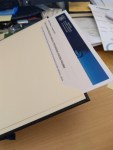
Map Envelope production:
Map envelope at the start of the book:
Preparing Images for the draft book:


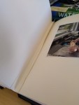
Finally producing the draft:
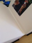
First ‘gatefold’:
24th April 2021
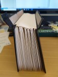
So it was long into the production that I realised I wouldn’t have enough pages in the purchased book. I had previously purchased others but had planned to use them for personal projects for future ideas and projects but I now needed to add additional pages.
I calculated how many more pages I needed and sectioned off the required number of folds and then removed them from a new book. Removing the original back and the front covers I joined the two sections together.
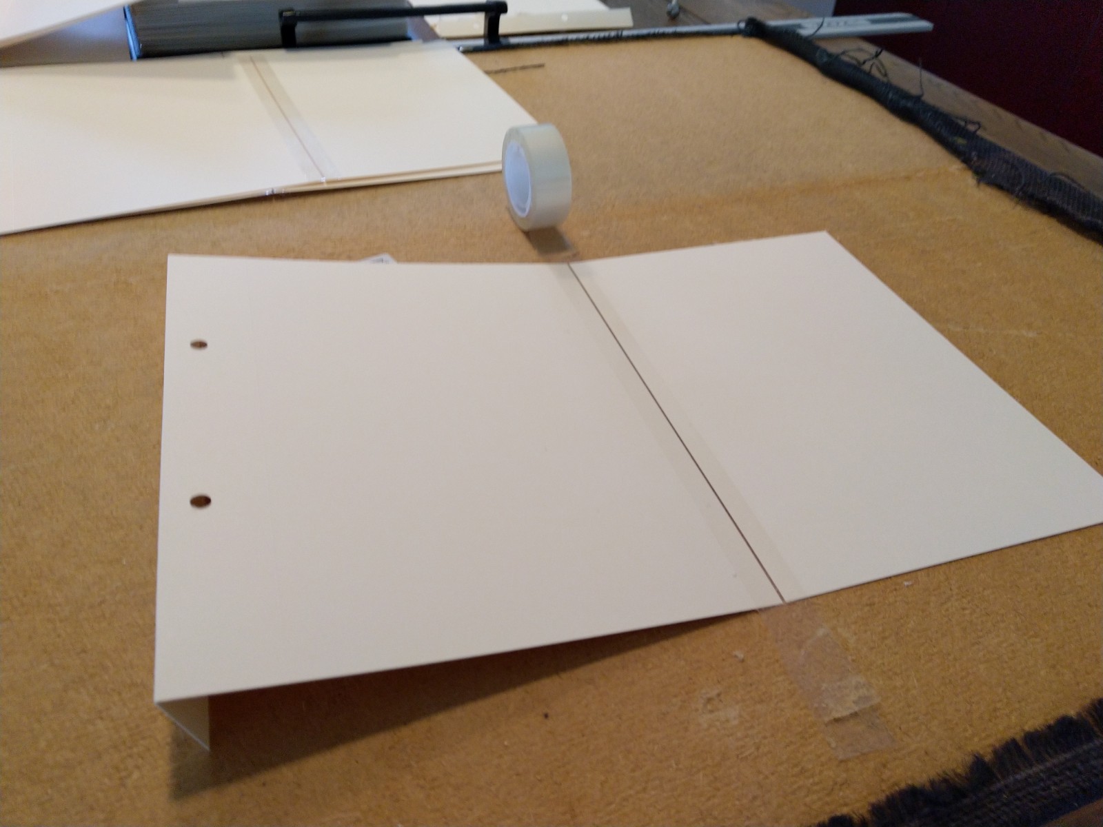
Due to the additional thicknesses of the pages from the images the back spine would need to be repaired with a new spine for the pages to be glued to. I tried this with a standard glue but found this was not strong enough so purchased a stronger craft glue suitable for leather and ceramics – maybe a little over the top but the pages now stuck in place. I did notice that the gaps between the sections were uneven and the join between the two books was a little messy so I tried to neaten this up by adding a fold of the same paper.
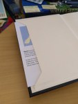
I also added a pocket to the front cover and the back as detailed above, the font containing a series of maps to show the location of Ngawi and the back giving details from the latest communications from the New Zealand Chief Coroner on the slow decline in suicide rates – still not a good story.
As you can see from the images below, I’m not really happy with the final result. I think it gives me a good feel with respect to the sequencing of the images and I think the gatefolds work well as a means to separate the sections but the construction is a little untidy and I don’t think would present well for assessment. So, I have decided to start again, this time with separate pages and separate front and back covers.
Another review of the comments made me rethink the title of the book and so I asked some fellow students their thoughts on changing it from ‘Women of Ngawi: The backbone of a Costal Community’ to ‘Inside the Shell’. Some of the comments said that the title gave too much away, others were confused by my original use of rural when it clearly had links to the sea and fishing, so hopefully the title will make people think and then find the link between the cray fishing industry and the women who are the backbone of this community.
29th April 2021
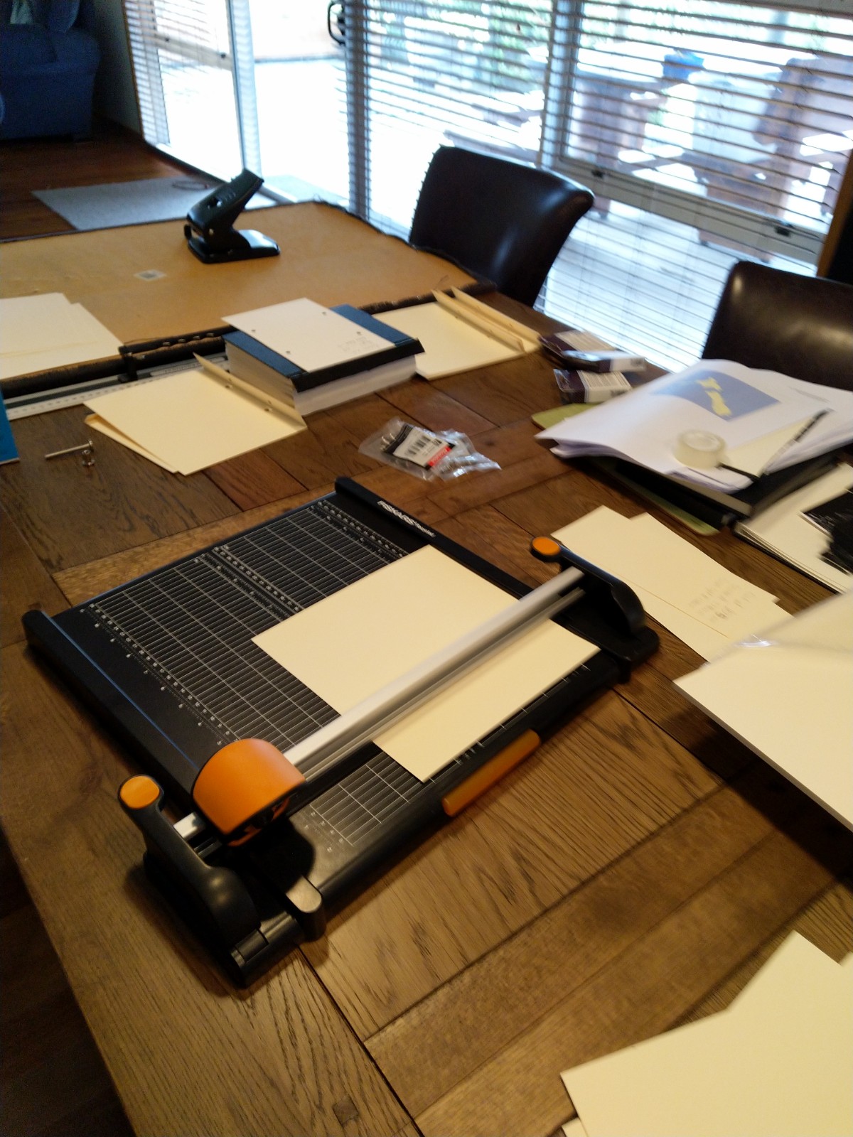
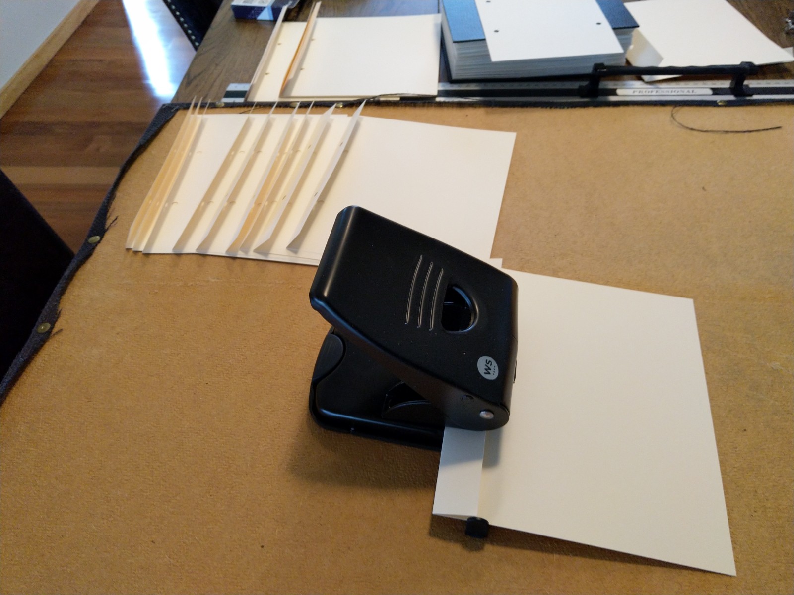
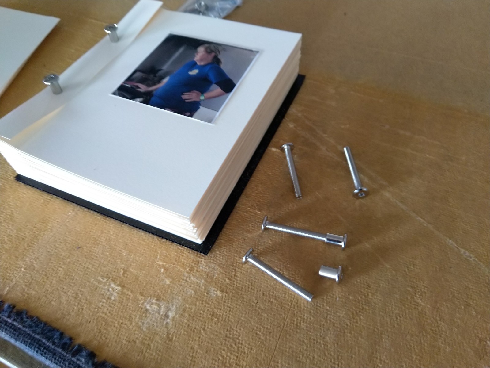
Book construction Mark II. After the failed previous construction, I have purchased two reems of 210gsm card for each image, a new hole punch and black plastic board for the front and back covers. To lock the construction, I found some threaded nuts and capping bolts which hopefully will be long enough.
I restarted the process by cutting and folding each of the single image pages. The fold will ensure that the final book will be even due to the fact that the images are not printed directly onto the page.
I then moved on to the new gatefold pages:
Then returning each of the images from the old book to the new:
Then using the new connectors, I started to reconstruct the book:
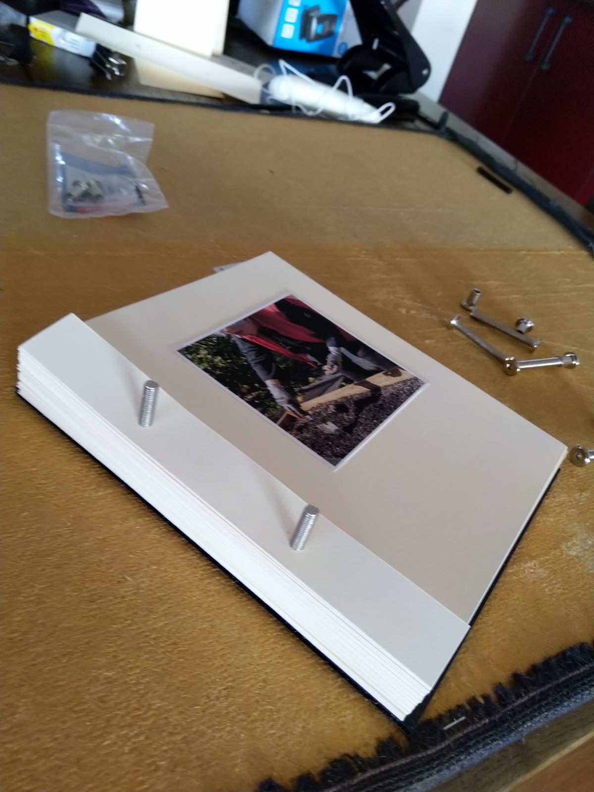
Until it was complete:
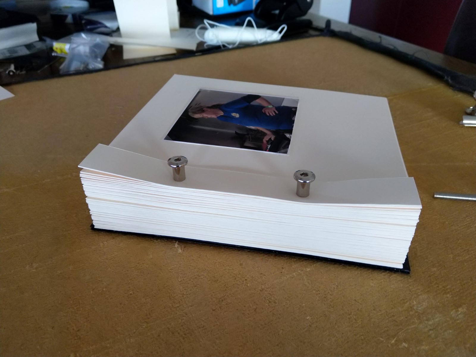
Well almost. There were a few issues – the first the connectors were not long enough. The second, the end cap were too thick for the holes punched in the card and would stand proud of the front cover which wasn’t what I wanted, but finally due to the large number of pages and the connector not being long enough there wasn’t enough room to open the pages fully to be able to video and see each of the images. I therefore needed an alternative way to join everything together, that would hold the pages and be flexible to allow the book to open so I could video the pages. The alternative would be to photograph each page and produce a slide show in Lightroom – might still have to do that.
